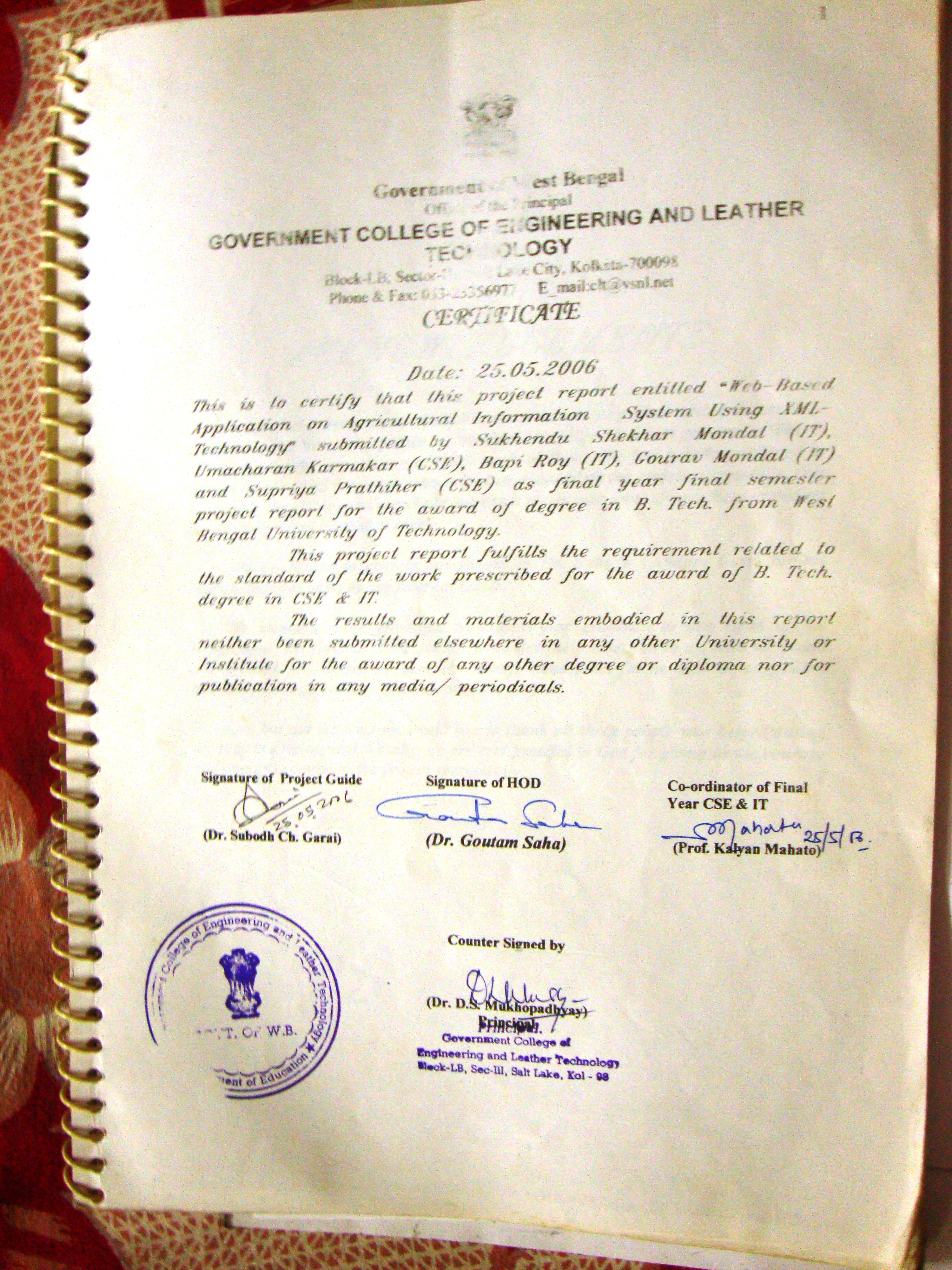
WEB-BASED APPLICATION ON AGRICULTURAL INFORMATION SYSTEM USING XML-TECHNOLOGY
BY
Sukhendu Sekhar Mondal (11202021031)
Umacharan Karmakar (11201021017)
Supriyo Pratihar (11201021015)
Gourav Mondal (11202021009)
Bapi Ray (11202021011)
UNDER THE GUIDANCE OF

Prof. Dr. Subodh Chandra Garai
The Project report submitted for the completion of 8th semester project for award of B. Tech degree in
Computer Science and Engineering
and
Information Technology

WEST BENGAL UNIVERSITY OF TECHNOLOGY (W.B.U.T)
GOVT. COLLEGE OF ENGINEERING & LEATHER TECHNOLOGY
GOVT. OF WEST BENGAL
LB BLOCK, SECTOR III, SALT LAKE
KOLKATA- 700098
OBJECTIVE
This is the final year project report during final year and final semester.
The main objectives of this project are as under:
- To provide integrated technical information to the user about agriculture
- To practise a web related project
- To practise state-of-the-art technology of XML
CONTENTS
- Objective
- Certificate
- Acknowledgements
- Introduction
- Scope of the project
- Theoretical backgrounds
- Functional Requirements
- Non-Functional Requirements
- Product Perspectives
- Software Engineering Paradigm Applied
- Feasibility Study
- Technical Feasibility
- Economic Feasibility
- Operational Feasibility
- Input
- Context Diagram
- Data Flow Diagram
- Entity Relationship Diagram
- Processing
- Table Design
- Testing
- Unit Testing
- Integration Testing
- Validation Check
- Attributes of the Software
- Evaluation of the Software
- Maintenance of the Software
- Security of the Software
- Limitation of the Software
- Future Scope
- Bibliography
- Project source code and outlook
ACKNOWLEDGEMENT
In one way or other many people helped us in preparing this project to the point of completion. We heartily wish to express our deepest gratitude to our guide Dr. Subodh Chandra Garai, for his active guidance, valuable suggestions and continuous encouragement, without whose help and efforts this project would not been completed successfully.
We owe our respect to Dr. D. S. Mukhopadhyay (Principal) and Prof. Kalyan Mahato (Head of the Dept.) for their necessary help and encouragement. We are thankfull to our classmates for their encouragement during preparation of this project.
INTRODUCTION
The agricultural information is generally providing by the Block Development Offices. That is why every block has to cover a large area to provide scientific, integrated, systematic information to the users including farmers. There is only single Block Development Agricultural Officer in each block to provide such information. So many interested and serious users cannot get appropriate and timely information at no or low cost. Also most of the farmers (users) of W. Bengal are not practising cultivation in scientific manner. That’s why they are not receiving satisfactory benefits from agricultural activities. The percentage of literate farmers increasing gradually. In many states like Uttar Pradesh, Haryna, Punjab farmers use computers and get the scientific information about agriculture and the annual incomes of most of the farmers in those states are Rs.100000 to Rs.150000, whereas in W. Bengal farmers’ annual incomes vary between Rs.30000 and Rs.80000. Using net the farmers also sell their products.
Our main aim through this project is to introduce a new web based agricultural information system that will help all concerned users.
In this project we basically give some important information about agriculture but we do not claim too much about any comprehensive system to provide information on all possible agricultural activities or products.
We hope that, in future, we shall be able to add more. Just this project may help the users a little bit and we believe that it is an attempt towards a positive and significant direction.
SCOPE OF THE PROJECT
We are assigned for this project for
- The cross checking of the existing HTML files of the website (or intranet site).
- Introduction a side wide uniform style sheet (XSLT).
- Validation of the pages as per W3C specifications.
THEORITICAL BACKGROUNDS
HTML
HTML stands for Hypertext Markup Language. HTML is a subset of SGML (Standard General Markup Language) and is the language used to define the layout and attributes of a World Wide Web document as well as to create links between web documents (documents being text, sound, or graphics). HTML stands for the Hypertext Markup Language. HTML code is the major Language of the Internet’s World Wide Web. Web sites and Web pages are written in HTML code. With HTML code and the World Wide Web, we have the ability to bring together text, pictures, sounds, and links. All in one place!
HTML code files are plain text files; so they can be composed and edited on any computer – Windows, UNIX, Mac, whatever.
ASP
Active server pages (ASP) technology provides a simplified, fast way to create dynamic web Content. ASP technology enables rapid development of web-based applications that are server-and platform-independent.
Active Server Pages (ASP) technology enables web developers and designers to rapidly develop and maintain information-rich, dynamic web pages that leverage existing business systems. As part of the Microsoft technology family, ASP technology enables rapid development of web-based applications that are platform independent. ASP technology separates the user interface from content generation, enabling designers to change the overall page layout without altering the dynamic content.
Active Server Pages (ASP) is a technology based on the VBScript or JavaScript and enables the Development of dynamic web sites. ASP was developed by Microsoft Technology to allow server side development. ASP files are HTML files with special Tags containing VB script & ASP Source code that provides the dynamic content.
XML
Microsoft® XML Core Services (MSXML) 4.0 allows customers to build high-performance XML-based applications that provide a high degree of interoperability with other applications that adhere to the XML 1.0 standard. Among the core services MSXML 4.0 provides developers support for the following:
- The Document Object Model (DOM), a standard library of application programming interfaces (APIs) for accessing XML documents.
- The XML Schema Definition language (XSD), a current W3C standard for using XML to create XML Schemas. XML Schemas can be used to validate other XML documents.
- Extensible Style sheet Language Transformations (XSLT) 1.0, a current W3C XML stylesheet language standard. XSLT is recommended for transforming XML documents.
- The XML Path Language (XPath) 1.0, a current W3C XML standard used by XSLT and other XML programming vocabularies to query and filter data stored in XML documents.
- The Simple API for XML (SAX), a programmatic alternative to DOM-based processing.
We use XML as a backup or database, but we do not use any other data base like SQL server, Microsoft Access, or ORACLE. IT has several advantages over other database server, which are listed below:
- XML stores each document as a text document, that’s why a little amount of memory is used to store each document. In case of SQL or Microsoft Access io create a database uses a lot of memory!
- XML is simple to other database.
- XML database can run in any type of machine.
- XML-family of languages (i.e., XSLT, XSD, XPath etc.) not only stores data but also manipulates data and displays differently formatted reports.
- This technology only requires an Operating System (in the server) having an Internet browser (in the client machine) and hence in an copy-left OS like LINUX the cost implications are almost nil.
Drawback of XML is that it is slow compared to other database but as the technology improves we expect that the XML database will run faster in future.
There are several branches available in XML, for several purposes. But we use only DOM (Document Object Model), X_Path (used for query), XSLT (Stylesheet Language Transform, though we can also use other stylesheet like CSS).
FUNCTIONAL REQUIRMENTS
The functional requirements of the project can be summarized as follows:
- In our project there are two categories of users, namely,
- GENERAL USERS and
- ADMINISTRATORS
- The following are the functions of the administrator:
- If any new product or corps is coming which is most economical for cultivating to the farmer, the administrator can add and edit the product.
- If there any government norms to popularise any product, the administrator edits this product to provide and add necessary information about the climax of several agricultural products; to refresh records of the database from time to time by the administrators.
- The following are the functions of general users:
- Accessing the necessary information about agriculture.
- Accessing results of any student associated with the University.
- Connecting with the block in case of old users.
The exclusive functions of our software are:
- Various field level validations are present in the various forms.
- The software does not allow the update and modifications of the main database as well as of the users (including administrators) profile of data by the general users.
NON-FUNCTIONAL REQUIRMENTS
The following are the non-functional requirements of our project:
- Manual recording of the subscription.
- Generation of reports periodically and
- Manual receiving of the notification regarding someone’s, which will cause the administrator to delete his/her record.
PRODUCT PERSPECTIVE
Website of any block maintains records of all the details of the block documents. It gives the information about the availability of the block, its mission, quality control, infrastructure, and facilities. It gives the information about the agricultural product of the block. It provides the facilities for the outside user to access the block database to collect necessary information.
SOFTWARE ENGINEERING PARADIGM
A software development process is designed as a framework involving a small number Frame of activities those are applicable to all software projects, containing a number of task sets, each a collection of software itself, including work products and quality assurance points. From to scratch to final product a systematic approach is followed. A Software development process deals with the broad categories of software development.
It has four fundamental activities or stages, viz.,
- Software specifications: Functionality of software and the constraints of its operation must be defined.
- Development: Meeting those specifications must be produced.
- Validation: It has to be validated to check for the customer need.
- Evolution: Must have the changes to meet the necessary needs for the customer time wise.
The software process model used in this project is the Waterfall Model. It is also called staircase model. It represents a systematic and sequential approach to its development. The beauty of this approach is the fact that a step is initiated only when its predecessor steps are completed successfully. The process comprises of the following steps:
- Feasibility study
- Requirement analysis and specification
- Design
- Coding and unit testing
- Integration and system testing
- Maintenance
FEASIBILITY STUDY
It is conducted to select the best system that meets the performance requirements. Here we consider economical, technical, operational aspects in judging whether our software is viable or not.as such feasibility study comprises of
- Technical feasibility
- Economic feasibility
- Operational feasibility
A feasibility study is conducted to select the best option that meets the performance requirements. Three key considerations are followings:
Technical Feasibility
Technical feasibility centers around the existing computer system and to what extends it can support the proposed addition or whether the new application could overload the system or require additional. The project can be implemented on any computer having the following specifications:
- Hardware requirements –
- PII or higher processor or AMD processor
- 64 MB minimum RAM
- 200 MB free hard disk space
- Softare requirements –
- Windows 98/98se/me/2000/xp
- MSXML 4.0
All these things are already present to every one. So this project is technically feasible.
Economic Feasibility
Economic feasibility analysis is the most frequently used method for evaluating the effectiveness of the project. The project is economically feasible because
- The software and hardware required is already present so new software or hardware is to be bought.
- The software is user friendly. So any person with minimum knowledge of computer can use the software. No experts are needed for operating the software.
Operational Feasibility
The software is user friendly and builds with conventional notation. As the project is GUI based with smart control buttons and icons, there will be no extra effort and manpower needed in educating and training the user staff.
REQUIREMENT ANALYSIS & SPECIFICATION
In this stage the requirement of the developed software are established. These are usually the services it will provide its constraints and the goals of the software. Once these are established they have to be defined in such a way that they are usable in the next state.
DESIGN
In this stage the established requirement are converted in such a way that they can be readily transformed computer programs.
IMPLEMENTATION AND UNIT TESTING
This is stage where the computer programs are created. Each program is called a unit and unit testing is the verification that every unit meets its specification.
INTEGRATION AND SYSTEM TESTING
All the units are combined and now the whole is tested. When the combined programs are successfully tested, the software product is finished.
MAINTENANCE
It means the hardware and software maintenance of the software.
TESTING
After completing program coding, the program testing begins. Testing a program consists of providing the program with a set of inputs and observing if the program behaves as expected. If the program fails to debugging and corrections. There are some terms which are associated with testing: failure, fault, test suit etc.
The objective of testing are:
- To execute the program with the intention of finding error.
- To generate a good test case, this has a high probability of an as yet undiscovered error.
- Successful test is one that uncovers an undiscovered error.
- Our objective is to design cases which facilitate the systematic focus on different classes of errors and uncover it with a Minimum amount of time and effort.
- Another benefit of testing is demonstrate that software works according to specification.
Test case design
Test cases are designed by the following two cases:
- BLACK BOX TESTING
It focuses on the functional requirements of the software. That is BBT enables us to sets of input condition that will fully exercise all functional requirements for a program. By using BBT we attempt to find the following class of errors –- Incorrect or missing functions
- Errors in data structures
- Performance errors
- Initialization and termination errors.
- WHITE BOX TESTING
It is the test case design method that uses the control structure of the procedural design to derive test cases. Using this method we aim to derive test cases that will serve the following purposes –- Guarantee that independent paths within a module have been exercised at least once.
- Exercise all logical decisions on their true and false sides.
- Exercise all loops at their boundary and within operational bounds.
- Exercise internal data structure to assure their validity.
GUI TESTING
As the project uses graphical user interface, and the modern GUI has the same look and feel, thus a series of standard test can be performed to test the graphical user interface. The following questions are used as guidelines for GUI testing:
- Will all the web pages open properly based on related keyboard or menu based command buttons?
- Can web pages be resizes, moved and scrolled properly?
- Are all the functions that are related to a particular web page available and operational?
- Does the web page appear properly in sequence?
Testing strategies followed in this project are:
Front-end GUI testing
The GUI tool has been extensively put to the test by innumerable developers, Still some amount of GUI testing buttons and mouse operations etc.
Actually testing was done to check the visual appearance of the web pages.
Back-end database testing
Tests are done to check whether the ASP data entry modules have been successful to insert update, and delete data into relevant tables. Also we check all the triggers are working properly or not.
VALIDATION CHECKS
System validation checks the quality of the software in both simulated and live (i.e., real-life) environments. It ensures that the customer can in fact match his/her claims, especially system performance. True validation is verified by having each system demonstrated.
Validation checks whether a particular product satisfies user requirements. The WEBSITE checks validation of the user by checking the username and password.
The persons who want to update the records are also first provided the username and password in the website.
Several levels of validation are offered by our project. They are as follows:
- A new user has to get him self registered to the site. Existing users have to provide their user-id and passwords which is validated then access is granted.
- An administrator has to provide his own user-id and password in order to use the special authorities granted to him.
ATTRIBUTES OF THE SOFTWARE
Reliability
The amount of time that the software is available for use as indicated by the followings sub-attributes:
- Maturity
- Fault tolerance
- Recoverability.
Usability
The degree to which the software is easy to use as indicated by the following sub-attributes:
- Understandability
- Learn-ability
- Operability.
Portability
The case with which the software can be transposed from one environment to the other as indicated by the following sub-attributes:
- Adaptability
- Installability
- Conformance
- Replace-ability.
In this case of our project it can be installed on a LAN where at least one machine has operating system windows XP,ME,98,95 and we can call that machine as server and the others are clients.
Reusability
The extent to which a program or parts of it reused in other applications defines its reusability.
Interoperability
It is defined as the effort required coupling one system to another.
EVALUATION OF THE SOFTWARE
Before selecting software, our first task to analyze the requirements of the software after initial selection, further scrutiny is needed to determine the desirability of the particular s/w compared with others. From the above point of view, we have chosen XML as database management system and ASP for developing the front-end. Evaluation of the system is to done to find it out its strengths and weaknesses.
MAINTENANCE OF THE SOFTWARE
Maintenance can be classified as follows:
- Corrective
- Adaptive
- Perfective.
- The first one is repair performance failures or making to the existing system because of previously uncorrected failures. In the previous existing system there was no scope of platform of independence. This fault was removed using ASP, HTML as front-end GUI. Maintaining ASP & XML program is easy and the object oriented approach of XML makes it easy to rectify problems in a particular frame.
- Adaptive maintenance means changing the program functions. ASP is a fast developing language and flexible enough to incorporate new technologies.
- Perfective maintenance indicates to the enhancements of system.
SECURITY OF THE SOFTWARE
Security must be implemented to prevent the information from being lost or to prevent Invalid or unscrupulous user from tampering critical information like details of the agriculture, details of the users etc. This is done by
- Nobody is given the permission to access the system until he/she is passed the authentication process. Any user wishing to view the contents of the site has to the first register to the site. Any existing user has to provide the user-id and password in order to enter the site. The user-id and password is validated against the contents of a member-table. Each user is given a member-id which is unique for every member.
- Existing users can only view the necessary documents of the other members but cannot alter or modify them. He however can update or alter his personal details after passing through the authentication process.
- Common users have limited facility when they access the website.
- Administrators however are certain authorities. They can enter new information, update database details and also refresh records.
LIMITATION OF THE SOFTWARE
Our software has some limitations too – they are listed below:
- Due to use of XML as a database, the database does not work so fast than other database server like ORACLE, SQL, Microsoft Access etc.
- In some operating systems, like WINDOWS XP, where the system security is high, some time the XML database may not work properly, that means operating system prevent from updating files. Since the XML document is saved as text file and the modifications are not allowed by the operating system, that’s why the INSERT or DELETE any XML document is interfered and hence disturbed.
- This is basically 2-tier architecture not maintain 3-tier architecture.
FUTURE SCOPE OF THE SOFTWARE
- In future we can design more interactive pages in the website which will give more information.
- We can provide an option of selling the agricultural product in future.
- The manual accessing information of the agriculture is time consuming. It can be done easily through web-based applications.
►●◄
Uzun zamandır bahis oynayabileceğim güvenilir bir site arıyordum. Güvenilir bir platform bulmak gerçekten çok zordu. Adımları doğru sırayla uyguladıktan sonra erişim sorunsuz açıldı. En sonunda doğru adrese ulaştım ve size de tüm detayları aktarmak istedim, güncel bilgilere buradan bakabilirsiniz: 1 x bet 1 x bet. Valla bak net söyleyeyim — spor bahislerinde iddialı olanlar burayı bilir.
Hiçbir sorun yaşamadım şu ana kadar. Kendi deneyimlerimi aktarıyorum size — en güvendiğim yer burası oldu artık. Umarım siz de memnun kalırsınız…
Pass this along to colleagues if the topic comes up, the framing here is sensible, and a stop at directionalintelligence adds more useful angles to share, the kind of content that improves conversations rather than just feeding them is what makes a resource genuinely valuable in professional contexts going forward over time and across project boundaries too.
Worth recognising the specific care that went into how this post ended, and a look at draftlog maintained the same careful conclusions, endings are where most blog content falls apart and this site has clearly invested in the closing stretches of its pieces rather than letting them simply trail off when energy fades.
Well structured and easy to read, that combination is rarer than people think, and a stop at bevelhamlet confirmed the same standard runs across the rest of the site, definitely the kind of place I will be coming back to when this topic comes up in conversation later again over the weeks ahead.
Worth flagging this post as worth a careful read rather than a casual skim, and a stop at aspenfalcon earned the same careful approach, the few sites that warrant slower reading are sites I now treat differently from the daily content stream and this one has clearly moved into that elevated treatment category.
Açıkçası bu alanda en doğru adresi bulmak zor. Herkes farklı bir şey söylüyor kafam allak bullak oldu. Sonunda tüm teknik detayları inceleyip sistemi test ettim. En sonunda doğru adrese ulaştım ve size de tüm detayları aktarmak istedim, güncel bilgilere buradan bakabilirsiniz: 1xbet tr 1xbet tr. Valla bak net söyleyeyim — spor bahislerinde uzman olanlar burayı bilir.
Hiçbir sıkıntı yaşamadım şu ana kadar. Birçok platform denedim ama en iyisi bu çıktı — en güvendiğim adres burası oldu artık. Şimdiden iyi şanslar ve bol kazançlar…
A quiet piece that did not try to compete on volume, and a look at directionmattersmost maintained that selective approach, sites that publish less but better are increasingly rare in an environment that rewards volume and this one has clearly chosen quality cadence over quantity which is a brave editorial decision in current conditions.
A clear cut above the usual noise on the subject, and a look at createforwardthinking only made that gap wider in my view, the kind of place that earns its visitors through quality rather than through aggressive marketing or sponsored placements which is increasingly the only way most sites stay afloat across the modern web.
Once I trust a site this much I tend to read everything they publish and that is the trajectory I am on with this one, and a stop at focuspowersmomentum confirmed the trajectory, the rare progression from interested reader to comprehensive reader is something only certain sites earn and this one is earning that progression rapidly.
Really like that the writer trusts the reader to follow simple logic without restating every previous point, and a stop at garnetharbortradehouse kept that respect going, treating an audience as capable adults rather than as people who need constant hand holding makes a noticeable difference in the reading experience for me.
Статья о преодолении сложных боссов
секс игрушки
1win document rejected 1win document rejected
mostbet cod bonus Moldova mostbet cod bonus Moldova
Thanks for the honest framing without exaggerated claims that the topic will change my life, and a stop at claritystarter kept the same modest tone, restraint in marketing language signals trustworthiness and the writers here are clearly playing the long game by building credibility rather than chasing immediate clicks through hyperbole.
Decided to set aside time later to read more carefully, and a stop at momentumstream reinforced that decision, content that earns a calendar entry rather than just a passing read is in a different tier altogether and this site is clearly working at that elevated level which I really do appreciate as a reader today.
melbet aviator demo http://www.melbet31393.help
Taking the time to read carefully here has been worthwhile for the past hour, and a look at ideafocus extended the worthwhile reading, the calculation of return on reading time spent is something I do informally and this site has been producing positive returns across multiple sessions during the last week of regular visits and reads.
Разработка сайта под ключ — это полный цикл работ от идеи до запуска. Создаем современные, быстрые и адаптивные сайты для бизнеса: корпоративные сайты, лендинги, интернет-магазины и сервисы. Переходите по запросу заказать создание сайтов дорого. Берем на себя дизайн, программирование, настройку функционала и техническую поддержку. Индивидуальный подход, прозрачные сроки и эффективные решения, которые помогут вам привлекать клиентов и увеличивать продажи.
Now placing this in the same category as a few other sites I have come to trust, and a look at birchharborcommercegallery continued the placement decision, the small category of fully trusted sites is one I extend rarely and only after multiple positive reading sessions and this site has earned the category placement methodically over time.
Really like the way the post resists reaching for cliches that would have made it feel generic, and a quick visit to coralharbortradehall kept that fresh feel going, original phrasing and unexpected metaphors are signs that the writer is actually thinking rather than just stitching together familiar phrases into the appearance of content.
1xbet indir nasıl yapılır diye çok araştırdım valla. Play Store’da resmi olanı bulamayınca çok şaşırdım. Sonunda tüm teknik detayları inceleyip sistemi test ettim. En sonunda güvenilir bir kaynağa ulaştım ve size de tüm detayları aktarmak istedim, güncel bilgilere buradan bakabilirsiniz: 1xbet mobile yukle 1xbet mobile yukle. Yani anlatmak istediğim şu — telefonuma indirdikten sonra çok memnun kaldım.
kurulumu da oldukça basit ve anlaşılırdı yani rahat olun. Birçok platform denedim ama en iyisi bu çıktı — en kullanışlı uygulama bu oldu artık. Herkese hayırlı olsun…
mostbet ставки Кыргызстан mostbet ставки Кыргызстан
1win как отыграть бонус http://1win17638.help
Mobil bahise yeni başlayanlar için ideal bir uygulama arıyordum. Apk dosyasını nereden indireceğimi bulmak çok zaman aldı. Sonunda tüm teknik detayları inceleyip sistemi test ettim. En sonunda güvenilir bir kaynağa ulaştım ve size de tüm detayları aktarmak istedim, güncel bilgilere buradan bakabilirsiniz: 1xbet uygulama 1xbet uygulama. Valla bak net söyleyeyim — mobil uygulaması gerçekten akıcı ve hızlı çalışıyor.
Hiçbir sorun yaşamadım indirme işleminde. Birçok platform denedim ama en iyisi bu çıktı — kesinlikle pişman olmazsınız deneyin derim. Herkese hayırlı olsun…
Bahis siteleri arasında uzun süredir araştırma yapıyorum valla. Sürekli adres değişikliği can sıkıcı artık. Adımları doğru sırayla uyguladıktan sonra erişim sorunsuz açıldı. En sonunda doğru adrese ulaştım und size de tüm detayları aktarmak istedim, güncel bilgilere buradan bakabilirsiniz: 1 x bet 1 x bet. Yani anlatmak istediğim şu — canlı bahis seçenekleri oldukça zengin aslında.
Hiçbir sorun yaşamadım şu ana kadar. Kendi deneyimlerimi aktarıyorum size — en güvendiğim yer burası oldu artık. Umarım siz de memnun kalırsınız…
Quietly the writers approach to the topic differs from the dominant takes I have been encountering, and a stop at momentumfocused extended that distinctive approach, content that maintains a different perspective without explicitly arguing against the dominant ones is content with confident editorial identity and this site has that confidence throughout pieces.
Recommended to anyone working in or curious about this area, the depth and clarity combine well, and a look at dunemeadowvendorhall keeps that going across more pages, the kind of site that earns regular visits rather than chasing trends has my respect because it suggests genuine commitment to the topic itself rather than to chasing trends.
Beyond the topic at hand this site reads as a small ongoing project of taking writing seriously, and a look at strategyfuelsgrowth reinforced that project quality, sites that treat publishing as an ongoing serious practice rather than as content production for traffic are sites worth supporting and this one has clearly chosen the serious approach.
Just enjoyed the experience without needing to think about why, and a look at shopneststore kept that effortless feeling going, sometimes the best content is invisible in the sense that you forget you are reading until you reach the end and realise time has passed without you noticing it pass naturally.
1win statistics http://www.1win83016.help
Now noticing how rare it is to find a site that does not feel rushed, and a look at directionalclarity extended that calm pace, content produced without time pressure has a different quality than content shipped to meet a deadline and this site reads as written without urgency which produces a different and better experience for readers.
1xbet indir işlemini nasıl yapacağımı çok merak ediyordum. Herkes farklı bir adres söylüyordu kime güveneceğimi şaşırdım. Adımları doğru sırayla uyguladıktan sonra erişim sorunsuz açıldı. En sonunda güvendiğim bir kaynağa ulaştım ve size de tüm detayları aktarmak istedim, güncel bilgilere buradan bakabilirsiniz: 1xbet android uygulama indir 1xbet android uygulama indir. Valla bak net söyleyeyim — telefonuma indirdikten sonra çok memnun kaldım.
güncellemeleri de düzenli olarak yapılıyor. Birçok platform denedim ama en iyisi bu çıktı — en sağlam uygulama bu oldu artık. Herkese hayırlı olsun…
Thanks for putting this online without locking it behind email signups or paywalls, and a quick visit to ideasintooutcomes kept that open feel going, content that trusts the reader to come back rather than gating access is the kind of approach I will reward with regular return visits over time happily.
Appreciate the practical examples, they made the abstract points easier to grasp, and a stop at clarityflow added more of the same, this site clearly understands that real examples beat empty theory every single time which is the mark of a writer who knows their audience well and respects their time.
Halfway through reading I knew this would be one to bookmark, and a look at mintorchardmarkethouse confirmed that early intuition, when bookmark intent forms before finishing a post you know the writing has cleared a quality bar that most content fails to clear and this site has cleared it on multiple visits already.
Reading this as part of my evening winding down routine fit perfectly, and a stop at claritymomentum extended the wind down nicely, content that calms rather than agitates is what I want at the end of the day and this site provides that calming reading experience reliably which is increasingly rare across the modern web.
Reading this on a phone at a coffee shop and finding it perfectly suited to that context, and a stop at strategydeployment continued the comfortable mobile experience, content that works across reading conditions without compromising on substance is increasingly important and this site has clearly thought about the whole reader experience here.
Looking at this from the perspective of someone tired of generic content the contrast is striking, and a look at trendycartspace maintained that distinctive feel, sites with strong editorial identity stand out against the bland background of algorithmic content and this one has clearly developed an identity worth recognising through careful attention.
Honest reaction is that this is the kind of writing I would defend in a conversation about good blog content, and a look at momentumstartswithclarity reinforced that, the rare site whose work I would actively recommend rather than just tolerate is the kind I want to support through return visits regularly.
Denemek isteyen arkadaşlara hep soruyorum. Herkes farklı bir şey söylüyor kafam karıştı. Güncel bilgileri kontrol edip süreci hatasız başlattım. En sonunda doğru adrese ulaştım ve size de tüm detayları aktarmak istedim, güncel bilgilere buradan bakabilirsiniz: 1xbet türkiye 1xbet türkiye. Valla bak net söyleyeyim — canlı bahis seçenekleri bile yeterli aslında.
Hiçbir sıkıntı yaşamadım şu ana kadar. İşin doğrusunu söylemek gerekirse — en güvendiğim adres burası oldu artık. Şimdiden iyi şanslar ve bol kazançlar…
Now wondering how the writers calibrated the level of detail so well, and a stop at clarityshapesgrowth continued the same calibration, the right level of detail is one of the harder editorial calls in any piece and this site has clearly developed an instinct for it through what I assume is years of careful practice publicly.
Started imagining how I would explain the topic to someone else after reading, and a look at draftlake gave me more material for that imagined explanation, content that improves my own ability to discuss a topic is content that has actually transferred knowledge rather than just decorating my screen for a few minutes.
melbet bonus reload melbet bonus reload
1win восстановление аккаунта https://1win17638.help
Looking through other posts here the consistency is what makes the site valuable rather than any single piece, and a stop at progressengineered extended that consistency observation, sites whose value lies in the ongoing pattern rather than in standout posts are sites I trust more deeply and this one has clearly built that kind of trust.
Appreciate the work that went into laying this out so clearly, every section earns its place without filler, and a look at visionactivation confirmed the same care, definitely the kind of place that deserves a return visit when the topic comes up again later in the future or for any related question.
Thanks for the readable length, I finished it without checking how much was left, and a stop at strategyignition kept me reading the same way, when I stop noticing the length of a piece because the content is engaging enough to sustain attention without willpower the writer has done their job well today.
Liked that there was nothing performative about the writing, and a stop at strategyalignment continued that genuine quality, performative writing tries to be witnessed rather than read and the difference between performance and substance is huge for the careful reader and this site has clearly chosen substance every time clearly.
înregistrare melbet http://melbet31393.help/
Felt energised after reading rather than drained, which is unusual for online content these days, and a look at amberharbormerchantgallery continued that good feeling, content that leaves you better than it found you is rare and worth bookmarking when you stumble across it for the first time today or any other day really.
1win bonus pentru cont nou 1win bonus pentru cont nou
mostbet live casino mostbet live casino
Now saved this in a way that I will actually find again rather than the casual bookmark approach, and a stop at strategyguided earned the same careful saving, organising my reading bookmarks so that high quality sources rise to the top is something I should do more of and this site triggered that organisation today.
Extended Review: מספר טלפון שירותי ליווי
1win как пополнить без карты https://www.1win17638.help
Picked up several practical tips that I plan to try out this week, and a look at growthwithpurpose added a few more I will be testing alongside, content with practical hooks that connect to my actual life is the kind that earns my repeat attention rather than the merely interesting that I forget within a day.
mostbet mines Кыргызстан mostbet mines Кыргызстан
Just dropping by to say thanks for the effort, it does not go unnoticed when a writer cares this much about the reader, and after I went through focuscreatesresults I was certain this is one of the better corners of the internet for this particular kind of content which is genuinely refreshing.
Now feeling confident that this site will continue producing work I will want to read, and a look at progressignition extended that confidence into the future, projecting forward from current quality to expected future quality is something I do for sites I genuinely follow and this one has earned that forward looking trust clearly today.
Felt the writer did the homework before publishing, the references hold up, and a look at claritysequencehub continued that documented care, content with traceable claims rather than vague assertions is the kind I trust and the lack of bald assertion in this post is one of its quietly impressive qualities for me.
Uzun zamandır bahis oynayabileceğim güvenilir bir site arıyordum. Güvenilir bir platform bulmak gerçekten çok zordu. Adımları doğru sırayla uyguladıktan sonra erişim sorunsuz açıldı. En sonunda doğru adrese ulaştım ve size de tüm detayları aktarmak istedim, güncel bilgilere buradan bakabilirsiniz: 1 x bet 1 x bet. Şimdi size kısaca özet geçeyim — spor bahislerinde iddialı olanlar burayı bilir.
Hiçbir sorun yaşamadım şu ana kadar. Kendi deneyimlerimi aktarıyorum size — kesinlikle pişman olmazsınız deneyin derim. Herkese hayırlı olsun…
Bookmark folder reorganised slightly to make this site easier to find, and a look at copperharborvendorroom earned the same accessibility upgrade, the small organisational moves I make for sites I expect to return to often are themselves a signal of how much I trust them and this site triggered those moves naturally.
Mobil bahis dünyasına adım atmak isteyenler için ideal bir uygulama arıyordum. Play Store’da resmi olanı bulamayınca çok hayal kırıklığı yaşadım. Sonunda tüm teknik detayları inceleyip sistemi test ettim. En sonunda güvendiğim bir kaynağa ulaştım ve size de tüm detayları aktarmak istedim, güncel bilgilere buradan bakabilirsiniz: 1xbet indir 1xbet indir. Yani anlatmak istediğim şu — son sürümü tüm eksiklikleri gidermiş resmen.
güncellemeleri de düzenli olarak yapılıyor. İşin doğrusunu söylemek gerekirse — en sağlam uygulama bu oldu artık. Umarım siz de memnun kalırsınız…
мостбет карта вывод https://mostbet12087.online
Generally my attention drifts on long posts but this one held it through the end, and a stop at visionguidesaction earned the same sustained focus, content that defeats my drift tendency is content with substantive pulling power and this site has demonstrated that pulling power across multiple pieces in a session that has now run quite long actually.
Açıkçası bu alanda en doğru adresi bulmak zor. Herkes farklı bir şey söylüyor kafam allak bullak oldu. Güncel bilgileri kontrol edip süreci hatasız başlattım. En sonunda doğru adrese ulaştım ve size de tüm detayları aktarmak istedim, güncel bilgilere buradan bakabilirsiniz: xbet xbet. Şimdi size kısaca özet geçeyim — casino sevenler için de ideal bir ortam var.
işlemler hızlı ve güvenli yani rahat olun. Birçok platform denedim ama en iyisi bu çıktı — kesinlikle pişman olmazsınız deneyin derim. Herkese hayırlı olsun…
Saving the link for sure, this one is a keeper, and a look at momentumoperations confirmed I should bookmark the entire site rather than just this page, the consistency across what I have seen so far suggests there is a lot more here worth coming back for soon when I have more time.
Thanks for sharing this with the open internet rather than locking it behind a paywall like so many sites do now, and a stop at visionexecutionhub kept the same vibe going, generous helpful and clearly written by someone who actually wants people to learn from it rather than just charge them.
A quiet kind of confidence runs through the writing, and a look at forwardthinkinggrowth carried that same understated assurance, confidence without bragging is the most attractive register for online writing and the writers here have clearly developed it through practice rather than affecting it through stylistic tricks that would feel hollow eventually.
Took some notes for a project I am working on, and a stop at directionalfocus added more raw material to those notes, content that contributes to my own creative work rather than just being interesting in the moment is the kind I value most and the kind I will keep coming back to repeatedly.
Worth pointing out that the writing reads as confident without being defensive about it, and a look at draftglade extended that secure tone, content that does not pre emptively argue against imagined critics has a different quality from defensive writing and this site reads as written from a place of real ease.
A piece that exhibited the kind of patience that good writing requires, and a look at growwithstructuredmomentum continued that patient quality, hurried writing is easy to spot and this site reads as having been written without time pressure which produces a different feel than the rushed content that dominates much of the modern blog space.
Now adjusting my mental model of how the topic fits into the broader landscape, and a look at directioncraft extended that adjustment, content that affects my structural understanding rather than just my factual knowledge is content with deeper impact and this site is providing those structural updates at a meaningful rate consistently across topics.
Quietly impressive in a way that does not announce itself, and a stop at clarityorientation extended that quiet impressiveness, the kind of quality that emerges through sustained attention rather than first impressions is the kind I trust more deeply and this site has been earning that deeper trust across multiple sessions over time consistently.
Looking through other posts here the consistency is what makes the site valuable rather than any single piece, and a stop at discoverhiddenpaths extended that consistency observation, sites whose value lies in the ongoing pattern rather than in standout posts are sites I trust more deeply and this one has clearly built that kind of trust.
Will be back, that is the simplest way to say it, and a quick visit to strategicflow reinforced the decision, this site has earned a spot in my regular rotation alongside a few other reliable places I check when I want something genuinely informative without all the usual modern web noise getting in the way.
mostbet экспресс ставка mostbet55146.online
Now thinking about this site as a small example of what good independent writing looks like, and a stop at dunecovemarkethouse continued that exemplary status, the few sites that serve as good examples are sites worth holding up in conversations about quality and this one has earned that exemplary placement through patient consistent effort over time.
Easy to recommend without reservations, the site delivers on every promise it implicitly makes, and a look at trustedshoppinghub kept that same standard going, the kind of consistency that earns trust over time rather than chasing it through aggressive marketing is what I see here and it is appreciated greatly by this particular reader today.
Without overstating it this is a quietly excellent post, and a look at actiondrivensuccess extended that quiet excellence, content that earns superlatives without demanding them through marketing language is content that has truly earned them through the substance and this site has clearly produced work in that earned excellence category today.
Decided after reading this that I would check this site weekly going forward, and a stop at shopgatemarket reinforced that commitment, deciding to add a site to a regular rotation requires meeting a quality bar that very few places clear and this one cleared it cleanly without any noticeable effort or marketing push behind it.
Honestly slowed down to read this carefully which is not my default, and a look at clarityshapesoutcomes kept me in that careful reading mode, the kind of writing that demands attention by being worth attention is rare in a media environment full of content engineered to be skimmed not read with any real focus today.
1win rulaj bonus 1win67203.help
мостбет быстрый вход http://mostbetskg.fun
Felt like I was reading something written by someone who actually thinks about the topic rather than reciting it, and a look at actiondirection reinforced that impression, the difference between recited content and considered content is huge and this site clearly belongs to the latter category which I appreciate as a careful reader looking for substance.
1xbet indir işlemini nasıl yapacağımı çok merak ediyordum valla. Herkes farklı bir şey söylüyordu kime güveneceğimi bilemedim. Adımları doğru sırayla uyguladıktan sonra erişim sorunsuz açıldı. En sonunda güvenilir bir kaynağa ulaştım ve size de tüm detayları aktarmak istedim, güncel bilgilere buradan bakabilirsiniz: 1xbet uygulaması indir 1xbet uygulaması indir. Şimdi size kısaca özet geçeyim — telefonuma indirdikten sonra çok memnun kaldım.
Hiçbir sorun yaşamadım indirme işleminde. Birçok platform denedim ama en iyisi bu çıktı — kesinlikle pişman olmazsınız deneyin derim. Herkese hayırlı olsun…
Telefonumda rahatça bahis oynayabileceğim bir uygulama arıyordum uzun zamandır. Apk dosyasını nereden indireceğimi bulmak çok zaman aldı. Sonunda tüm teknik detayları inceleyip sistemi test ettim. En sonunda güvenilir bir kaynağa ulaştım ve size de tüm detayları aktarmak istedim, güncel bilgilere buradan bakabilirsiniz: 1xbet uygulama 1xbet uygulama. Yani anlatmak istediğim şu — mobil uygulaması inanılmaz hızlı ve stabil çalışıyor.
güncellemeleri de sorunsuz bir şekilde geliyor. Birçok platform denedim ama en iyisi bu çıktı — en kullanışlı uygulama bu oldu artık. Umarım siz de memnun kalırsınız…
Reading this prompted me to clean up some old notes related to the topic, and a stop at royalgoodsarena extended that organising urge, content that triggers personal organisation rather than just consuming attention is content with motivating energy and this site has the kind of clarity that prompts active follow up rather than passive consumption.
mostbet adresă nouă pentru acces https://www.mostbet56730.help
how to bet on sports in 1win http://1win83016.help/
Decided to set aside time later to read more carefully, and a stop at claritybeforegrowth reinforced that decision, content that earns a calendar entry rather than just a passing read is in a different tier altogether and this site is clearly working at that elevated level which I really do appreciate as a reader today.
Mobil bahis platformu arayışım epey uzun sürdü valla. Apk dosyasını nereden indireceğimi bulmak epey zaman aldı. Sonunda tüm teknik detayları inceleyip sistemi test ettim. En sonunda güvendiğim bir kaynağa ulaştım ve size de tüm detayları aktarmak istedim, güncel bilgilere buradan bakabilirsiniz: 1xbet giriş indir 1xbet giriş indir. Şimdi size kısaca özet geçeyim — mobil uygulaması gerçekten akıcı ve sorunsuz çalışıyor.
Hiçbir sıkıntı yaşamadım indirme esnasında. Kendi deneyimlerimi aktarıyorum size — kesinlikle pişman olmazsınız deneyin derim. Umarım siz de memnun kalırsınız…
1win app MD http://1win67203.help/
mostbet Токмок mostbet Токмок
Now feeling confident that this site will continue producing work I will want to read, and a look at progresspathfinder extended that confidence into the future, projecting forward from current quality to expected future quality is something I do for sites I genuinely follow and this one has earned that forward looking trust clearly today.
Adding this to my list of go to references for the topic, and a stop at growthnavigationhub confirmed the rest of the site deserves the same, definitely the kind of resource that earns its place rather than getting forgotten the moment the next interesting article shows up in my feed somewhere else on the web.
melbet md pariuri https://www.melbet31393.help
Skipped breakfast still reading this and finished hungry but satisfied, and a stop at momentumarchitecture kept me past breakfast time, content that displaces basic biological needs is content with serious attentional pull and the writers here are clearly capable of producing that level of engagement which is genuinely impressive these days.
Really like that the writer trusts the reader to follow simple logic without restating every previous point, and a stop at startpurposefulgrowthpath kept that respect going, treating an audience as capable adults rather than as people who need constant hand holding makes a noticeable difference in the reading experience for me.
Worth marking the moment when reading this clicked into something useful for my own work, and a look at growthvector extended that practical click, content that connects to my actual life rather than just being interesting is content with the highest kind of value and this site is generating that connection at a high rate.
Came in expecting another generic take and got something with actual character instead, and a look at directioncrafting carried that personality forward, finding a distinct voice on a saturated topic is impressive and worth pointing out when it happens because most sites end up sounding identical to their nearest competitors quickly.
1вин-kg http://www.1win17638.help
Now appreciating that the post left me with enough to say in a follow up conversation, and a look at coppercovemarkethouse added more material for those follow ups, content that prepares me for related conversations rather than just informing me alone is content with social utility and this site provides that social armament reliably for me.
Saving the link for sure, this one is a keeper, and a look at forwardprogression confirmed I should bookmark the entire site rather than just this page, the consistency across what I have seen so far suggests there is a lot more here worth coming back for soon when I have more time.
мостбет скачать бесплатно https://www.mostbet55146.online
Definitely returning here, that is decided, and a look at coastharbormerchantgallery only made the case stronger, this is one of those rare websites that rewards regular visits rather than feeling stale after the first read which is something I cannot say about most of the places I bookmark today across all my topics.
Looking forward to seeing what gets published next month, and a look at domemarina extended that anticipation across the broader site, finding myself looking forward to a sites future content rather than just consuming its existing content is a stronger commitment level than I usually reach with new finds and this site triggered that.
Appreciate the thoughtful approach, the writer clearly took time to make this readable for someone who is not already an expert, and a look at ideasrequireaction kept that going nicely, easy on the eyes and easy on the brain which is always a winning combination when reading on a busy day.
Came in confused about the topic and left with a much firmer grasp on it, and after buildpurposefullynow I felt I could explain this to someone else without hesitation, that is the gold standard for any educational content and most sites simply fail to reach it ever which is unfortunate but true.
Now adjusting my mental model of how the topic fits into the broader landscape, and a look at opendealsmarket extended that adjustment, content that affects my structural understanding rather than just my factual knowledge is content with deeper impact and this site is providing those structural updates at a meaningful rate consistently across topics.
A piece that read as if the writer was thinking carefully rather than just typing fluently, and a look at momentumvector continued that considered quality, the difference between fluent typing and careful thinking shows up in writing and this site reads as the product of thought rather than just the product of language fluency apparently.
Thanks for treating the topic with the seriousness it deserves without becoming pompous about it, and a stop at clarityovernoise continued that balanced treatment, the gap between earnest and self serious is huge and writers who can stay on the right side of it earn my respect when I find them online today.
My usual pattern is to skim and bounce but this site has reset that pattern temporarily, and a stop at mintmeadowgoodsgallery maintained the slower reading mode, content that changes how I read is content with structural influence and this site has clearly nudged my reading behaviour toward something better at least for the duration of these visits.
Reading this with a fresh mind in the morning brought out details I might have missed in the afternoon, and a stop at growthacceleration earned the same fresh attention, content that rewards being read at full attention rather than at energy lows is content with real density and this site has that density consistently.
мостбет официальный сайт мостбет официальный сайт
Generally I do not leave comments but this post merits a small note, and a stop at momentumflowlab extended that comment worthy quality, the urge to actively contribute to a sites community rather than passively consume from it is something specific content provokes and this site has provoked that engagement urge from me today.
Came back to this twice now in the same week which is unusual for me, and a look at actionwithpurpose suggested I will keep coming back, the kind of post that earns repeated visits rather than one and done reading is the gold standard for content quality and this site clearly hit that standard.
Плитняк гранитный 20-40 мм Плитняк гранитный 20-40 мм
Mobil bahis dünyasına adım atmak isteyenler için ideal bir uygulama arıyordum. Güncel apk dosyasını nereden indireceğimi bulmak çok zaman aldı. Sonunda tüm teknik detayları inceleyip sistemi test ettim. En sonunda güvendiğim bir kaynağa ulaştım ve size de tüm detayları aktarmak istedim, güncel bilgilere buradan bakabilirsiniz: 1xbet türkiye indir 1xbet türkiye indir. Yani anlatmak istediğim şu — son sürümü tüm eksiklikleri gidermiş resmen.
kurulumu da oldukça kolay ve hızlıydı yani rahat olun. Birçok platform denedim ama en iyisi bu çıktı — başka yerde vakit kaybetmeyin yani. Umarım siz de memnun kalırsınız…
мостбет обход блокировки мостбет обход блокировки
Now feeling something close to gratitude for the fact this site exists, and a look at learnandadvanceintentionally extended that gratitude, the rare site that produces this kind of response is the rare site worth defending in conversations about whether the modern internet is still capable of producing genuinely valuable independent content for serious adults.
The tone stayed consistent across the whole post which is harder than it looks for longer pieces, and a look at actionmatrix continued the same voice, this kind of editorial consistency is a sign of either a single careful writer or a tightly run team and either is impressive today across the broader media environment.
Decided to set a calendar reminder to revisit, and a stop at ideaprocessing extended that revisit list, calendar entries for content are a level of commitment I rarely make but when I do they signal a higher regard than a simple bookmark and this site has earned that calendar tier of relationship from me today.
Felt the post had been quietly polished rather than aggressively styled, and a look at visionalignment confirmed the same understated polish, sites whose quality reveals itself slowly rather than announcing itself loudly are the kind I trust more deeply because the trust is not based on first impressions of marketing but actual substance.
Easily one of the better explanations I have read on the topic, and a stop at ideaacceleration pushed it even higher in my mental ranking of useful resources, the kind of site that beats the average not by trying harder but by simply caring more about what it puts out daily which always shows.
Liked that there was nothing performative about the writing, and a stop at clarityspark continued that genuine quality, performative writing tries to be witnessed rather than read and the difference between performance and substance is huge for the careful reader and this site has clearly chosen substance every time clearly.
A piece that handled the topic with appropriate weight without becoming portentous, and a look at forwarddesign continued that calibrated seriousness, content that takes itself seriously without becoming pompous is something this site has clearly figured out and the balance shows up in every piece I have read across multiple sessions now.
If patience for careful reading is rare these days finding sites that reward it is rarer still, and a stop at driftwillowmarketroom extended that rare reward, the diminishing returns on shallow content reading have made me more selective about where to spend reading time and this site is meeting the higher selectivity bar consistently.
Coming back tomorrow when I can give this a proper read, the post deserves better attention than I can give right now, and a look at actioncreatesclarity suggests there is plenty more here that deserves the same treatment, definitely a site I will be exploring properly over the next few days when I can.
Once you find a site like this the search for similar voices begins, and a look at bettershoppinghub extended the search energy, finding a high quality reference point makes the gap between it and adjacent sources visible in a way it was not before and this site has provided that high reference point across multiple recent visits.
I usually skim posts like these but this one held my attention all the way through, and a stop at shopcoremarket did the same, that is a strong endorsement coming from me because I am usually quick to bounce when content gets repetitive or fails to deliver on its initial promise made in the headline.
A piece that did not lean on the writer credentials or institutional backing, and a look at growthalignment maintained the same focus on substance, content that earns trust through quality rather than through name dropping is the kind I find most persuasive and this site is clearly playing on the substance side of that distinction.
During a reading session that included several other sources this one stood out, and a look at actiondesign continued the standout quality, the side by side comparison of sources during research is a useful exercise and this site has been winning those comparisons for me consistently across multiple research sessions during the last week.
Liked the way the post handled the final paragraph, no neat bow but no abrupt cutoff either, and a stop at royaldealzone continued that thoughtful ending pattern, endings are hard and most blog writers either over engineer them or skip them entirely and this site has clearly figured out a sustainable middle approach.
Now wondering how the writers calibrated the level of detail so well, and a stop at clarityfirstalways continued the same calibration, the right level of detail is one of the harder editorial calls in any piece and this site has clearly developed an instinct for it through what I assume is years of careful practice publicly.
Skipped the related products section because there was none, and a stop at actionoveranalysis also lacked any aggressive monetisation, content that is not constantly trying to convert me into a customer or subscriber is content that has confidence in its own value and that confidence shows up as a different reading experience.
Reading this in the time it took to drink half a cup of coffee, and a stop at domelounge fit naturally into the second half, content that respects the rhythms of a typical morning is content with practical fit and this site has the kind of length and pacing that works for the way I actually read.
Closed my email tab so I could read this without interruption, and a stop at fastgoodsarena earned the same protected attention, when content is good enough to defend against the usual digital distractions you know it deserves better than the half attention most online reading gets in a typical busy day.
Generally I find the content on similar topics frustrating in specific ways and this post avoided all of them, and a look at directionpowersgrowth continued that frustration free experience, content that sidesteps the standard failure modes of its genre is content with editorial awareness and this site has clearly studied what fails elsewhere consistently.
Worth flagging that the writing rewarded a second read more than I expected, and a look at caramelharborcommercegallery produced the same second read benefit, content with hidden depths that emerge only on careful rereading is rare in the modern blog space and this site has clearly invested in that level of compositional density throughout.
Really appreciate the absence of stock photos that have nothing to do with the content, and a quick visit to exploreideasdeeplynow maintained the same restraint, visual filler is a tell that the writing cannot stand on its own and the lack of it here suggests the team has confidence in their content quality alone.
Now recognising the editorial wisdom of letting some questions remain open at the end, and a look at clovercrestmarkethouse continued that intellectual honesty, content that does not force closure on contested questions is content that respects the limits of knowledge and this site has clearly developed the maturity to know when to leave space.
природный камень природный камень
1xbet indir nasıl yapılır diye çok araştırdım valla. Play Store’da resmi olanı bulamayınca çok şaşırdım. Adımları doğru sırayla uyguladıktan sonra erişim sorunsuz açıldı. En sonunda güvenilir bir kaynağa ulaştım ve size de tüm detayları aktarmak istedim, güncel bilgilere buradan bakabilirsiniz: 1xbet mobii 1xbet mobii. Yani anlatmak istediğim şu — telefonuma indirdikten sonra çok memnun kaldım.
Hiçbir sorun yaşamadım indirme işleminde. Birçok platform denedim ama en iyisi bu çıktı — kesinlikle pişman olmazsınız deneyin derim. Şimdiden iyi şanslar ve bol kazançlar…
Mobil bahis platformu arayışım epey uzun sürdü valla. Apk dosyasını nereden indireceğimi bulmak epey zaman aldı. Sonunda tüm teknik detayları inceleyip sistemi test ettim. En sonunda güvendiğim bir kaynağa ulaştım ve size de tüm detayları aktarmak istedim, güncel bilgilere buradan bakabilirsiniz: 1xbet mobil yükle 1xbet mobil yükle. Yani anlatmak istediğim şu — son sürümü tüm ihtiyaçları karşılıyor resmen.
kurulumu da oldukça basit ve hızlıydı yani rahat olun. Birçok platform denedim ama en iyisi bu çıktı — kesinlikle pişman olmazsınız deneyin derim. Şimdiden iyi şanslar ve bol kazançlar…
Speaking carefully because I do not want to overstate things this site is genuinely above average across multiple measurements, and a stop at explorefreshstrategicideas continued the above average performance, the calibration of judgement against potential overstatement is something I take seriously and this site clears the higher bar even after that calibration applies.
1win crash game https://1win67203.help
Reading this in pieces during a long afternoon and finding it consistently rewarding, and a stop at growthoriented fit naturally into the same fragmented reading pattern, sites whose posts can be read in segments without losing the thread are well suited to how I actually read these days and this one is built well.
Liked the way the post handled the final paragraph, no neat bow but no abrupt cutoff either, and a stop at snowharbortradegallery continued that thoughtful ending pattern, endings are hard and most blog writers either over engineer them or skip them entirely and this site has clearly figured out a sustainable middle approach.
Will be sharing this with a couple of people who care about the topic, and a stop at focusmovesideas added more material worth passing along, the kind of site that is generous with quality content and does not make you jump through hoops to access it which is appreciated more than the team probably realises.
мостбет aviator коэффициенты мостбет aviator коэффициенты
Bookmark earned and shared the link with one specific person who would care, and a look at directionalvision got the same targeted share, sharing carefully rather than broadcasting is a discipline I try to maintain and this site is generating shares from me at a sustainable rate rather than the spam rate of viral content.
Over the course of reading several posts here a pattern of quality has emerged, and a stop at growththroughdirection confirmed the pattern, the difference between sites that hit quality occasionally and sites that hit it consistently is huge and this site has clearly demonstrated the consistent kind through what I have read this morning.
Now planning to recommend this site in a context where my recommendations are taken seriously, and a stop at ideamotionlab confirmed I should make that recommendation soon, the small but real act of recommending content into spaces where my taste matters is something I take seriously and this site is worth the recommendation.
mostbet скачать с официального сайта mostbet55146.online
Adding this site to my regular reading list, the post earned that on its own, and a quick stop at progressinitiator sealed the decision, the kind of place worth checking back with from time to time because it consistently produces material that holds up against a critical reading too which I really value.
Mobil bahis uygulaması arıyordum uzun süredir. Play Store’da resmi olanı bulamayınca çok şaşırdım. Adımları doğru sırayla uyguladıktan sonra erişim sorunsuz açıldı. En sonunda sağlam bir kaynağa ulaştım ve size de tüm detayları aktarmak istedim, güncel bilgilere buradan bakabilirsiniz: 1xbet uygulaması indir 1xbet uygulaması indir. Yani anlatmak istediğim şu — mobil uygulaması gerçekten akıcı çalışıyor.
güncellemeleri düzenli olarak geliyor. Birçok platform denedim ama en iyisi bu çıktı — başka yerde vakit kaybetmeyin yani. Umarım siz de memnun kalırsınız…
Quietly enthusiastic about this site after the past few hours of reading, and a stop at progresswithfocus extended that enthusiasm, the calibration of enthusiasm to evidence is something I try to maintain and this site has earned a calibrated quiet enthusiasm rather than the loud excitement that usually fades within a day or two of finding something.
Now adding a small note in my reading log that this site is one to watch, and a look at strategyexecutionhub reinforced the watch status, the few sites I track deliberately rather than encounter accidentally are sites I expect ongoing returns from and this one has cleared the bar for that elevated tracking based on what I read.
A piece that built up gradually rather than front loading its main points, and a look at buildtowardmomentum maintained the same gradual structure, content that trusts the reader to reach conclusions through accumulating reasoning is more persuasive than content that announces conclusions and then defends them and this site uses the persuasive approach.
A genuine pleasure to find a site that publishes at a sustainable cadence rather than chasing the daily content treadmill, and a look at clarityalignment confirmed the careful publication rhythm, sites that prioritise quality over frequency are rare and this one has clearly chosen the slower pace which I appreciate as a reader.
Came here from another site and ended up exploring much further than I planned, and a look at frostrivervendorlounge only encouraged more exploration, the kind of place where one click leads to another not through manipulative design but through genuinely interesting content is rare and worth highlighting when found like this somewhere on the open internet.
1xbet mobil indir nasıl yapılır diye çok kafa yordum valla. Play Store’da resmi uygulamayı bulamayınca çok üzüldüm. Güncel bilgileri kontrol edip süreci hatasız başlattım. En sonunda sağlam bir kaynağa ulaştım und size de tüm detayları aktarmak istedim, güncel bilgilere buradan bakabilirsiniz: 1xbet mobil uygulama 1xbet mobil uygulama. Valla bak net söyleyeyim — telefonuma indirdikten sonra çok memnun kaldım.
kurulumu da oldukça basit ve hızlıydı yani rahat olun. Birçok platform denedim ama en iyisi bu çıktı — başka yerde vakit kaybetmeyin yani. Umarım siz de memnun kalırsınız…
Reading this post made me realise I had been settling for lower quality elsewhere, and a look at clarityunlocksgrowth extended that recalibration, content that exposes how much I had been accepting in adjacent sources is content with calibrating effect on my standards and this site is performing that calibration function across topics for me reliably.
Looking for similar voices elsewhere has come up empty in my recent searches, and a stop at fastcartarena extended the search frustration, the rare site that does what no other does in quite the same way is precious and this one has clearly developed a particular approach that I have not been able to find duplicates of.
Now feeling slightly more committed to my own careful reading practices having read this, and a stop at daisycoveartisanexchange reinforced that commitment, content that models the kind of attention it deserves is content that calibrates the reader and this site has clearly raised my own bar for what to bring to good writing today.
Came in for one specific question and got answers to three I had not even thought to ask, and a look at floraharborcommercegallery extended that bonus value pattern, the kind of resource that anticipates reader needs rather than just answering the literal question asked is the gold standard and this site reaches it.
Mobil bahis dünyasına adım atmak isteyenler için ideal bir uygulama arıyordum. Play Store’da resmi olanı bulamayınca çok hayal kırıklığı yaşadım. Sonunda tüm teknik detayları inceleyip sistemi test ettim. En sonunda güvendiğim bir kaynağa ulaştım ve size de tüm detayları aktarmak istedim, güncel bilgilere buradan bakabilirsiniz: 1xbet nasıl indirilir 1xbet nasıl indirilir. Şimdi size kısaca özet geçeyim — telefonuma indirdikten sonra çok memnun kaldım.
kurulumu da oldukça kolay ve hızlıydı yani rahat olun. Kendi deneyimlerimi aktarıyorum size — başka yerde vakit kaybetmeyin yani. Şimdiden iyi şanslar ve bol kazançlar…
Held my interest from the opening line through to the closing thought, and a stop at actiondrivenclarity did the same, content that earns sustained attention in an environment full of distractions is doing something right and this site is clearly doing several things right rather than just one or two which I really appreciate.
Without comparing too aggressively to other sources this one stands out for the right reasons, and a look at lemonridgevendorroom continued that distinctive quality, content that distinguishes itself through substance rather than style tricks is content with lasting differentiation and this site has clearly chosen substance based differentiation as its core editorial strategy.
Probably one of the more reliable sources I have found for this kind of careful coverage, and a look at ideasdeserveexecution reinforced the reliability, the small group of sources I would describe as reliable for a given topic is curated carefully and this site has earned a place in that small group through consistent performance.
Thanks again for the post, I learned a couple of things I can actually use later this week, and after I went over chestnutharborvendorroom the rest of the site looked equally promising, definitely going to spend more time here when I get a free moment over the weekend to read more carefully.
Reading this triggered a small but real correction in something I had assumed, and a stop at visionpathway extended that corrective effect, content that updates my beliefs through evidence rather than rhetoric is content with intellectual integrity and this site has earned that label consistently across the pieces I have read so far today.
Reading this confirmed a hunch I had been carrying about the topic without having articulated it, and a stop at driftorchardvendorparlor extended the confirmation, content that gives shape to fuzzy intuitions is doing the rare work of making private thoughts public and this site is providing that articulating service consistently for me lately.
Thanks for putting this online without locking it behind email signups or paywalls, and a quick visit to visionmechanism kept that open feel going, content that trusts the reader to come back rather than gating access is the kind of approach I will reward with regular return visits over time happily.
Glad the writer did not feel the need to argue with imaginary critics in the post itself, and a stop at shopbasemarket kept the same focused approach going, defensive writing wastes the reader time and confidence on positions that did not need defending and this post has clearly avoided that common failure.
Reading this on the train into work was a better use of the commute than my usual choices, and a stop at rapidgoodscorner extended that commute reading well, content that improves transit time rather than just filling it is content with practical benefit and this site has earned its place in my morning commute reading rotation.
Telefonuma bahis uygulaması indirmek istiyordum uzun zamandır. Herkes farklı bir adres veriyordu kime güveneceğimi şaşırdım. Adımları doğru sırayla uyguladıktan sonra erişim sorunsuz açıldı. En sonunda sağlam bir kaynağa ulaştım und size de tüm detayları aktarmak istedim, güncel bilgilere buradan bakabilirsiniz: 1xbet uygulama 1xbet uygulama. Yani anlatmak istediğim şu — telefonuma indirdikten sonra çok memnun kaldım.
güncellemeleri de sorunsuz bir şekilde yükleniyor. Kendi deneyimlerimi aktarıyorum size — başka yerde vakit kaybetmeyin yani. Umarım siz de memnun kalırsınız…
Now feeling confident enough in this site to use it as a reference point for evaluating others on the same topic, and a look at ideasneedclarity continued the comparison friendly quality, sites that serve as quality benchmarks for their topic are precious and this one has clearly become a benchmark for me on this particular subject area.
Let me save you some serious time, learned this the hard way. You find this amazing deal online: brand new Beamer, unlimited miles, price that makes you smile. Plus they freeze a surprise $2500 on your card for a week right before giving you the keys. Eight years in South Florida and these clowns still almost get me. When you need a proper and reliable premium ride to cruise around, do some real digging first and read actual customer reviews. Anyone who’s waited for an Uber in August understands exactly what I mean about this city, whether you are doing South of Fifth brunch, Design District shopping, or a spontaneous Keys trip.
Most of these local agencies are just shiny websites hiding the same beat-up fleet with fake reviews, until I finally found one outfit that doesn’t play stupid games. If you are looking for the only honest source for premium wheels across South Florida, check the current details here: luxury car rental south beach luxury car rental south beach. Also, definitely bring serious shades unless you enjoy driving straight into the sun like a zombie every single evening. Just drive safe out there and absolutely skip that “windshield protection” upsell — pure profit for them, zero value for you. hope this helps some of you save a few bucks.
Now recognising that this site has earned a place in the small group of resources I treat as authoritative, and a stop at progressnavigator confirmed that placement, the difference between resources I trust and resources I just consume is real and this site has clearly moved into the trusted category through consistent quality over time.
If patience for careful reading is rare these days finding sites that reward it is rarer still, and a stop at buildtowardclarity extended that rare reward, the diminishing returns on shallow content reading have made me more selective about where to spend reading time and this site is meeting the higher selectivity bar consistently.
Android için doğru sürümü bulmak gerçekten zordu. Play Store’da arattım ama bulamadım resmi olanı. Adımları doğru sırayla uyguladıktan sonra erişim sorunsuz açıldı. En sonunda güvendiğim bir kaynağa ulaştım ve size de tüm detayları aktarmak istedim, güncel bilgilere buradan bakabilirsiniz: 1xbet mobile download 1xbet mobile download. Valla bak net söyleyeyim — telefonuma indirdikten sonra çok memnun kaldım.
Hiçbir sorun yaşamadım indirme aşamasında. İşin doğrusunu söylemek gerekirse — kesinlikle pişman olmazsınız deneyin derim. Herkese hayırlı olsun…
Comfortable in tone and substantive in content, that is a hard combination to land, and a look at flintmeadowmerchantgallery kept that pairing alive across more material, this is what good editorial direction looks like in practice and the team here clearly has someone keeping a steady hand on the wheel across what they decide to publish.
Reading this gave me confidence to make a decision I had been putting off, and a stop at buildwithintelligence reinforced that confidence, content that translates into action in my own life rather than just informing it is content with the highest practical value and this site is generating that action level utility for me lately.
Glad to have another data point on a question I am still thinking through, and a look at crystalcovegoodsgallery added two more, content that acknowledges its place in a wider conversation rather than pretending to settle the question alone is intellectually honest in a way that I wish was more common across the open web.
Now recognising the specific pleasure of reading writing that shows real care for sentence shapes, and a look at ideabuilderhub extended that craft pleasure, sentence level writing quality is something most blog content ignores entirely and this site has clearly invested in the prose layer alongside the substance which is rare today.
If you asked me to point to a recent positive sign for the open web this site would be near the top, and a stop at growstepbyintent reinforced that designation, the few sites that serve as evidence the web can still produce quality independent content are precious and this one has clearly become one for me.
I don’t think the title of your article matches the content lol. Just kidding, mainly because I had some doubts after reading the article. https://accounts.binance.bh/register/person?ref=IXBIAFVY
Reading this felt productive in a way most internet reading does not, and a look at actionbuildsresults continued that productive feeling, sometimes the open web feels like a waste of time but sites like this remind me why I still bother to look around rather than retreating to old reliable sources for everything I need.
Reading more of the archives is now on my plan for the weekend, and a stop at fashioncartworld confirmed the archive worth the time, the rare archive worth a dedicated reading session rather than just casual sampling is the rare archive of serious work and this site has clearly produced enough of that work to warrant the deeper exploration.
Thanks for the clean writing, no broken sentences and no awkward translations like some other sites have, and a quick stop at directioncreatesresults kept that polish going nicely, it really does make a difference when a reader can move through a page without tripping on every line or going back to reread.
Skimmed first and then went back to read carefully, and the careful read paid off in places I had missed, and a stop at honeycovevendorroom got the same treatment, the rare site whose content rewards a second pass is content I want more of in my regular rotation rather than disposable single read articles.
Reading this in a relaxed evening setting was a small pleasure, and a stop at nightfalltradegallery extended the pleasant evening reading, content that fits the tone of relaxed time without becoming forgettable is what I look for in evening reading and this site has the right tone for that particular slot in my daily reading routine.
Glad the writer did not feel compelled to cover every possible angle of the topic, focus is a virtue, and a stop at strategyvector reflected the same disciplined scope, knowing what to leave out is half of what makes good writing good and this post has clearly been edited with that principle in mind.
Took the time to read the comments on this post too and they were also worth reading, and a stop at growthnavigation suggested the community quality matches the content quality, when the conversation around a piece is as good as the piece itself you know you have found a real corner of the internet.
Telefonuma güncel uygulamayı yüklemek istiyordum açıkçası. Play Store’da resmi olanı bulamayınca çok hayal kırıklığı yaşadım. Güncel bilgileri kontrol edip süreci hatasız başlattım. En sonunda güvendiğim bir kaynağa ulaştım ve size de tüm detayları aktarmak istedim, güncel bilgilere buradan bakabilirsiniz: 1xbet indirme 1xbet indirme. Şimdi size kısaca özet geçeyim — son sürümü tüm ihtiyaçları karşılıyor resmen.
güncellemeleri de düzenli olarak yapılıyor. Birçok platform denedim ama en iyisi bu çıktı — başka yerde vakit kaybetmeyin yani. Herkese hayırlı olsun…
Started forming counter examples to test the claims and the post handled most of them implicitly, and a look at strategyoperations continued that anticipatory style, writers who think two steps ahead of the critical reader save themselves from a lot of follow up work and this writer has clearly internalised that habit consistently.
1xbet indir nasıl yapılır diye çok araştırdım valla. Play Store’da resmi olanı bulamayınca çok şaşırdım. Adımları doğru sırayla uyguladıktan sonra erişim sorunsuz açıldı. En sonunda güvenilir bir kaynağa ulaştım ve size de tüm detayları aktarmak istedim, güncel bilgilere buradan bakabilirsiniz: 1xbet mobile download 1xbet mobile download. Şimdi size kısaca özet geçeyim — mobil uygulaması inanılmaz hızlı ve stabil çalışıyor.
güncellemeleri de sorunsuz bir şekilde geliyor. İşin doğrusunu söylemek gerekirse — başka yerde vakit kaybetmeyin yani. Herkese hayırlı olsun…
If patience for careful reading is rare these days finding sites that reward it is rarer still, and a stop at momentumbydesign extended that rare reward, the diminishing returns on shallow content reading have made me more selective about where to spend reading time and this site is meeting the higher selectivity bar consistently.
Mobil uygulama indirme konusunda çok araştırma yaptım valla. Herkes farklı bir adres söylüyordu kime güveneceğimi şaşırdım. Güncel bilgileri kontrol edip süreci hatasız başlattım. En sonunda güvenilir bir kaynağa ulaştım ve size de tüm detayları aktarmak istedim, güncel bilgilere buradan bakabilirsiniz: 1xbet indir 1xbet indir. Valla bak net söyleyeyim — son sürümü her şeyi düşünmüş resmen.
güncellemeleri otomatik yapıyor çok memnunum. İşin doğrusunu söylemek gerekirse — başka yerde vakit kaybetmeyin yani. Şimdiden iyi şanslar ve bol kazançlar…
If I am being honest this is the kind of site I quietly hope my own work will someday resemble, and a stop at floraridgecraftcollective extended that aspirational feeling, finding work that models what I want to produce is part of why I read carefully and this site has been performing that modelling function for me lately consistently.
Reading this slowly and letting each paragraph land before moving on, and a stop at creekharborartisanexchange earned the same patient approach, content that rewards slow reading rather than speed is content with real density and the writers here are clearly producing work that benefits from the careful eye rather than the rushed scan.
You are my inhalation , I possess few web logs and very sporadically run out from to brand 🙁
Ended up here on a wandering afternoon and was glad I stayed for the read, and a stop at progresswithdirection extended the wandering into a proper exploration of the site, the kind of place that rewards aimless clicking with something genuinely interesting rather than the shallow content that mostly populates the modern open web.
Started forming counter examples to test the claims and the post handled most of them implicitly, and a look at motionstrategy continued that anticipatory style, writers who think two steps ahead of the critical reader save themselves from a lot of follow up work and this writer has clearly internalised that habit consistently.
Over the course of reading several posts here a pattern of quality has emerged, and a stop at chestnutharbortradehouse confirmed the pattern, the difference between sites that hit quality occasionally and sites that hit it consistently is huge and this site has clearly demonstrated the consistent kind through what I have read this morning.
Valorant Tracker valorant th is your companion in the world of VALORANT. Professional player settings, the best crosshair codes, current ranks, match statistics, and detailed analytics will help you improve your gaming skills and climb the ranking ladder faster.
GTA 6 release date https://gta6-online.hu price, platforms, map, and all the information about one of the most anticipated games of recent years. Learn about the official release, available platforms, details about the world of Leonida and Vice City, new characters, gameplay features, and the latest news from Rockstar Games.
плитняк сланец купить плитняк сланец купить
Picked up several practical tips that I plan to try out this week, and a look at cloudharborcommercegallery added a few more I will be testing alongside, content with practical hooks that connect to my actual life is the kind that earns my repeat attention rather than the merely interesting that I forget within a day.
Found a small mental shift after reading this, the framing here is just a bit different from the standard takes online, and a look at canyonharborcommercegallery extended that fresh perspective across more material, the rare site whose voice actually changes how you think about something rather than just confirming existing beliefs.
Telefonuma güvenilir bir bahis uygulaması indirmek istiyordum. Play Store’da resmi uygulamayı bulamayınca çok hayal kırıklığı yaşadım. Adımları doğru sırayla uyguladıktan sonra erişim sorunsuz açıldı. En sonunda güvendiğim bir kaynağa ulaştım ve size de tüm detayları aktarmak istedim, güncel bilgilere buradan bakabilirsiniz: 1xbet mobil uygulama 1xbet mobil uygulama. Valla bak net söyleyeyim — mobil uygulaması inanılmaz stabil çalışıyor.
kurulumu da çok hızlıydı yani rahat olun. Kendi deneyimlerimi aktarıyorum size — başka yerde vakit kaybetmeyin yani. Şimdiden iyi şanslar ve bol kazançlar…
Solid value for anyone willing to read carefully, and a look at actionwithclarity extends that value across the rest of the site, this is the kind of place that rewards return visits rather than offering everything in a single splashy post and then leaving readers nothing to come back for later which is unfortunately common.
I learned more from this short post than from longer articles I read earlier today, and a stop at clarityfirstexecution added even more useful detail without going off topic, this site clearly knows how to keep things focused without sacrificing depth which is a hard balance to strike for any writer.
Now thinking about how to apply some of this to a project I have been planning, and a look at focusbuildsresults added more material for the planning, content that connects to my actual creative work rather than just being interesting in the abstract is the kind that earns priority placement in my reading rotation consistently going forward.
Really like that the writer trusts the reader to follow simple logic without restating every previous point, and a stop at hazelharborvendorhall kept that respect going, treating an audience as capable adults rather than as people who need constant hand holding makes a noticeable difference in the reading experience for me.
Telefonuma güncel versiyonu yüklemek istiyordum açıkçası. Play Store’da resmi olanı bulamayınca çok şaşırdım. Adımları doğru sırayla uyguladıktan sonra erişim sorunsuz açıldı. En sonunda güvenilir bir kaynağa ulaştım ve size de tüm detayları aktarmak istedim, güncel bilgilere buradan bakabilirsiniz: 1xbet indir tr canli bahis site 1xbet indir tr canli bahis site. Valla bak net söyleyeyim — telefonuma indirdikten sonra çok memnun kaldım.
güncellemeleri de sorunsuz yükleniyor. Birçok platform denedim ama en iyisi bu çıktı — başka yerde vakit kaybetmeyin yani. Herkese hayırlı olsun…
A piece that did not waste any of its substance on sales or promotion, and a look at claritycreatesimpact continued that pure content focus, sites that resist the urge to monetise every paragraph are increasingly rare and this one has clearly made the editorial choice to keep the writing clean from commercial intrusion which I value highly.
This one is staying open in a tab for the rest of the day so I can come back and re read certain parts, and a look at dawnridgegoodsgallery suggests I will be doing the same with a few more pages here too, this is going to be a deep dive over the coming hours.
Reading this post made me realise I had been settling for lower quality elsewhere, and a look at ideaactivation extended that recalibration, content that exposes how much I had been accepting in adjacent sources is content with calibrating effect on my standards and this site is performing that calibration function across topics for me reliably.
mostbet free bet http://www.mostbet47654.help
pin-up bonus kodi kiritish pin-up bonus kodi kiritish
mostbet apk virus yo‘qmi mostbet apk virus yo‘qmi
If I were to recommend a starting point for the topic this site would be near the top of my list, and a stop at bayharbortradehouse reinforced that recommendation status, the small list of starting point recommendations I keep for friends asking about topics is short and this site is now firmly on it.
Now recognising the post as a rare example of careful writing on a topic that mostly receives careless treatment, and a stop at progresswithmeaning extended that contrast with the average elsewhere, content that highlights how much the average is settling for low quality is content that has both internal merit and external value as a benchmark.
Now feeling confident enough in this site to use it as a reference point for evaluating others on the same topic, and a look at quickshoppingcorner continued the comparison friendly quality, sites that serve as quality benchmarks for their topic are precious and this one has clearly become a benchmark for me on this particular subject area.
Telefonuma son sürümü yüklemek istiyordum açıkçası. Herkes farklı bir link paylaşıyordu kime güveneceğimi şaşırdım. Sonunda tüm teknik detayları inceleyip sistemi test ettim. En sonunda güvendiğim bir kaynağa ulaştım ve size de tüm detayları aktarmak istedim, güncel bilgilere buradan bakabilirsiniz: 1xbet yukle 1xbet yukle. Şimdi size kısaca özet geçeyim — telefonuma indirdikten sonra çok memnun kaldım.
güncellemeleri de düzenli olarak yapılıyor. Birçok platform denedim ama en iyisi bu çıktı — başka yerde vakit kaybetmeyin yani. Umarım siz de memnun kalırsınız…
Reading this gave me a quiet moment of intellectual pleasure that I had not been expecting, and a stop at momentumflowing extended that pleasure across more pages, the unexpected reward of stumbling into careful writing is one of the small ongoing pleasures of reading the open web and this site is delivering it reliably.
Telefonuma 1xbet yüklemek istiyordum ama nasıl yapacağımı bilmiyordum. Play Store’da resmi uygulamayı bulamayınca çok üzüldüm. Güncel bilgileri kontrol edip süreci hatasız başlattım. En sonunda güvenilir bir kaynağa ulaştım ve size de tüm detayları aktarmak istedim, güncel bilgilere buradan bakabilirsiniz: 1xbet son sürüm indir 1xbet son sürüm indir. Yani anlatmak istediğim şu — mobil uygulaması inanılmaz kullanışlı çalışıyor.
Hiçbir sorun yaşamadım indirme işleminde. İşin doğrusunu söylemek gerekirse — kesinlikle pişman olmazsınız deneyin derim. Şimdiden iyi şanslar ve bol kazançlar…
Reading this brought back the satisfaction I used to get from blogs ten years ago, and a stop at elitetrendcenter kept that nostalgic quality alive, sites that capture what was good about an earlier era of internet writing are increasingly precious and this one is doing that without feeling like a deliberate throwback at all.
Worth saying that the prose reads naturally without straining for style, and a stop at fasttrendhub maintained the same unforced quality, writing that achieves elegance without effort is the highest tier and this site has clearly worked out how to land that effortless quality consistently rather than only on the writers best days.
Mobil bahis uygulaması arıyordum uzun süredir. Play Store’da resmi olanı bulamayınca çok şaşırdım. Güncel bilgileri kontrol edip süreci hatasız başlattım. En sonunda sağlam bir kaynağa ulaştım ve size de tüm detayları aktarmak istedim, güncel bilgilere buradan bakabilirsiniz: 1xbet indirme 1xbet indirme. Yani anlatmak istediğim şu — son sürümü bütün eksikleri kapatmış resmen.
kurulumu da oldukça kolaydı yani rahat olun. Birçok platform denedim ama en iyisi bu çıktı — kesinlikle pişman olmazsınız deneyin derim. Şimdiden iyi şanslar ve bol kazançlar…
Now adding a small note in my reading log that this site is one to watch, and a look at suncovevendorparlor reinforced the watch status, the few sites I track deliberately rather than encounter accidentally are sites I expect ongoing returns from and this one has cleared the bar for that elevated tracking based on what I read.
A genuine compliment to the writer for keeping the post focused on what mattered, and a look at calmcovecraftcollective continued that disciplined focus, focus is a editorial choice that compounds across many small decisions and this site has clearly made those small decisions consistently across what I have read so far this week here.
Found this through a friend who recommended it and now I see why, and a look at purposefulmovement only strengthened that recommendation in my own mind, word of mouth still works for content that actually delivers and this site is clearly earning recommendations the old fashioned way through quality rather than marketing.
The CS2 Pro https://counter-strike.ch portal features the latest Counter-Strike 2 news, live match results, tournament schedules, and analysis. Learn about professional scene events, team rankings, and the top stories from the world of CS2.
With Valorant Tracker https://www.valorant-fa.com you can learn about professional player settings, find the best aim, track ranks, and analyze match statistics. A useful tool for improving your skills and progressing more effectively in VALORANT.
Mobil uygulama arayışım epey zaman aldı valla. Play Store’da arattım ama bulamadım resmi olanı. Adımları doğru sırayla uyguladıktan sonra erişim sorunsuz açıldı. En sonunda güvendiğim bir kaynağa ulaştım ve size de tüm detayları aktarmak istedim, güncel bilgilere buradan bakabilirsiniz: 1xbet güncelleme 1xbet güncelleme. Valla bak net söyleyeyim — telefonuma indirdikten sonra çok memnun kaldım.
güncellemeleri de otomatik geliyor. İşin doğrusunu söylemek gerekirse — kesinlikle pişman olmazsınız deneyin derim. Umarım siz de memnun kalırsınız…
These stories are so important.
Bookmark earned and folder updated to track this site separately, and a look at kettlecrestmarkethouse confirmed the folder upgrade was the right call, organising my reading list so that good sites do not get lost in a sea of casual bookmarks is something I do more carefully now and this site warranted its own spot.
Reading this confirmed that my time researching the topic in other places had not been wasted, and a stop at claritydrivenmovement extended the confirmation, when independent sources agree that is a useful signal and this site is one of the more reliable sources I have found for cross checking what I read elsewhere on similar subjects.
Felt the post had been written without looking over its shoulder, and a look at focusarchitecture continued that confident posture, content written for its own sake rather than against imagined critics has a different quality and this site reads as written from a place of confidence rather than defensive justification of every claim.
A memorable post for me on a topic I had thought I was tired of, and a look at birchharbormerchantgallery suggested the same site can refresh other tired topics, sites that can revive my interest in subjects I had written off as exhausted are doing rare work and this one is clearly doing that for me today.
Genuine reaction is that I will probably think about this on and off for a few days, and a look at progressoverperfection added fuel to that, the best content lingers in your head after you close the tab rather than evaporating immediately and this site clearly knows how to write that kind of memorable content.
Felt slightly impressed without being able to point to one specific reason, and a look at directionbuildsconfidence continued that diffuse positive feeling, when content works at a level you cannot easily articulate the writer is doing something with craft rather than just delivering information and that is something I have learned to recognise.
Thanks for putting in the work to make this approachable, plenty of sites cover the same ground but most do it badly, and a quick visit to gildedgrovegoodsroom confirmed this one stands apart, simple language and useful examples without anyone trying to sell me anything along the way which I really appreciated.
Reading this on the train into work was a better use of the commute than my usual choices, and a stop at directiondrivesexecution extended that commute reading well, content that improves transit time rather than just filling it is content with practical benefit and this site has earned its place in my morning commute reading rotation.
Quietly the post solved something I had been turning over without quite knowing how to phrase the question, and a look at meadowharborgoodsroom extended that quiet solving, content that addresses unformulated needs is content with reader insight and this site has demonstrated that insight at a high rate across the pieces I have read recently.
Reading this brought back an idea I had set aside months ago, and a stop at caramelharborvendorhall added more substance to that idea, content that revives dormant projects in my own thinking is content with serious creative value and this site is contributing to my own work in ways I had not expected when first clicking through.
Worth bookmarking and sharing with anyone interested in the topic, that is my honest take, and a stop at domelegend reinforces that, the kind of generous resource that makes the open web feel worth defending against the constant pressure to retreat into walled gardens and curated feeds today everywhere I look across all my devices.
Halfway through I knew I would finish the post, and a stop at directioncreatestraction also held me through to the end, content that signals its quality early and then sustains it is content with real internal consistency and this site has clearly figured out how to maintain quality from opening sentence through to closing thought.
Worth bookmarking and sharing with anyone interested in the topic, that is my honest take, and a stop at executeideasnow reinforces that, the kind of generous resource that makes the open web feel worth defending against the constant pressure to retreat into walled gardens and curated feeds today everywhere I look across all my devices.
Now planning to write about the topic myself eventually using this post as a reference, and a look at fastgoodscorner would also serve in that future piece, content that becomes raw material for my own writing rather than just informing my reading is content with multiplicative value and this site is generating that multiplicative effect.
During the time spent here I noticed the absence of the usual distractions, and a stop at opalmeadowgoodsgallery extended that distraction free experience, content that does not fight my attention with pop ups and modals and aggressive prompts is content that respects me and this site has clearly chosen the respectful approach throughout.
Excellent post, balanced and well organised without showing off, and a stop at explorefutureoptions continued in that same vein, this site has clearly figured out the formula for content that works for readers rather than for search engine ranking signals which is harder than it sounds today and worth real recognition from anyone.
mostbet tikish qanday http://www.mostbet47654.help
mostbet konvertatsiya https://mostbet10093.help/
pin up bepul aylantirish pinup77432.help
Glad I gave this a chance instead of bouncing on the headline, and after autumncovecraftcollective I was certain I had made the right call, snap judgements based on titles miss a lot of good content and this is a reminder to slow down and check things out before scrolling past in a hurry.
Felt the post had been written without looking over its shoulder, and a look at cottonmeadowartisanexchange continued that confident posture, content written for its own sake rather than against imagined critics has a different quality and this site reads as written from a place of confidence rather than defensive justification of every claim.
A clean read with no irritations, and a look at autumncovemerchantgallery continued that frictionless quality, the absence of small irritations is something I notice only when present elsewhere and this site is one of the rare places where everything just works and lets me focus on the substance rather than fighting the format.
Liked everything about the experience, from the opening through to the closing notes, and a stop at bayharbortradehall extended that into more pages, finding a site where the editorial vision shows through every choice rather than feeling random is an increasingly rare experience and one I am glad to have today during this particular reading session.
I’ve got the scars to prove it, the rental landscape down here is crazy. Then you show up at the local lot to pick up the car. Different car waiting — scratches everywhere, smells like an ashtray, and that “amazing price”? Doesn’t include the mandatory $400 cleaning fee or the $30 per day toll pass you can’t waive. Eight years in South Florida and these clowns still almost get me. When you need a proper and reliable premium ride to cruise around, run far from the airport counters. Anyone who’s waited for an Uber in August understands exactly what I mean about this city, especially since the AC must be arctic cold and unlimited miles non-negotiable.
I’ve run through maybe 45 rental companies across Dade, Broward, and Monroe, until I finally found one outfit that doesn’t play stupid games. If you are looking for the only honest source for premium wheels across South Florida, check the current details here: luxury car rental luxury car rental. Yeah, parking in South Beach will cost you a nice bottle of wine — but that’s the Miami tax. Anyway, glad there’s at least one straight operator left in this rental circus, let me know if you guys have any other clean spots.
Now noticing that the post avoided the temptation to be funny in places where humour would have undermined the substance, and a stop at easyonlinepurchases maintained the same restraint, knowing when to be serious is a rare editorial virtue and this site has clearly developed it through what I assume is careful editorial practice over years.
Closed several other tabs to focus on this one as I read, and a stop at gingerbrookmarketfoundry held my undivided attention the same way, content that earns full focus in an attention environment full of competing pulls is content doing something genuinely well and the team behind it deserves recognition for that achievement consistently.
Probably this is one of the better quiet successes on the open web at the moment, and a look at visioncatalyst reinforced that quiet success quality, sites that are doing well without making a noise about doing well are the sites I most respect and this one has clearly chosen the quiet success path consistently throughout.
My usual response to new bookmarks is to forget them but this one I have already returned to twice, and a look at clarityvector pulled me back a third time, the actual return rate to bookmarked sites is the real measure of value and this one is clearing that measure at a notable rate already.
Thank you for keeping the writing honest and the points easy to verify against your own experience, and a stop at bayharborcommercegallery reflected the same approach, no exaggeration just steady useful content that I can take with me into my own work without second guessing every sentence I happen to read here.
как сделать ставку в мостбет как сделать ставку в мостбет
mostbet kazinoda o‘ynash mostbet kazinoda o‘ynash
mostbet click yechish mostbet click yechish
pin-up Oʻzbekiston Apelsin http://pinup77432.help/
A particular pleasure to read this with a fresh coffee, and a look at growthsteeringhub extended the pleasure across more pages, content that pairs well with quiet morning rituals is something I have come to value highly and this site has the kind of energy that fits naturally into a calm reading routine.
Pleasant surprise, the post delivered more than the headline promised, and a stop at claritydrivenmovement continued that pattern of under promising and over delivering, the rarest combination on the modern web where most content does the opposite by promising the world and delivering thin recycled summaries instead each time you click on something interesting.
Glad I gave this a chance rather than scrolling past, and a stop at momentumthroughdirection confirmed I made the right call, sometimes the best content is hidden behind unassuming headlines that do not scream for attention and learning to slow down and check those out has paid off many times now across years of reading.
Came here from another site and ended up exploring much further than I planned, and a look at growthbydesignthinking only encouraged more exploration, the kind of place where one click leads to another not through manipulative design but through genuinely interesting content is rare and worth highlighting when found like this somewhere on the open internet.
Reading this in the morning set a good tone for the day, and a quick visit to growthneedsdirection kept that good tone going, content can do that sometimes when it hits the right notes and finding sites that consistently strike that tone is something I have learned to recognise and reward with regular visits.
Reading this slowly in the morning before opening email, and a stop at frostrivervendorparlor extended that protected attention, content that earns the prime morning reading slot before the daily distractions begin is content with elevated status and this site has earned that prime slot consistently in my recent reading habits clearly.
Reading this in segments because the day was busy, and the post survived the fragmented attention well, and a stop at growthwithdirection held up similarly under interrupted reading, content that can withstand modern distracted reading patterns rather than requiring a perfect block of focused time is increasingly the kind I prefer.
Left me wanting to read more rather than feeling burned out, that is a good sign, and a look at dawnmeadowgoodsroom confirmed there is plenty more here to explore, the kind of writing that builds appetite rather than killing it which is a rare quality on the modern open internet today across most categories of content.
Случается сплошь и рядом — родственник в запое , а куда бежать — непонятно . Я через это прошел несколько лет назад. Пьют успокоительное, но нет . Требуется профессиональная помощь . Перерыл весь интернет — одни обещания . Пока не нашел один нормальный вариант. Если ищешь где получить лечение наркомании в Воронеже — не ведись на дешевые акции . У нас в Воронеже, кстати , тоже полно левых контор без лицензии. Вся проверенная информация тут : наркологическая клиника телефон наркологическая клиника телефон Откровенно говоря, после того как ознакомился, многое прояснилось . Там и про вывод из запоя , и про реабилитацию . И цены адекватные. Рекомендую не откладывать.
Useful information presented in a way that does not feel like a sales pitch, that is what I appreciated most, and a stop at quickcartworld was the same, no upsell and no fake urgency just steady content laid out properly for someone trying to actually learn from it rather than just be sold to.
Строительство без ошибок https://donbass.org.ua начинается здесь. Узнавайте о новых технологиях, популярных строительных материалах, особенностях ремонта и эффективных решениях для жилой и коммерческой недвижимости.
Практический портал https://dsmu.com.ua о ремонте, строительстве и обустройстве жилья. Реальные советы, инструкции и обзоры помогут сократить расходы, повысить качество работ и добиться отличного результата.
Все о современном https://dcsms.uzhgorod.ua доме: строительство, ремонт, интерьер и благоустройство. Экспертные статьи, обзоры материалов и полезные рекомендации для создания комфортного пространства для жизни.
Liked the post enough to read it twice and the second read found new things, and a stop at apricotharborcraftcollective similarly rewarded the second look, content with hidden depths that only reveal themselves on careful rereading is the rare kind that earns lasting respect rather than fleeting first impressions only briefly held.
Started a draft response in my head and ended without publishing it because the post said it well enough, and a look at driftorchardvendorhall produced the same effect, content that satisfies my urge to add to it by being complete enough on its own is rare and represents a particular kind of editorial completeness here.
Came away with some new perspectives I had not considered before, and after epictrendcorner those ideas felt more complete, the kind of content that stays with you a little while after reading rather than slipping out the moment you switch tabs and move on with your day to whatever comes next.
Mobil bahise yeni başlayanlar için ideal bir uygulama arıyordum. Apk dosyasını nereden indireceğimi bulmak çok zaman aldı. Adımları doğru sırayla uyguladıktan sonra erişim sorunsuz açıldı. En sonunda güvenilir bir kaynağa ulaştım ve size de tüm detayları aktarmak istedim, güncel bilgilere buradan bakabilirsiniz: 1xbet nasıl indirilir 1xbet nasıl indirilir. Yani anlatmak istediğim şu — telefonuma indirdikten sonra çok memnun kaldım.
kurulumu da çok basit ve anlaşılırdı yani rahat olun. Birçok platform denedim ama en iyisi bu çıktı — en kullanışlı uygulama bu oldu artık. Umarım siz de memnun kalırsınız…
Probably one of the more reliable sources I have found for this kind of careful coverage, and a look at dewdawn reinforced the reliability, the small group of sources I would describe as reliable for a given topic is curated carefully and this site has earned a place in that small group through consistent performance.
A piece that did not try to be timeless and ended up reading as durable anyway, and a look at advancewithclarity extended that durable feel, content that stays useful past its publication date without straining for permanence is content that ages well and this site has the kind of evergreen quality that I value highly today.
Reading carefully this time rather than scanning, and the depth shows up in places I missed first time around, and a look at cartwaymarket rewarded the same careful approach, content that holds up to multiple reads is content I want more of in my regular rotation rather than disposable scroll fodder daily.
Now placing this in the same category as a few other sites I have come to trust, and a look at junipercovegoodsroom continued the placement decision, the small category of fully trusted sites is one I extend rarely and only after multiple positive reading sessions and this site has earned the category placement methodically over time.
Mobil uygulama indirme konusunda çok araştırma yaptım valla. Güncel apk dosyasını nereden indireceğimi bilemedim bir türlü. Adımları doğru sırayla uyguladıktan sonra erişim sorunsuz açıldı. En sonunda güvenilir bir kaynağa ulaştım ve size de tüm detayları aktarmak istedim, güncel bilgilere buradan bakabilirsiniz: 1xbet indir 1xbet indir. Valla bak net söyleyeyim — mobil uygulaması inanılmaz kullanışlı çalışıyor.
güncellemeleri otomatik yapıyor çok memnunum. Kendi deneyimlerimi aktarıyorum size — kesinlikle pişman olmazsınız deneyin derim. Herkese hayırlı olsun…
Pass this along to anyone you know dealing with similar questions, the answers here are clear, and a stop at caramelcovemarkethall adds even more useful material, this is the kind of resource that deserves to circulate widely rather than getting lost in the constant churn of new content online that buries good work daily.
Telefonuma 1xbet yüklemek istiyordum uzun süredir. Herkes farklı bir şey söylüyordu kime güveneceğimi şaşırdım. Sonunda tüm teknik detayları inceleyip sistemi test ettim. En sonunda güvendiğim bir kaynağa ulaştım ve size de tüm detayları aktarmak istedim, güncel bilgilere buradan bakabilirsiniz: 1xbet mobil uygulama indir 1xbet mobil uygulama indir. Şimdi size kısaca özet geçeyim — telefonuma indirdikten sonra çok memnun kaldım.
güncellemeleri de otomatik geliyor. Birçok platform denedim ama en iyisi bu çıktı — kesinlikle pişman olmazsınız deneyin derim. Şimdiden iyi şanslar ve bol kazançlar…
мостбет регистрация сегодня http://www.most-bet-kg.online
Did not expect much when I clicked through but ended up reading the whole thing carefully, and a stop at auroracovemerchantgallery kept that engagement going, sometimes the unassuming sites turn out to deliver more than the flashy ones which is something I have learned to look out for over time online lately and across topics.
mostbet приветственный бонус https://www.mostbetskg.fun
1xbet indir nasıl yapılır diye çok araştırdım valla. Herkes farklı bir link atıyordu kime güveneceğimi şaşırdım. Sonunda tüm teknik detayları inceleyip sistemi test ettim. En sonunda sağlam bir kaynağa ulaştım ve size de tüm detayları aktarmak istedim, güncel bilgilere buradan bakabilirsiniz: 1xbet uygulama 1xbet uygulama. Şimdi size kısaca özet geçeyim — mobil uygulaması gerçekten akıcı çalışıyor.
güncellemeleri de düzenli geliyor. Kendi deneyimlerimi aktarıyorum size — başka yerde vakit kaybetmeyin yani. Herkese hayırlı olsun…
Telefonuma güvenilir bir bahis uygulaması indirmek istiyordum. Güncel apk dosyasını nereden indireceğimi bilemedim bir türlü. Sonunda tüm teknik detayları inceleyip sistemi test ettim. En sonunda güvendiğim bir kaynağa ulaştım ve size de tüm detayları aktarmak istedim, güncel bilgilere buradan bakabilirsiniz: 1xbet mobil uygulama indir 1xbet mobil uygulama indir. Valla bak net söyleyeyim — telefonuma indirdikten sonra çok memnun kaldım.
güncellemeleri otomatik olarak yapılıyor. Birçok platform denedim ama en iyisi bu çıktı — başka yerde vakit kaybetmeyin yani. Şimdiden iyi şanslar ve bol kazançlar…
Just want to flag that this was useful and not bury the appreciation in caveats, and a look at gildedcovecommerceatelier earned the same direct praise, recognising good work without hedging it with criticism is something I try to practice because over qualified compliments tend to read as backhanded and miss the point sometimes.
мостбет бонусы для Кыргызстана mostbetskg.buzz
Came in skeptical and left mostly convinced, that is the highest praise I can offer, and a look at directionsetsvelocity pushed me further in the same direction, content that survives a critical first read is rare and worth recognising because most blog posts crumble under any real scrutiny these days when you actually pay attention closely.
Bookmarking this for later, the kind of resource I want to keep nearby, and a quick look at growththroughfocus confirmed the rest of the site is worth the same treatment, definitely going into my reference folder for the next time the topic comes up at work or in conversation with someone who asks.
Clean writing, easy to read, and never tries too hard to impress, that combination is harder to find than people think, and after my time on frostridgevendorlounge I am sure this site treats its readers well, no flashy tricks just useful content done right which is honestly all I want online.
A particular kind of restraint shows up in the writing, and a look at autumnmeadowmarkethall maintained the same restraint across pages, knowing what not to say is just as important as knowing what to say and this site has clearly developed strong instincts on both sides of that editorial line throughout pieces I have read.
как играть в mines mostbet https://mostbetskg.fun
мостбет платежные методы мостбет платежные методы
Okay folks gather round — Miami rental horror story time. Then you roll up to the local address to pick up the car. Plus a surprise $3000 hold on your credit card for two weeks right before giving you the keys. Nine years in South Florida and these clowns still nearly fool me. When you’re hunting for a legit and reliable premium ride to cruise around, do some real digging first and read actual customer reviews. Miami without proper wheels is basically a nightmare, especially since the AC must freeze your teeth and unlimited miles or no deal.
Most of these local agencies are just polished turds with fake five-star reviews hiding overpriced junk, but I eventually found a service where what you reserve is exactly what you get, period, end of story. If you are looking for the only trustworthy source for premium rides across South Florida, check the current details here: realcar realcar. Yeah, parking in Wynwood will cost you a nice dinner — but that’s the price of being in Miami. Anyway, glad there’s at least one honest operator left in this rental jungle, let me know if you guys have any other clean spots.
Got something practical out of this that I can apply later this week, and a stop at buildsimplemomentum added more details to think about, this is exactly the kind of content I bookmark for future reference rather than the throwaway listicles that dominate most search results these days for almost any common topic.
Современный портал https://zlochinec.kyiv.ua для мужчин о здоровье, саморазвитии, бизнесе и увлечениях. Практические рекомендации, актуальные новости и вдохновляющие истории для тех, кто стремится к новым достижениям.
Мир женских интересов https://amideya.com.ua в одном информационном ресурсе. Читайте статьи о моде, здоровье, карьере, семье и путешествиях, находите полезные рекомендации и вдохновение на каждый день.
Ваш гид в мире ремонта https://tfsm.com.ua и строительства. Пошаговые инструкции, обзоры строительных материалов, советы мастеров и практические решения для ремонта квартир, строительства домов и благоустройства участков.
Now noticing the careful balance the post struck between confidence and humility, and a stop at shoppointmarket maintained the same balance, finding the line between asserting and admitting is hard and this site has clearly developed the calibration to walk that line consistently which produces a more persuasive reading experience for me.
Мир дизайна https://vineyardartdecor.com и интерьера с вдохновляющими проектами, экспертными рекомендациями и полезными статьями. Узнайте, как создать красивое, практичное и современное пространство для жизни и работы.
Granted I am giving this site more credit than I usually give new finds, and a look at ivoryridgemarketparlor continued earning that credit, the calibration of how much trust to extend after limited exposure is something I do carefully and this site has earned more trust on shorter exposure than most due to consistent quality across.
Came in skeptical and left mostly convinced, that is the highest praise I can offer, and a look at snowharbortradehall pushed me further in the same direction, content that survives a critical first read is rare and worth recognising because most blog posts crumble under any real scrutiny these days when you actually pay attention closely.
A piece that did exactly what it promised in the headline without overshooting or underdelivering, and a look at coralharborcraftcollective continued that calibration, alignment between promise and delivery is a basic editorial virtue that many sites fail at and this site has clearly mastered the matching of expectation and substance throughout pieces.
Reading this gave me a small mental break from the heavier reading I had been doing, and a stop at daisyharborvendorroom extended that lighter feel, content that provides relief without becoming trivial is harder to produce than people realise and this site has clearly figured out how to be light without being shallow at all.
A clean read with no irritations, and a look at birchharbormarketguild continued that frictionless quality, the absence of small irritations is something I notice only when present elsewhere and this site is one of the rare places where everything just works and lets me focus on the substance rather than fighting the format.
Came here from another site and ended up exploring much further than I planned, and a look at buypathmarket only encouraged more exploration, the kind of place where one click leads to another not through manipulative design but through genuinely interesting content is rare and worth highlighting when found like this somewhere on the open internet.
Time spent here today felt productive in the way that good reading sessions sometimes do, and a stop at calmcovemerchantgallery extended that productive feeling across the rest of the morning, the difference between productive reading and merely passing time is real and this site is consistently on the productive side for me lately.
Skimmed first and then went back to read carefully, and the careful read paid off in places I had missed, and a stop at dazzquay got the same treatment, the rare site whose content rewards a second pass is content I want more of in my regular rotation rather than disposable single read articles.
Strong recommendation, anyone interested in this topic owes themselves a visit, and a stop at directioncreatespower extends that recommendation across more of the site, this is the kind of resource that makes me more optimistic about the state of the open web than I usually am these days actually for once which is genuinely refreshing.
mostbet скачать apk Кыргызстан https://www.mostbetskg.buzz
A piece that read smoothly because the writer understood how readers actually move through prose, and a look at trustedbuyinghub maintained the same reader awareness, writers who think about the reading experience as much as the writing experience produce better work and this site has clearly made that shift in editorial approach.
Easily one of the better explanations I have read on the topic, and a stop at builddirectionally pushed it even higher in my mental ranking of useful resources, the kind of site that beats the average not by trying harder but by simply caring more about what it puts out daily which always shows.
Now thinking about how to apply some of this to a project I have been planning, and a look at forestcovevendorhall added more material for the planning, content that connects to my actual creative work rather than just being interesting in the abstract is the kind that earns priority placement in my reading rotation consistently going forward.
Came away with a slightly better mental model of the topic than I started with, and a stop at jewelcovevendorhall sharpened that further, content that improves the reader thinking apparatus rather than just dumping facts into it is the rare kind I genuinely value and seek out when I have time to read carefully.
Useful read, especially because the writer did not assume too much background from the reader, and a quick look at momentumthroughfocus continued in the same way, a thoughtful site that meets people where they are which is something the modern web could use a lot more of for both casual and serious readers.
мостбет Нарын мостбет Нарын
Reading this site over the past week has changed how I evaluate content in this space, and a look at clarityinmotion extended that recalibration, the standards I bring to reading on the topic have shifted upward as a direct result of regular exposure to this kind of work and that shift will outlast any single reading session.
Really appreciate this kind of writing, no shouting and no clickbait headlines just steady useful content, and a quick look at clovercresttradingatelier kept that going, definitely a site I will be returning to whenever I need a sensible take on similar topics in the days ahead and also during slower work weeks.
pin up jonli kazino pin up jonli kazino
mostbet futbol live http://mostbet10093.help/
mostbet uzcard yechish Oʻzbekiston https://mostbet47654.help
Really appreciate the confidence to make a clear point rather than hedging everything, and a quick visit to valecovecraftcollective maintained the same direct stance, writing that takes positions rather than equivocating is more useful even when the positions are debatable because at least the reader has something to react to clearly.
Reading this as part of my evening winding down routine fit perfectly, and a stop at skyharborvendorlounge extended the wind down nicely, content that calms rather than agitates is what I want at the end of the day and this site provides that calming reading experience reliably which is increasingly rare across the modern web.
A piece that built up gradually rather than front loading its main points, and a look at dawnmeadowgoodsgallery maintained the same gradual structure, content that trusts the reader to reach conclusions through accumulating reasoning is more persuasive than content that announces conclusions and then defends them and this site uses the persuasive approach.
My usual response to new bookmarks is to forget them but this one I have already returned to twice, and a look at daisycovemarkethall pulled me back a third time, the actual return rate to bookmarked sites is the real measure of value and this one is clearing that measure at a notable rate already.
Decided to set a calendar reminder to revisit, and a stop at canyonharbortradehall extended that revisit list, calendar entries for content are a level of commitment I rarely make but when I do they signal a higher regard than a simple bookmark and this site has earned that calendar tier of relationship from me today.
Started a draft response in my head and ended without publishing it because the post said it well enough, and a look at openbuyersmarket produced the same effect, content that satisfies my urge to add to it by being complete enough on its own is rare and represents a particular kind of editorial completeness here.
Now noticing the careful balance the post struck between confidence and humility, and a stop at auroraharborvendorhall maintained the same balance, finding the line between asserting and admitting is hard and this site has clearly developed the calibration to walk that line consistently which produces a more persuasive reading experience for me.
Reading this on a difficult day was a small bright spot, and a stop at berrycovecommerceatelier extended that brightness, content that improves a hard day is content that has earned a particular kind of place in my reading habits and this site is occupying that uplifting role for me today which I appreciate clearly.
Now considering the post as evidence that careful blog writing is still possible, and a look at buyloopshop extended that evidence, the broader question of whether the modern web can sustain quality writing has obvious empirical answers in sites like this one and seeing them is reassuring even when they remain a minority overall today.
Such writing is increasingly rare and worth supporting through attention, and a stop at berrycovemerchantgallery extended that supportive attention across more pages, the conscious choice to spend time on sites that produce careful work rather than convenient consumption is itself a small form of patronage and this site is receiving that conscious patronage from me.
Alright, real talk about the Miami rental game — it’s a straight-up jungle out here. You find this amazing deal online: brand new Beamer, unlimited miles, price that makes you smile. Plus they freeze a surprise $2500 on your card for a week right before giving you the keys. Eight years in South Florida and these clowns still almost get me. If you are trying to find a legitimate luxury fleet without getting ripped off, run far from the airport counters. Anyone who’s waited for an Uber in August understands exactly what I mean about this city, whether you are doing South of Fifth brunch, Design District shopping, or a spontaneous Keys trip.
Most of these local agencies are just shiny websites hiding the same beat-up fleet with fake reviews, but I eventually found a service where what you book is exactly what shows up, no surprises, no fine print nightmares. If you are looking for the only honest source for premium wheels across South Florida, check the current details here: exotic car rental miami exotic car rental miami. Yeah, parking in South Beach will cost you a nice bottle of wine — but that’s the Miami tax. Anyway, glad there’s at least one straight operator left in this rental circus, let me know if you guys have any other clean spots.
Android için doğru sürümü bulmak gerçekten zordu. Güncel apk’yı nereden indireceğimi bilemedim açıkçası. Sonunda tüm teknik detayları inceleyip sistemi test ettim. En sonunda güvendiğim bir kaynağa ulaştım ve size de tüm detayları aktarmak istedim, güncel bilgilere buradan bakabilirsiniz: 1xbet mobil uygulama indir 1xbet mobil uygulama indir. Yani anlatmak istediğim şu — son sürümü her şeyi düşünmüş resmen.
kurulumu da oldukça basitti yani rahat olun. Kendi deneyimlerimi aktarıyorum size — en hızlı uygulama bu oldu artık. Umarım siz de memnun kalırsınız…
Reading this prompted me to clean up some old notes related to the topic, and a stop at galafactors extended that organising urge, content that triggers personal organisation rather than just consuming attention is content with motivating energy and this site has the kind of clarity that prompts active follow up rather than passive consumption.
Just want to recognise that someone clearly cared about how this turned out, and a look at shopgridmarket confirmed that care extends across the broader site, you can feel the difference between content shipped to hit a deadline and content released because the writer was actually proud of the result for once.
A quiet piece that did not try to compete on volume, and a look at easyshopgoods maintained that selective approach, sites that publish less but better are increasingly rare in an environment that rewards volume and this one has clearly chosen quality cadence over quantity which is a brave editorial decision in current conditions.
Now adding the homepage to my regular check rotation rather than waiting for individual links to find me, and a stop at focusenablesgrowth confirmed the rotation upgrade, the move from passive discovery to active checking is a vote of confidence in a sites ongoing quality and this site has earned that active engagement clearly.
Now feeling something close to gratitude for the fact this site exists, and a look at floraridgevendorroom extended that gratitude, the rare site that produces this kind of response is the rare site worth defending in conversations about whether the modern internet is still capable of producing genuinely valuable independent content for serious adults.
Let me tell you about the Miami rental circus — it’s wild out here. Then you actually go to the local office to pick it up. Plus a surprise $2000 hold on your card and a $35 per day GPS you never asked for right before giving you the keys. Fool me seven times? Yeah that’s just Tuesday in Miami, lesson learned. When you’re searching for a legit and reliable premium ride to cruise around, avoid the airport like the plague. Miami without real wheels is basically a punishment, whether you are doing Brickell happy hour, Bal Harbour shopping, or a spontaneous drive down to the Keys.
Most of these local agencies are just fancy websites hiding the same beat-up fleet with bought reviews, but I eventually found a service with no games, no bait-and-switch, and no hidden asterisks in paragraph 8. If you are looking for the only straight shooter for premium rides across South Florida, check the current details here: porsche 911 carrera rental near me https://luxury-car-rental-miami-7.com. Yeah, parking in Brickell will cost you a nice steak dinner — but that’s just Miami life. Anyway, glad there’s at least one honest rental joint left in this town, let me know if you guys have any other clean spots.
Случается сплошь и рядом — человек пропадает , а что делать — просто тупик. Я через это прошел несколько лет назад. Пьют успокоительное, но хрен там. Требуется реальная медицина. Обзвонил десяток контор — только деньги тянут. Пока не нашел один нормальный вариант. Если ищешь где получить анонимное лечение алкоголиков — не ведись на дешевые акции . В Воронеже , кстати , хватает левых контор без лицензии. Реальные контакты ниже по ссылке: нарколог воронеж нарколог воронеж Честно скажу , после того как ознакомился, многое прояснилось . Там и про вывод из запоя , и про реабилитацию . И цены адекватные. Советую не откладывать.
Mobil bahis için doğru uygulamayı arıyordum uzun zamandır. Apk’yı nereden indireceğimi bilemedim bir türlü. Adımları doğru sırayla uyguladıktan sonra erişim sorunsuz açıldı. En sonunda sağlam bir kaynağa ulaştım ve size de tüm detayları aktarmak istedim, güncel bilgilere buradan bakabilirsiniz: 1xbet nasıl indirilir 1xbet nasıl indirilir. Valla bak net söyleyeyim — telefonuma indirdikten sonra çok rahatladım.
güncellemeleri de düzenli geliyor. Kendi deneyimlerimi aktarıyorum size — başka yerde vakit kaybetmeyin yani. Herkese hayırlı olsun…
Felt the post handled a sensitive angle of the topic with appropriate care, and a look at curiopact extended that careful handling across related material, sites that can navigate delicate territory without causing damage are rare and require a level of judgement that comes from experience rather than from following any clear playbook.
Skipped past the first paragraph thinking it was setup and had to come back when the rest referenced it, and a stop at progressthroughfocus similarly rewarded careful reading from the start, content where every paragraph carries weight is content I now know to read from the beginning rather than skipping ahead.
Took a few notes from this post, the points are easy to remember without needing to come back and check, and a look at moveintoprogress added a couple more, the kind of place that sticks in the memory long after the browser tab has been closed for the day which says a lot really.
мостбет слоты на деньги http://most-bet-kg.online
mostbet вывод не пришел mostbet вывод не пришел
During a reading session that included several other sources this one stood out, and a look at silverharborvendorhall continued the standout quality, the side by side comparison of sources during research is a useful exercise and this site has been winning those comparisons for me consistently across multiple research sessions during the last week.
Even on a quick first read the substance of the post comes through, and a look at coralharborartisanexchange reinforced that immediate quality, content that does not require a slow careful read to demonstrate value but rewards one anyway is content with real depth and this site has produced work of that demanding depth class.
Vague feelings of recognition kept surfacing as I read because the writing names things I have been thinking, and a look at progressbuiltintentionally produced more of those recognition moments, content that gives shape to private intuitions is content that makes me feel less alone in my own thinking and this site has that effect.
Now placing this in the small category of sites whose updates I would actually want to know about, and a stop at crystalharborvendorhall confirmed that placement, the difference between sites I want to follow and sites I just consume from is real and this one has crossed into the active follow category from the casual consumption side.
Now noticing the post fit a particular gap in my reading without my having articulated the gap before, and a look at emberstonevendorlounge extended that gap filling effect, content that meets needs I had not consciously formulated is content with reader insight and this site has clearly developed that anticipatory editorial sense across many pieces.
Closed three other tabs to focus on this one and never opened them again, and a stop at valecoveartisanexchange similarly held attention exclusively, content that crowds out other reading from working memory is content with real density and this site has demonstrated that density across multiple pages I have visited so far this morning.
Comfortable read, finished it without realising how much time had passed, and a look at timbertrailcraftcollective pulled me into more pages the same way, the absence of friction in good content lets time disappear and that is one of the highest compliments I can pay any piece of writing I find online during a regular search session.
Bookmark earned and shared the link with one specific person who would care, and a look at chestnutharborvendorstudio got the same targeted share, sharing carefully rather than broadcasting is a discipline I try to maintain and this site is generating shares from me at a sustainable rate rather than the spam rate of viral content.
Looking at the surface design and the substance together this site has both right, and a look at uplandcovevendorparlor reinforced that integrated quality, sites where presentation and content reinforce each other rather than fighting are sites with full editorial coherence and this one has clearly invested in both layers in a balanced way.
Swear I’ve seen every scam in the book by now, the rental landscape down here is crazy. You find a killer listing online: sleek Audi, convertible, price almost too good to be true. Different car sitting there — bald tires, dashboard lit up like a Christmas tree, and that “killer price”? Yeah doesn’t include the non-negotiable $45 daily insurance or the $500 deposit they forget to mention. Nine years in South Florida and these clowns still nearly fool me. If you are trying to find a legitimate luxury fleet without getting ripped off, stay the hell away from the airport rental center. Miami without proper wheels is basically a nightmare, whether you are doing Coconut Grove dinner, Sunny Isles sunrise, or a spontaneous drive down to Homestead.
I’ve tested maybe 50 rental outfits across Dade, Broward, and Collier, but I eventually found a service where what you reserve is exactly what you get, period, end of story. If you are looking for the only trustworthy source for premium rides across South Florida, check the current details here: luxury car for rent luxury car for rent. Yeah, parking in Wynwood will cost you a nice dinner — but that’s the price of being in Miami. Just drive safe out there and definitely skip that “emergency roadside” upsell — complete waste of money. let me know if you guys have any other clean spots.
Been through enough garbage to last a lifetime, the rental landscape down here is crazy. Then you actually go to the local office to pick up the car. Plus they lock up a surprise $3500 on your card for who knows how long right before giving you the keys. Ten years in South Florida and these jokers still almost catch me slipping. If you are trying to find a legitimate luxury fleet without getting ripped off, run away from the airport counters. Anyone who’s taken public transport here knows the struggle is real about this city, especially since the AC must be ice cold and unlimited miles non-negotiable.
Most of these local agencies are just shiny websites hiding the same beat-up fleet with fresh wax and fake reviews, but I eventually found a service with no games, no bait-and-switch, and no hidden fees in the fine print. If you are looking for the only straight shooter for premium rides across South Florida, check the current details here: luxury car rental near me https://luxury-car-rental-miami-10.com. Yeah, parking in Brickell will cost you a nice dinner — but that’s just how it is down here. Anyway, glad there’s at least one honest rental joint left in this town, hope this helps some of you save a few bucks.
Now planning to write about the topic myself eventually using this post as a reference, and a look at premiumcartarena would also serve in that future piece, content that becomes raw material for my own writing rather than just informing my reading is content with multiplicative value and this site is generating that multiplicative effect.
Sets a higher bar than most of what shows up in search results for this topic, and a look at amberridgecommercegallery did not lower that bar at all, in fact it confirmed the impression, this is the kind of consistency that earns a place in regular rotation for serious readers instead of casual scrollers passing through.
This filled in a gap in my understanding that I had not even noticed was there, and a stop at amberridgevendorlounge did the same, the kind of post that gives you more than you expected when you first clicked through from somewhere else, a real find for anyone curious about the area covered here.
мостбет акции https://www.mostbetskg.buzz
Big thanks to whoever wrote this, you saved me a lot of time hunting for the same info on other sites, and a stop at flintmeadowmarketparlor only added more useful detail without going off topic, that kind of focus is honestly hard to come across these days when most posts wander everywhere.
Glad I gave this a chance instead of bouncing on the headline, and after premiumgoodsarena I was certain I had made the right call, snap judgements based on titles miss a lot of good content and this is a reminder to slow down and check things out before scrolling past in a hurry.
Alright listen up because I’m about to save you a massive headache. Then you actually show up to the local office to pick up the car. Totally different vehicle waiting for you — bald tires, dashboard lit up like a Christmas tree, and that “amazing rate”? Doesn’t include the mandatory $40 daily toll pass or the $350 “premium location” fee they spring on you at the counter. Twelve years in South Florida and these jokers still almost catch me sleeping. When you need a proper and reliable premium ride to cruise around, run far from the airport counters. Miami without real wheels is basically a nightmare, especially since the AC must be ice cold and unlimited miles non-negotiable.
Most of these local agencies are just shiny turds with fake five-star reviews bought in bulk online hiding overpriced junk, until I finally found one company that doesn’t play stupid games. If you are looking for the only straight shooter for premium rides across South Florida, check the current details here: miami car rental luxury miami car rental luxury. Also, definitely bring quality shades unless you enjoy driving into the sun like a zombie every single evening. Anyway, glad there’s at least one honest operator left in this rental jungle, let me know if you guys have any other clean spots.
Better signal to noise ratio than most places I check on this kind of topic, and a look at jasperharbortradehall kept that going, every paragraph here carries something worth reading rather than padding out the page to hit some arbitrary length target that search engines reward but readers ignore as soon as they notice it.
Reading this confirmed a small detail I had been uncertain about, and a stop at birchharborvendorhall provided the source for further checking, content that supports verification through citations or links rather than just asserting facts is more trustworthy and this site has clearly built its credibility through that kind of verifiable approach consistently.
Picked this for my morning read because the topic seemed worth the time, and a look at silvercovemarkethall confirmed the choice was right, my morning reading slot is precious and giving it to this site felt like a good investment rather than a waste which is a higher endorsement than I usually offer for content.
Grateful for posts like this one, they remind me there are still places online run by people who care about quality, and a look at focusoverfriction reflected the same standards, you can tell the difference between content made for readers and content made just for search engines today and this is the former.
Now appreciating that the post left me with enough to say in a follow up conversation, and a look at flickaltars added more material for those follow ups, content that prepares me for related conversations rather than just informing me alone is content with social utility and this site provides that social armament reliably for me.
Took the time to read the comments on this post too and they were also worth reading, and a stop at claritypoweredgrowth suggested the community quality matches the content quality, when the conversation around a piece is as good as the piece itself you know you have found a real corner of the internet.
Reading this prompted a small redirection in something I was working on, and a stop at progressstartshere extended that redirecting influence, content that affects my actual work rather than just my thinking has the highest practical impact and this site is providing that level of influence for me at a sustainable rate apparently.
Honest opinion is that this is the kind of post that builds long term trust with readers, and a look at clippoise reinforced that perception, the slow accumulation of trust through consistent quality is the only sustainable way to build a real audience and this site is clearly playing that long game.
Probably one of the more reliable sources I have found for this kind of careful coverage, and a look at thinkclearlyact reinforced the reliability, the small group of sources I would describe as reliable for a given topic is curated carefully and this site has earned a place in that small group through consistent performance.
Now realising the post solved a small problem I had been carrying for weeks, and a look at goldmanor extended that problem solving function, content that connects to specific unresolved questions in my own life rather than just providing general interest is content with real practical impact and this site is providing that practical value.
Honest assessment is that this is one of the better short reads I have had this week, and a look at daisyharborvendorparlor reinforced that, the bar for short content is low because most of it sacrifices substance for brevity but this site manages both at once which is harder than it sounds for most writers attempting it.
Alright let me drop some truth about the Miami rental scene — it’s an absolute minefield. You spot a tempting offer online: brand new Porsche, unlimited miles, price that makes you click instantly. Totally different vehicle waiting for you — check engine light on, curb rash on every rim, and that “tempting price”? Doesn’t include the mandatory $35 daily toll pass or the $250 cleaning fee they sneak in at the end. Fool me ten times? That’s just the 305 experience, lesson learned. If you are trying to find a legitimate luxury fleet without getting ripped off, run away from the airport counters. Miami without solid wheels is basically a punishment, especially since the AC must be ice cold and unlimited miles non-negotiable.
Most of these local agencies are just shiny websites hiding the same beat-up fleet with fresh wax and fake reviews, but I eventually found a service with no games, no bait-and-switch, and no hidden fees in the fine print. If you are looking for the only straight shooter for premium rides across South Florida, check the current details here: benz for rent https://luxury-car-rental-miami-10.com. Yeah, parking in Brickell will cost you a nice dinner — but that’s just how it is down here. Just drive safe out there and absolutely skip that “paint protection” upsell — pure robbery. hope this helps some of you save a few bucks.
Bookmark earned and folder updated to track this site separately, and a look at crownharborvendorhall confirmed the folder upgrade was the right call, organising my reading list so that good sites do not get lost in a sea of casual bookmarks is something I do more carefully now and this site warranted its own spot.
One of the more thoughtful posts I have read recently on this topic, and a stop at onecartonline added even more weight to that impression, this is genuinely good content that holds its own against far better known sites in the same space without trying to imitate any of them at all which I appreciate.
Comfortable in tone and substantive in content, that is a hard combination to land, and a look at seacovevendorparlor kept that pairing alive across more material, this is what good editorial direction looks like in practice and the team here clearly has someone keeping a steady hand on the wheel across what they decide to publish.
Saving the link for sure, this one is a keeper, and a look at uplandcovecraftcollective confirmed I should bookmark the entire site rather than just this page, the consistency across what I have seen so far suggests there is a lot more here worth coming back for soon when I have more time.
Worth recognising that the post did not pretend to be the final word on the topic, and a stop at premiumbuyarena continued that humility, content that admits its own scope and limits is more trustworthy than content that overreaches and this site has clearly developed the editorial maturity to know what it can and cannot claim well.
Reading this between two meetings turned out to be the highlight of the morning, and a stop at stoneharborcraftcollective continued that highlight quality, content that outshines the structured parts of a working day is doing something well beyond ordinary and this site has produced multiple such highlights for me already this week alone.
Now noticing that the post did not mention the writer at all, focus stayed on the topic, and a look at acornharbormerchantgallery continued that author absent quality, content that disappears the writer to focus on the substance is a particular kind of generosity and this site has clearly chosen the substance over the personality consistently.
Alright listen up because I’m about to save you a massive headache. Then you actually show up to the local office to pick up the car. Totally different vehicle waiting for you — bald tires, dashboard lit up like a Christmas tree, and that “amazing rate”? Doesn’t include the mandatory $40 daily toll pass or the $350 “premium location” fee they spring on you at the counter. Twelve years in South Florida and these jokers still almost catch me sleeping. If you are trying to find a legitimate luxury fleet without getting ripped off, run far from the airport counters. Miami without real wheels is basically a nightmare, especially since the AC must be ice cold and unlimited miles non-negotiable.
I’ve tested maybe 65 rental outfits across Dade, Broward, and Monroe, but I eventually found a service where what you book is exactly what shows up, no surprises, no hidden fine print. If you are looking for the only straight shooter for premium rides across South Florida, check the current details here: luxury car rental in miami luxury car rental in miami. Also, definitely bring quality shades unless you enjoy driving into the sun like a zombie every single evening. Just drive safe out there and absolutely skip that “windshield protection” upsell — complete waste of money. let me know if you guys have any other clean spots.
My usual pattern is to skim and bounce but this site has reset that pattern temporarily, and a stop at chestnutcovecommerceatelier maintained the slower reading mode, content that changes how I read is content with structural influence and this site has clearly nudged my reading behaviour toward something better at least for the duration of these visits.
Considered against the flood of similar content this one stands apart in important ways, and a stop at easycartonline extended that distinctive feel, sites that find their own corner of a crowded topic and stay there are sites worth following and this one has clearly carved out its own space and committed to defending it carefully.
Thanks for not padding this with the usual filler intros and outros that every other blog seems to require, and a quick visit to ferncovevendorlounge continued that lean approach across more posts, content stripped of waste is content that respects you and I will always come back to that kind of approach.
Found a small mental shift after reading this, the framing here is just a bit different from the standard takes online, and a look at premiumflashhub extended that fresh perspective across more material, the rare site whose voice actually changes how you think about something rather than just confirming existing beliefs.
Ребята, выручайте! Решил обновить кухонный уголок, а старую обивку уже не найти. Посоветуйте нормальную мебельную ткань для частого использования. где купить ткань для перетяжки мебели https://tkan-dlya-mebeli-1.ru Говорят, флок и микровелюр быстро вытираются, а рогожка лучше. Буду благодарен за любые советы, особенно от тех, кто сам перетягивал.
Mobil uygulama arayışım epey zaman aldı valla. Güncel apk’yı nereden indireceğimi bilemedim açıkçası. Adımları doğru sırayla uyguladıktan sonra erişim sorunsuz açıldı. En sonunda güvendiğim bir kaynağa ulaştım ve size de tüm detayları aktarmak istedim, güncel bilgilere buradan bakabilirsiniz: 1xbet indir 1xbet indir. Valla bak net söyleyeyim — telefonuma indirdikten sonra çok memnun kaldım.
güncellemeleri de otomatik geliyor. İşin doğrusunu söylemek gerekirse — en hızlı uygulama bu oldu artık. Şimdiden iyi şanslar ve bol kazançlar…
Telefonuma güncel sürümü yüklemek istiyordum açıkçası. Play Store’da resmi olanı bulamayınca üzüldüm. Adımları doğru sırayla uyguladıktan sonra erişim sorunsuz açıldı. En sonunda sağlam bir kaynağa ulaştım ve size de tüm detayları aktarmak istedim, güncel bilgilere buradan bakabilirsiniz: 1xbet güncelleme 1xbet güncelleme. Şimdi size kısaca özet geçeyim — mobil uygulaması gerçekten akıcı çalışıyor.
kurulumu da çok kolaydı yani rahat olun. İşin doğrusunu söylemek gerekirse — kesinlikle pişman olmazsınız deneyin derim. Şimdiden iyi şanslar ve bol kazançlar…
Now thinking about this site as a small example of what good independent writing looks like, and a stop at silkmeadowvendorroom continued that exemplary status, the few sites that serve as good examples are sites worth holding up in conversations about quality and this one has earned that exemplary placement through patient consistent effort over time.
Well done, the writing is professional without being stiff, and the topic is treated with care, and a look at coastharborcraftcollective reflected that approach, the kind of site I would point a colleague to if they asked for a reliable starting point on this topic in the future without any hesitation at all.
Let me save you some serious pain with this Miami rental nonsense. Then you actually show up to the local office to grab the keys. Completely different car sitting there — dents everywhere, smells like cheap air freshener covering something worse, and that “dream price”? Doesn’t include the mandatory $50 daily insurance or the $300 “administrative fee” they invent at checkout. Eleven years in South Florida and these clowns still almost get me. When you’re searching for a legit and reliable premium ride to cruise around, avoid the airport like the plague. Miami without proper wheels is basically a disaster, whether you are doing Key Biscayne sunset, Design District shopping, or a spontaneous drive down to the Everglades.
Most of these local agencies are just shiny garbage with fake Google reviews bought in bulk hiding overpriced junk, until I finally found one outfit that actually delivers what’s in the photos. If you are looking for the only honest source for premium rides across South Florida, check the current details here: rolls royce cullinan for rent near me https://luxury-car-rental-miami-11.com. Yeah, parking in South Beach will cost you a nice bottle of champagne — but that’s the Miami tax. Anyway, glad there’s at least one straight operator left in this rental jungle, hope this helps some of you save a few bucks.
More substantial than most of what I find searching for this topic online, and a stop at alpineharborvendorhall kept that quality consistent, this is one of those sites where the writing actually rewards careful reading rather than punishing the patient reader with empty filler stretched out across long paragraphs that say very little.
Picked this for a morning recommendation in our company chat, and a look at executioncreatesconfidence suggested I will mention this site again later, recommending content into a workplace context is a small editorial act that requires confidence in the recommendation and this site is making me confident in those recommendations consistently here too.
Spent a few minutes here and came away with a clearer picture of the topic, the writing keeps things simple without dumbing them down, and after a stop at limvoro the rest of the points lined up neatly which is something I appreciate when I am short on time and need answers fast.
Swear I’ve seen it all by now, the rental landscape down here is crazy. You find a killer deal online — photos look pristine, price seems fair, terms almost reasonable. Plus they slap a surprise $2500 hold on your card for good measure right before giving you the keys. Living here six years and still almost fall for this stuff sometimes. If you are trying to find a legitimate vehicle without getting ripped off, stay far away from the airport rental center. Miami without proper wheels is basically a nightmare, whether you are doing South Beach dinner plans, Sunny Isles sunrise cruise, or a quick run down to the Florida Keys.
Most of these local agencies are just polished garbage with decent Google reviews bought somewhere, but I eventually found a service where what you reserve is exactly what rolls up, no surprises. If you are looking for the only trustworthy source for premium vehicles across South Florida, check the current details here: rental car in miami florida https://luxury-car-rental-miami-6.com. Yeah, parking in South Beach will cost you a nice dinner — but that’s the price of admission. Anyway, glad there’s at least one honest operator left in this rental jungle, hope this helps some of you save a few bucks.
Now planning to come back when I have the right kind of attention to read carefully, and a stop at crowncovevendorroom reinforced that plan, choosing the right moment to read certain content is a quiet form of respect for the work and this site is generating those careful planning behaviours from me consistently as a reader.
Вот такая история — близкий подсел на иглу, а что делать — просто тупик. Моя семья столкнулась лично . Пьют успокоительное, но хрен там. Нужна реальная помощь . Перерыл весь интернет — одни обещания . А потом наткнулся на один действительно рабочий вариант. Нужна лечение наркомании в Воронеже — не рискуй здоровьем близкого. В Воронеже , если честно, тоже полно левых контор без лицензии. Вся проверенная информация ниже по ссылке: наркологическая клиника воронеж наркологическая клиника воронеж Откровенно говоря, после того как ознакомился, понял свои ошибки. Там и про вывод из запоя , и про условия в клинике. Плюс работают круглосуточно — это важно . Рекомендую не откладывать.
Reading this confirmed a hunch I had been carrying about the topic without having articulated it, and a stop at pineharbortradeparlor extended the confirmation, content that gives shape to fuzzy intuitions is doing the rare work of making private thoughts public and this site is providing that articulating service consistently for me lately.
Случается, когда уже не до раздумий — близкий в тяжелом состоянии, а везти в клинику страшно . Моя семья такое пережила совсем недавно. Руки опускаются, а время идет. Хватаешься за телефон , а в ответ тишина . Пока кто-то не посоветовал один реально работающий вариант. Требуется немедленная консультация — а ехать куда-то просто физически не можете, то выход один . Я про срочную наркологическую помощь на дому . В Москве , если честно, тоже полно шарлатанов, которые тянут бабло . Вся проверенная информация вот тут : нарколог на дом круглосуточно цены нарколог на дом круглосуточно цены Честно скажу , после того как ознакомился с условиями, понял, как действовать правильно. И про снятие запоя на дому, и про консультацию нарколога . И цены адекватные, без разводов на месте. Рекомендую не ждать чуда.
Now appreciating that the post did not try to imitate any other style I might recognise, and a stop at clippoises continued that distinct voice, content with its own register rather than borrowed from elsewhere is content with real authorial presence and this site has clearly developed that presence through what feels like patient editorial work.
1win как получить бонус 1win как получить бонус
A welcome contrast to the loud takes that have dominated my feed lately, and a look at cottongrovegoodsgallery extended that calm voice, content that arrives without yelling has become unusual in the modern attention economy and this site is one of the few places I have found that consistently delivers without raising its voice.
Now planning to write about the topic myself eventually using this post as a reference, and a look at freshdealstation would also serve in that future piece, content that becomes raw material for my own writing rather than just informing my reading is content with multiplicative value and this site is generating that multiplicative effect.
Now adding this to a short list of sites I would defend in a conversation about the modern web, and a look at claritycreatesforwardmotion reinforced that defence list, the few sites that serve as evidence the web can still produce good things are precious and this one has clearly joined that small list of exemplary sites.
Learned something from this without having to dig through layers of fluff, and a stop at apricotharborvendorloft added a bit more context that helped tie things together for me, definitely a useful corner of the internet for anyone who wants real information without the usual marketing nonsense around it that often ruins similar pages.
Following the post through to the end without my attention drifting once, and a look at trailharborartisanexchange earned the same uninterrupted attention, content that holds attention without manipulating it is content with substantive pull and this site has demonstrated that substantive pull across multiple pieces in a single reading session reliably here today.
Okay folks gather round — Miami rental horror story time. Then you roll up to the local address to pick up the car. Different car sitting there — bald tires, dashboard lit up like a Christmas tree, and that “killer price”? Yeah doesn’t include the non-negotiable $45 daily insurance or the $500 deposit they forget to mention. Nine years in South Florida and these clowns still nearly fool me. If you are trying to find a legitimate luxury fleet without getting ripped off, do some real digging first and read actual customer reviews. Anyone who’s tried the trolley system knows what I’m talking about about this city, especially since the AC must freeze your teeth and unlimited miles or no deal.
I’ve tested maybe 50 rental outfits across Dade, Broward, and Collier, but I eventually found a service where what you reserve is exactly what you get, period, end of story. If you are looking for the only trustworthy source for premium rides across South Florida, check the current details here: rent luxury sedan https://luxury-car-rental-miami-9.com. Yeah, parking in Wynwood will cost you a nice dinner — but that’s the price of being in Miami. Just drive safe out there and definitely skip that “emergency roadside” upsell — complete waste of money. let me know if you guys have any other clean spots.
Let me save you some serious pain with this Miami rental nonsense. Then you actually show up to the local office to grab the keys. Plus they put a surprise $4000 hold on your card and say it’ll take two weeks to release right before giving you the keys. Eleven years in South Florida and these clowns still almost get me. When you’re searching for a legit and reliable premium ride to cruise around, avoid the airport like the plague. Miami without proper wheels is basically a disaster, whether you are doing Key Biscayne sunset, Design District shopping, or a spontaneous drive down to the Everglades.
I’ve tested maybe 60 rental companies across Dade, Broward, and Collier, until I finally found one outfit that actually delivers what’s in the photos. If you are looking for the only honest source for premium rides across South Florida, check the current details here: mercedes car rent https://luxury-car-rental-miami-11.com. Yeah, parking in South Beach will cost you a nice bottle of champagne — but that’s the Miami tax. Just drive safe out there and definitely skip that “tire and wheel” upsell — pure profit for them, zero value for you. hope this helps some of you save a few bucks.
Reading this confirmed a hunch I had been carrying about the topic without having articulated it, and a stop at stoneharborartisanexchange extended the confirmation, content that gives shape to fuzzy intuitions is doing the rare work of making private thoughts public and this site is providing that articulating service consistently for me lately.
Let me tell you about the Miami rental circus — it’s wild out here. Then you actually go to the local office to pick it up. Plus a surprise $2000 hold on your card and a $35 per day GPS you never asked for right before giving you the keys. Seven years in South Florida and I still almost fall for these tricks. If you are trying to find a legitimate luxury fleet without getting ripped off, avoid the airport like the plague. Anyone who’s taken the Metro here knows the struggle about this city, especially since the AC must freeze your face off and unlimited miles or forget it.
Most of these local agencies are just fancy websites hiding the same beat-up fleet with bought reviews, until I finally found one outfit that actually delivers what’s promised. If you are looking for the only straight shooter for premium rides across South Florida, check the current details here: miami car rental luxury miami car rental luxury. Yeah, parking in Brickell will cost you a nice steak dinner — but that’s just Miami life. Just drive safe out there and definitely pass on that “tire protection” upsell — total garbage. let me know if you guys have any other clean spots.
The whole experience of reading this was pleasant from start to finish, no pop ups and no annoying interruptions, and a look at cottongrovegoodsroom continued that clean experience, technical choices about page design matter for the reader and this site clearly cares about the small details that add up to comfort across multiple visits.
Honestly thank you to whoever wrote this because it scratched an itch I had not quite been able to articulate, and a stop at crystalcoveartisanexchange kept that satisfying feeling going, the kind of writing that meets unspoken needs is special and this site clearly has writers who understand their readers more than most do today.
Современный портал https://rus3edin.org.ua о строительстве и ремонте с материалами по проектированию, отделке, утеплению, монтажу инженерных систем и благоустройству территории. Все необходимое для успешной реализации строительных проектов.
Now feeling the rare pleasure of trusting a source completely on first encounter, and a look at emberbrookmarketfoundry extended that initial trust into something more durable, the calibration of trust to evidence is something I do informally and this site has earned high trust through the cumulative weight of multiple consistently good posts already.
My usual response to new bookmarks is to forget them but this one I have already returned to twice, and a look at rubyorchardtradegallery pulled me back a third time, the actual return rate to bookmarked sites is the real measure of value and this one is clearing that measure at a notable rate already.
Working through this site has been a small antidote to the shallow content that fills most of my reading time, and a stop at frostridgevendorstudio extended that antidote function, sites that quietly improve the average quality of my reading by being themselves are sites worth supporting through return visits and recommendations consistently.
Thank you for the genuine effort here, it shows in every paragraph and not just the headline, and after my visit to globehaven I was sure this site cares about getting things right rather than chasing clicks, which is the main reason I will come back later this week to read more.
Now noticing the careful balance the post struck between confidence and humility, and a stop at calmbrookvendorfoundry maintained the same balance, finding the line between asserting and admitting is hard and this site has clearly developed the calibration to walk that line consistently which produces a more persuasive reading experience for me.
The overall feel of the post was professional without being stuffy, and a look at createforwardprogress kept that approachable expertise going, finding the right register for technical content is hard but this site has clearly figured out how to sound knowledgeable without slipping into that distant lecturing tone that loses readers in droves every time.
Alright, real talk about the Miami rental game — it’s a straight-up jungle out here. You find this amazing deal online: brand new Beamer, unlimited miles, price that makes you smile. Plus they freeze a surprise $2500 on your card for a week right before giving you the keys. Eight years in South Florida and these clowns still almost get me. When you need a proper and reliable premium ride to cruise around, run far from the airport counters. Miami without decent wheels is basically a hostage situation, whether you are doing South of Fifth brunch, Design District shopping, or a spontaneous Keys trip.
I’ve run through maybe 45 rental companies across Dade, Broward, and Monroe, but I eventually found a service where what you book is exactly what shows up, no surprises, no fine print nightmares. If you are looking for the only honest source for premium wheels across South Florida, check the current details here: rent urus miami rent urus miami. Yeah, parking in South Beach will cost you a nice bottle of wine — but that’s the Miami tax. Anyway, glad there’s at least one straight operator left in this rental circus, let me know if you guys have any other clean spots.
Liked that the post resisted a sales pitch ending, and a stop at trustedbuyerszone maintained the no pitch approach, content that ends without trying to convert me into a customer or subscriber is content that has confidence in its own value and this site is clearly playing the long game on reader trust.
Refreshing to find writing that does not try to manipulate the reader into clicking onto the next page through cliffhangers and forced engagement, and a stop at meadowharborgoodsroom continued in the same respectful way, this is what reader first design actually looks like in practice rather than just in marketing copy that sounds nice.
Looking for similar voices elsewhere has come up empty in my recent searches, and a stop at acornharbortradehall extended the search frustration, the rare site that does what no other does in quite the same way is precious and this one has clearly developed a particular approach that I have not been able to find duplicates of.
If I had encountered this site five years ago I would have been telling everyone about it, and a look at creekharbortradehouse extended that retrospective enthusiasm, the version of me who used to recommend favourite blogs frequently would have made sure friends knew about this one and that earlier enthusiasm is partially returning to me here.
Comfortable reading experience throughout, no jarring tone shifts and no awkward formatting, and a look at executeideasforward kept that smooth feel going, the kind of editorial polish that goes unnoticed when present but glaring when absent is something this site has clearly invested in across the broader content as well which deserves recognition.
Even just sampling a few posts the consistency is what stands out, and a look at elitegoodsmarket confirmed the broader pattern, sites where every piece I sample lives up to the standard set by the others are sites with serious quality control and this one has clearly invested in whatever editorial process produces that consistency reliably.
A piece that respected the reader by not over explaining the obvious, and a look at crystalcovegoodsroom continued that calibrated approach, finding the right level of explanation is one of the harder editorial calls and this site has clearly thought carefully about what readers will already know versus what they need help with consistently.
A genuine pleasure to find a site that publishes at a sustainable cadence rather than chasing the daily content treadmill, and a look at limqiro confirmed the careful publication rhythm, sites that prioritise quality over frequency are rare and this one has clearly chosen the slower pace which I appreciate as a reader.
Reading this with my morning coffee turned into reading the related posts with my morning coffee, and a stop at mossharbortradehall stretched the morning further, content that pulls breakfast into a reading session rather than just accompanying it is content that has earned a higher claim on my attention than the average article does.
Now setting aside time on my next free afternoon to read more from the archives, and a stop at flintmeadowtradinggallery confirmed that time will be well spent, the rare site whose archive deserves a dedicated reading session rather than just casual sampling is the kind of resource worth scheduling around and this one qualifies clearly.
Thanks for treating the topic with the seriousness it deserves without becoming pompous about it, and a stop at modernoutfitstore continued that balanced treatment, the gap between earnest and self serious is huge and writers who can stay on the right side of it earn my respect when I find them online today.
Solid recommendation from me to anyone working in the area, the perspective here is grounded, and a look at ivoryridgemarkethouse adds even more useful angles, the kind of site that becomes a reference rather than just a one time read which is a higher bar than most blogs ever reach today on the modern web.
Genuinely well crafted writing, the kind that makes the topic look easier than it actually is, and a look at coralmeadowtradehouse added even more depth, you can feel the experience behind every line which is something only writers who have been at this for a while can pull off with this level of grace.
1win как вывести на mastercard https://www.1win-kg.fun
Now appreciating that the post did not require me to agree with the writer to find it valuable, and a look at crowncovecraftcollective maintained the same useful regardless of agreement quality, content that informs even when it does not convince is content with broader utility and this site reads as useful even when I disagree.
Saving this link for the next time someone asks me about this topic, and a look at rivercovevendorroom expanded what I will be sharing with them, this is the kind of resource that makes a real difference when you are trying to point a friend to something useful and reliable rather than generic marketing pages.
Reading this site over the past week has changed how I evaluate content in this space, and a look at apexhelms extended that recalibration, the standards I bring to reading on the topic have shifted upward as a direct result of regular exposure to this kind of work and that shift will outlast any single reading session.
Found the writing surprisingly fresh for what is by now a well covered topic, and a stop at actiondrivenprogress kept that freshness going across the related pages, original perspective on familiar ground is hard to come by and this site has clearly earned its place in the conversation rather than just rehashing old ideas.
Worth recommending broadly to anyone who reads on the topic, and a look at solarorchardartisanexchange only confirms that, the rare combination of accessibility and depth in this site makes it suitable for both newcomers and people who already know the area which is hard to pull off in any blog format today and rarely managed.
I came here looking for a quick answer and ended up reading the whole post because it was actually interesting, and after timbertrailartisanexchange I had a much fuller picture, no stress and no confusion just a clear walk through the topic that made everything fall into place without much effort.
Alright listen up because I’m about to save you a massive headache. Miami rental game is wild — half these local clowns show you a custom Mercedes online and hand you a busted sedan with mismatched tires. You land at MIA, tired, grab an Uber to the rental office, and bam — surprise $1500 hold on your card. No thanks, I’m way too old for this nonsense. When you genuinely need a proper and reliable premium ride to cruise around, skip the airport counters entirely. Any local will tell you the exact same thing about this city, whether you are doing Coral Gables brunch, South Beach night run, or a spontaneous Everglades detour.
Most of these local agencies are just polished websites hiding the same overpriced junk, but I eventually found a service where what you book is exactly what you get, period. If you are looking for the only straight-up source for premium wheels in South Florida, check the current details here: premium car rental premium car rental. Yeah, parking in Brickell will cost you a small mortgage — but that’s city life. Anyway, at least there’s one honest rental joint left in this town, let me know if you guys have any other clean spots.
Genuinely glad I clicked through to read this rather than skipping past, and a stop at clovercrestartisanexchange confirmed I should keep clicking through to more pages here, the kind of resource that justifies its place in my browser history rather than feeling like wasted time which is the highest compliment I offer any site online today.
My usual response to new bookmarks is to forget them but this one I have already returned to twice, and a look at elmharborvendorcollective pulled me back a third time, the actual return rate to bookmarked sites is the real measure of value and this one is clearing that measure at a notable rate already.
mostbet отыгрыш бонуса mostbet отыгрыш бонуса
Been through enough garbage to last a lifetime, the rental landscape down here is crazy. Then you actually go to the local office to pick up the car. Plus they lock up a surprise $3500 on your card for who knows how long right before giving you the keys. Fool me ten times? That’s just the 305 experience, lesson learned. When you need a reliable and proper premium ride to cruise around, run away from the airport counters. Miami without solid wheels is basically a punishment, especially since the AC must be ice cold and unlimited miles non-negotiable.
Most of these local agencies are just shiny websites hiding the same beat-up fleet with fresh wax and fake reviews, until I finally found one outfit that actually delivers what’s promised. If you are looking for the only straight shooter for premium rides across South Florida, check the current details here: escalade for rent near me https://luxury-car-rental-miami-10.com. Yeah, parking in Brickell will cost you a nice dinner — but that’s just how it is down here. Anyway, glad there’s at least one honest rental joint left in this town, let me know if you guys have any other clean spots.
Closed the laptop and walked away thinking about the post for a good twenty minutes, and a stop at brightbrooktradingfoundry produced similar lingering thoughts, content that survives the closing of the browser tab is content that has actually entered the mind rather than just decorating the screen for the duration of the reading.
Been there, done that, got the overpriced tow truck receipt to prove it. Then you actually show up to the local office to pick up the car. Totally different vehicle waiting for you — bald tires, dashboard lit up like a Christmas tree, and that “amazing rate”? Doesn’t include the mandatory $40 daily toll pass or the $350 “premium location” fee they spring on you at the counter. Twelve years in South Florida and these jokers still almost catch me sleeping. If you are trying to find a legitimate luxury fleet without getting ripped off, do some real digging first and read actual customer reviews. Anyone who’s waited for an Uber in August heat knows the struggle exactly about this city, especially since the AC must be ice cold and unlimited miles non-negotiable.
I’ve tested maybe 65 rental outfits across Dade, Broward, and Monroe, until I finally found one company that doesn’t play stupid games. If you are looking for the only straight shooter for premium rides across South Florida, check the current details here: car hire miami beach florida car hire miami beach florida. Also, definitely bring quality shades unless you enjoy driving into the sun like a zombie every single evening. Just drive safe out there and absolutely skip that “windshield protection” upsell — complete waste of money. let me know if you guys have any other clean spots.
A welcome reminder that thoughtful writing still happens online, and a look at forestmeadowvendorroom extended that reassurance, the modern web makes it easy to forget that careful writing exists and finding sites that practice it is a small antidote to the cynicism that builds up from too much exposure to algorithmic content.
Now adding the writer to a small mental list of voices I want to follow, and a look at ivoryridgemarketparlor reinforced that follow intention, the few writers whose work I actively track are writers who have demonstrated sustained quality and this writer has clearly demonstrated that sustained quality across the pieces I have sampled here today.
Случается, когда уже не до раздумий — человек в запое , а что делать — совсем не знаешь . Моя семья такое пережила недавно. Думаешь, сам справится, но нет . Требуется профессиональная помощь . Перерыл весь интернет — одни обещания . Пока не нашел один нормальный вариант. Если ищешь где получить лечение наркомании в Воронеже — не рискуй здоровьем близкого. У нас в Воронеже, кстати , хватает левых контор без лицензии. Вся проверенная информация тут : наркологическая помощь наркологическая помощь Честно скажу , после того как ознакомился, понял свои ошибки. И про кодирование, и про условия в клинике. Плюс работают круглосуточно — это важно . Советую не откладывать.
Seriously, the amount of garbage “luxury” deals down here is astonishing. Then you show up at the local office and it’s a whole different story. Plus they want a surprise $2000 hold on your debit card right before giving you the keys. Fool me five times? Actually yeah, Miami keeps fooling everyone, lesson learned. If you are trying to find a legitimate luxury fleet without getting ripped off, don’t just grab the cheapest option on Kayak. Miami without proper wheels is basically a hostage situation, especially since the AC must freeze your teeth and you want unlimited miles or bust.
Most of these local agencies are just smoke and mirrors with decent SEO hiding overpriced junk, until I finally found one outfit that actually delivers what’s in the listing. If you are looking for the only honest broker for premium vehicles across South Florida, check the current availability here: exotic cars miami beach https://luxury-car-rental-miami-5.com. Yeah, finding parking in Wynwood will test your patience — but that’s not on them. Just drive safe out there and maybe decline that “premium roadside” upsell — it’s always a scam. hope this helps some of you save a few bucks.
Reading this prompted a brief but useful conversation with a colleague who happened to walk by, and a stop at crystalcovecommerceatelier extended that conversational seed, content that becomes a starting point for in person discussion rather than ending in solitary reading is content with social generative energy and this site has plenty of it apparently.
A quiet kind of confidence runs through the writing, and a look at creekharbortradehall carried that same understated assurance, confidence without bragging is the most attractive register for online writing and the writers here have clearly developed it through practice rather than affecting it through stylistic tricks that would feel hollow eventually.
Ребята, выручайте! Решил обновить кухонный уголок, а старую обивку уже не найти. Посоветуйте нормальную мебельную ткань для частого использования. ткань для обивки мебели сзади https://tkan-dlya-mebeli-1.ru А то везде пишут разное, а на деле хочется купить ткань мебельную и забыть на пару лет. Буду благодарен за любые советы, особенно от тех, кто сам перетягивал.
Taking the time to read carefully here has been worthwhile for the past hour, and a look at garnetharbortradinghouse extended the worthwhile reading, the calculation of return on reading time spent is something I do informally and this site has been producing positive returns across multiple sessions during the last week of regular visits and reads.
Probably worth setting aside a longer block to read more carefully than I can right now, and a stop at onlinedealspoint confirmed the longer block plan, the impulse to schedule dedicated time for a sites archive is itself a measure of trust and this site has earned that scheduling impulse from me clearly today actually.
A clean piece that knew exactly what it wanted to say and said it, and a look at globebeat maintained the same clarity of intention, knowing the goal of a piece before writing is something most blog content lacks and the clarity of purpose here shows up in every paragraph for any careful reader to notice.
Recommended without hesitation if you care about careful coverage of this topic, and a stop at stylishbuycorner reinforced the recommendation, the bar I set for unhesitating recommendations is fairly high and this site has cleared it through the cumulative weight of multiple consistently good pieces rather than through any single standout post which is meaningful.
A genuinely unexpected highlight of my reading week, and a look at coastharborvendorhall extended that pattern, the surprise of finding excellent content rather than the predictable mediocre is one of the few real pleasures of casual web browsing and this site delivered that surprise cleanly today which I really do appreciate.
Yesterday I was complaining about the state of online writing and today this site has temporarily fixed that complaint, and a look at brightharborvendorhall extended that mood reversal, the short term mood improvement that comes from finding good content is real and this site has produced that improvement for me at a useful moment.
Reading this in the gap between work projects was a small but meaningful break, and a stop at meadowharborvendorhall extended that gentle reset, content that provides genuine refreshment rather than just distraction during work breaks is content with a particular kind of utility and this site fits that role for me reliably during work days.
Just want to record that this site is entering my regular reading list, and a look at quartzmeadowmarketgallery confirmed it deserves the spot, my regular reading list is short and well curated and adding to it requires meeting a fairly high quality bar that this site has clearly cleared without much effort apparently.
Let me save you some serious time, learned this the hard way. Then you actually show up to the local office to grab the keys. Plus they put a surprise $4000 hold on your card and say it’ll take two weeks to release right before giving you the keys. Fool me eleven times? That’s just called living in Miami, lesson learned. If you are trying to find a legitimate luxury fleet without getting ripped off, do some real digging first and read actual customer reviews. Miami without proper wheels is basically a disaster, whether you are doing Key Biscayne sunset, Design District shopping, or a spontaneous drive down to the Everglades.
Most of these local agencies are just shiny garbage with fake Google reviews bought in bulk hiding overpriced junk, but I eventually found a service with no games, no switch, and no hidden BS in paragraph 12 of the contract. If you are looking for the only honest source for premium rides across South Florida, check the current details here: car hire miami beach florida car hire miami beach florida. Yeah, parking in South Beach will cost you a nice bottle of champagne — but that’s the Miami tax. Just drive safe out there and definitely skip that “tire and wheel” upsell — pure profit for them, zero value for you. hope this helps some of you save a few bucks.
1win ставки на Dota 2 http://1win-kg.buzz/
mostbet probleme la instalare apk https://www.mostbet93547.help
A piece that did not lean on the writer credentials or institutional backing, and a look at creekharborcraftcollective maintained the same focus on substance, content that earns trust through quality rather than through name dropping is the kind I find most persuasive and this site is clearly playing on the substance side of that distinction.
Honest assessment after reading this twice is that it holds up under careful attention, and a look at levqino extended that durability across more pages, content that survives a second read without revealing weak spots is rarer than the average reader probably realises and this site clearly cleared that bar.
1win ставки http://www.1win-kg.site
Considered as a whole this site has developed a coherent point of view that comes through in individual pieces, and a look at elmbrooktradingfoundry continued displaying that coherence, sites with a unified perspective rather than a grab bag of takes are sites with editorial maturity and this one has clearly developed that maturity through years of work.
Reading this with a fresh mind in the morning brought out details I might have missed in the afternoon, and a stop at skyharborcraftcollective earned the same fresh attention, content that rewards being read at full attention rather than at energy lows is content with real density and this site has that density consistently.
Okay folks gather round — Miami rental horror story time. Then you roll up to the local address to pick up the car. Plus a surprise $3000 hold on your credit card for two weeks right before giving you the keys. Fool me nine times? That’s just the Miami welcome committee, lesson learned. If you are trying to find a legitimate luxury fleet without getting ripped off, stay the hell away from the airport rental center. Anyone who’s tried the trolley system knows what I’m talking about about this city, whether you are doing Coconut Grove dinner, Sunny Isles sunrise, or a spontaneous drive down to Homestead.
I’ve tested maybe 50 rental outfits across Dade, Broward, and Collier, until I finally found one company that doesn’t play stupid games. If you are looking for the only trustworthy source for premium rides across South Florida, check the current details here: luxury car hire near me https://luxury-car-rental-miami-9.com. Also, definitely bring polarized shades unless you enjoy driving blind into the sunset every single night. Just drive safe out there and definitely skip that “emergency roadside” upsell — complete waste of money. hope this helps some of you save a few bucks.
A piece that read as the work of someone who reads carefully themselves, and a look at tealcovecraftcollective continued that informed feel, writers who are also serious readers produce work with a different quality and this site reads as the product of someone steeped in good writing rather than just generating content for an audience.
Нужна бесплатная юридическая консультация? Переходите по запросу нужен юрист консультант в Апрелевке и получите помощь опытных правозащитников в любой области права: семейные споры, долги и кредиты, недвижимость, трудовые конфликты, защита прав потребителей и многое другое. Задайте вопрос онлайн или по телефону и получите подробный разбор вашей ситуации и рекомендации адвоката по дальнейшим действиям. Консультация проводится бесплатно и конфиденциально.
Вот такая история — человек пропадает , а что делать — непонятно . Я через это прошел несколько лет назад. Пьют успокоительное, но нет . Нужна реальная помощь . Обзвонил десяток контор — сплошной развод . Пока не нашел один нормальный вариант. Нужна анонимное лечение алкоголиков — не ведись на дешевые акции . У нас в Воронеже, если честно, хватает левых контор без лицензии. Реальные контакты тут : наркологическая помощь в воронеже https://narkologicheskaya-pomoshh-voronezh-11.ru Откровенно говоря, после того как ознакомился, понял свои ошибки. И про кодирование, и про условия в клинике. Плюс работают круглосуточно — это важно . Советую не откладывать.
A piece that read as if the writer was thinking carefully rather than just typing fluently, and a look at directionalclaritywins continued that considered quality, the difference between fluent typing and careful thinking shows up in writing and this site reads as the product of thought rather than just the product of language fluency apparently.
Now saved this in a way that I will actually find again rather than the casual bookmark approach, and a stop at ferncovecommerceatelier earned the same careful saving, organising my reading bookmarks so that high quality sources rise to the top is something I should do more of and this site triggered that organisation today.
Now appreciating that I did not feel exhausted after reading, and a stop at etherfairs extended that energising quality, content that leaves me with more attention than it consumed is rare and the gap between draining and energising content is real over the course of a typical day spent reading widely online.
One of the more thoughtful posts I have read recently on this topic, and a stop at emberstonevendorlounge added even more weight to that impression, this is genuinely good content that holds its own against far better known sites in the same space without trying to imitate any of them at all which I appreciate.
Recommended to anyone working in or curious about this area, the depth and clarity combine well, and a look at createforwarddirection keeps that going across more pages, the kind of site that earns regular visits rather than chasing trends has my respect because it suggests genuine commitment to the topic itself rather than to chasing trends.
Came in confused about the topic and left with a much firmer grasp on it, and after cottonmeadowmarkethall I felt I could explain this to someone else without hesitation, that is the gold standard for any educational content and most sites simply fail to reach it ever which is unfortunate but true.
Bookmark moved to my permanent reference folder rather than the casual maybe later folder, and a look at birchbrookvendorfoundry earned the same upgrade, the distinction between casual interest and lasting reference is something I track carefully and very few sites cross that threshold but this one did so without much effort apparently.
Started reading and ended an hour later without realising the time had passed, and a look at garnetbrookvendorfoundry produced the same time dilation effect, when content makes time feel different the writer has achieved something well beyond the average and this site is producing that experience for me reliably across multiple readings.
Now placing this in the small category of sites whose updates I would actually want to know about, and a stop at flarequills confirmed that placement, the difference between sites I want to follow and sites I just consume from is real and this one has crossed into the active follow category from the casual consumption side.
Полезный строительный https://quickstudio.com.ua блог с идеями для ремонта, обустройства дома и повышения комфорта. Читайте обзоры материалов, советы специалистов и вдохновляйтесь новыми проектами.
Let me tell you about the Miami rental circus — it’s wild out here. Then you actually go to the local office to pick it up. Plus a surprise $2000 hold on your card and a $35 per day GPS you never asked for right before giving you the keys. Fool me seven times? Yeah that’s just Tuesday in Miami, lesson learned. If you are trying to find a legitimate luxury fleet without getting ripped off, avoid the airport like the plague. Anyone who’s taken the Metro here knows the struggle about this city, whether you are doing Brickell happy hour, Bal Harbour shopping, or a spontaneous drive down to the Keys.
Most of these local agencies are just fancy websites hiding the same beat-up fleet with bought reviews, but I eventually found a service with no games, no bait-and-switch, and no hidden asterisks in paragraph 8. If you are looking for the only straight shooter for premium rides across South Florida, check the current details here: rent escalade near me https://luxury-car-rental-miami-7.com. Also, definitely bring polarized shades unless you enjoy driving into the apocalypse every single evening. Just drive safe out there and definitely pass on that “tire protection” upsell — total garbage. hope this helps some of you save a few bucks.
Beyond the immediate post itself the editorial sensibility behind the site is what struck me, and a stop at cloudharbortradehall continued displaying that sensibility, content that reveals editorial choices through accumulated reading is content with structural quality and this site has clearly developed an underlying approach worth identifying through multiple sessions of reading.
Now feeling mildly impressed in a way I do not quite remember feeling about a blog in a while, and a stop at clovercrestmarketparlor extended that mild impression, content that produces specific positive emotional responses rather than just neutral information transfer is content with extra dimensions and this site has those extra dimensions clearly.
1win slots play https://1win5770.help
1win lucky jet бонус https://zolotoikolos.ru
Started smiling at one paragraph because the writing was just nice, and a look at nightorchardtradeparlor produced a couple more such moments, prose that produces small spontaneous reactions in the reader is doing more than just transferring information and the writers here are clearly hitting that level fairly consistently throughout pieces.
Once I had read three posts the editorial pattern was clear, and a look at goodslinkstore confirmed the pattern from a fourth angle, sites where the underlying approach reveals itself through accumulated reading rather than being announced are sites with real depth and this one has that quality clearly visible across multiple pieces consistently.
Adding this site to my regular reading list, the post earned that on its own, and a quick stop at cottonbrookvendorfoundry sealed the decision, the kind of place worth checking back with from time to time because it consistently produces material that holds up against a critical reading too which I really value.
Useful reading material, the kind I can hand off to someone newer to the topic without worrying about confusing them, and a quick look at floraharborvendorhall confirmed the same beginner friendly tone runs throughout the site which is great for sharing with people just starting their learning journey on this particular topic.
Big thanks to whoever wrote this, you saved me a lot of time hunting for the same info on other sites, and a stop at cottonmeadowcraftcollective only added more useful detail without going off topic, that kind of focus is honestly hard to come across these days when most posts wander everywhere.
Случается, когда уже не до раздумий — родственник сорвался , а тащить в больницу нет сил. Моя семья такое пережила совсем недавно. Сидишь, не знаешь что делать . Начинаешь обзванивать знакомых, а в ответ тишина . Пока кто-то не посоветовал один проверенный вариант. Если нужна немедленная консультация — а ехать куда-то нет никакой возможности , то выход один . Я про анонимный вызов врача нарколога на дом . В Москве , кстати , тоже полно шарлатанов, которые тянут бабло . Вся проверенная информация ниже по ссылке: неотложная наркологическая помощь на дому неотложная наркологическая помощь на дому Откровенно говоря, после того как ознакомился с условиями, понял, как действовать правильно. Там и про капельницы расписано , и про консультацию нарколога . И цены адекватные, без разводов на месте. Рекомендую не ждать чуда.
Even across multiple posts the writers voice has remained consistent in a way I appreciate, and a stop at marbleharbortradehall continued that voice, sites that maintain editorial consistency across many pieces have something most sites lack and this one has clearly worked out how to keep its voice steady across what reads as a growing archive.
Once I had read three posts the editorial pattern was clear, and a look at nextgenbuyhub confirmed the pattern from a fourth angle, sites where the underlying approach reveals itself through accumulated reading rather than being announced are sites with real depth and this one has that quality clearly visible across multiple pieces consistently.
Now appreciating that the post did not require me to agree with the writer to find it valuable, and a look at embercovecommerceatelier maintained the same useful regardless of agreement quality, content that informs even when it does not convince is content with broader utility and this site reads as useful even when I disagree.
A well calibrated piece that knew its scope and stayed inside it, and a look at dawnbrookmarketfoundry maintained the same scope discipline, scope creep is one of the failure modes of long blog posts and this site has clearly invested in the editorial discipline to prevent it which shows up in tightly contained pieces.
1вин элсом вывод https://1win-kg.buzz/
mostbet limba română https://mostbet93547.help/
1win забыл пароль https://1win-kg.site
Reading this brought back the satisfaction I used to get from blogs ten years ago, and a stop at globalgoodscenter kept that nostalgic quality alive, sites that capture what was good about an earlier era of internet writing are increasingly precious and this one is doing that without feeling like a deliberate throwback at all.
Honestly enjoyed reading this more than I expected to when I first clicked through, and a stop at mossharborartisanexchange kept that pleasant surprise going, sometimes you stumble onto a site that just clicks with how you like to read and this is one of those for me right now today which is great.
Halfway through I knew I would finish the post, and a stop at konvexa also held me through to the end, content that signals its quality early and then sustains it is content with real internal consistency and this site has clearly figured out how to maintain quality from opening sentence through to closing thought.
Now wondering how the writers calibrated the level of detail so well, and a stop at ivoryharborvendorroom continued the same calibration, the right level of detail is one of the harder editorial calls in any piece and this site has clearly developed an instinct for it through what I assume is years of careful practice publicly.
A small thing but the line spacing and font choices made reading this physically pleasant, and a look at gemcoast maintained the same careful design, technical choices about typography are part of what makes online reading actually comfortable and this site has clearly invested in the design layer alongside the content layer carefully.
My reading list is short and selective and this site is now on it, and a stop at cottongrovegoodsgallery confirmed the placement, the short list of sites I read deliberately rather than encounter accidentally is something I curate carefully and adding to it is a real act of trust which this site has earned today.
Reading this gave me a small mental break from the heavier reading I had been doing, and a stop at suncovecraftcollective extended that lighter feel, content that provides relief without becoming trivial is harder to produce than people realise and this site has clearly figured out how to be light without being shallow at all.
Been there, done that, got the overpriced tow truck receipt. Miami rental game is wild — half these local clowns show you a custom Mercedes online and hand you a busted sedan with mismatched tires. You land at MIA, tired, grab an Uber to the rental office, and bam — surprise $1500 hold on your card. No thanks, I’m way too old for this nonsense. When you genuinely need a proper and reliable premium ride to cruise around, do some real digging first and read actual customer reviews. Miami without a decent whip is basically a punishment, whether you are doing Coral Gables brunch, South Beach night run, or a spontaneous Everglades detour.
Most of these local agencies are just polished websites hiding the same overpriced junk, until I finally stumbled on one provider that doesn’t play games. If you are looking for the only straight-up source for premium wheels in South Florida, check the current details here: luxury car rental agency luxury car rental agency. Yeah, parking in Brickell will cost you a small mortgage — but that’s city life. Just drive safe out there and maybe pass on that overpriced roadside assistance add-on. hope this helps some of you save a few bucks.
mostbet mastercard Moldova https://www.mostbet93547.help
1win crash http://1win-kg.buzz
Let me save you some serious time, learned this the hard way. You see a sweet ride online — clean spec, fair price, looks legit. Different car, scratches all over, and that “all-inclusive” price? Yeah that didn’t include insurance, fees, or the mandatory cleaning charge. Fool me five times? Actually yeah, Miami keeps fooling everyone, lesson learned. If you are trying to find a legitimate luxury fleet without getting ripped off, do some real digging first and read actual customer reviews. Ask anyone who’s tried Ubering across the 305 during rush hour, whether you are doing Design District shopping, late-night South Beach cruising, or a spontaneous drive down to Homestead.
Most of these local agencies are just smoke and mirrors with decent SEO hiding overpriced junk, until I finally found one outfit that actually delivers what’s in the listing. If you are looking for the only honest broker for premium vehicles across South Florida, check the current availability here: porsche rental near me https://luxury-car-rental-miami-5.com. Yeah, finding parking in Wynwood will test your patience — but that’s not on them. Just drive safe out there and maybe decline that “premium roadside” upsell — it’s always a scam. hope this helps some of you save a few bucks.
Bookmarked the page and the homepage too because clearly there is more to explore here, and a quick stop at amberharborvendorlounge only made that more obvious, this is the kind of place I want to dig through over a weekend rather than rushing through during a coffee break tomorrow morning before getting back to work.
Now wishing I had found this site sooner, and a look at caramelcovecommerceatelier extended that mild regret, the calculation of how many years of good content I missed by not finding the right sources earlier is one I try not to make too often but it does come up sometimes when I find sites this good.
If I had to summarise the editorial sensibility of this site in a few words it would be careful and human, and a look at bravofarms extended that summary feeling, capturing the essence of a sites approach in brief is hard but this site has a clear enough identity that the summary comes naturally enough.
1win демо plinko https://1win-kg.site/
The way the post stayed on topic throughout without going on tangents was really refreshing, and a look at dazzquays kept that focused approach going, discipline like this in writing is rare and worth recognising because most writers cannot resist wandering off into related subjects that dilute their main point and confuse readers along the way.
I’ve got the scars to prove it, the rental landscape down here is crazy. You find this amazing deal online: brand new Beamer, unlimited miles, price that makes you smile. Different car waiting — scratches everywhere, smells like an ashtray, and that “amazing price”? Doesn’t include the mandatory $400 cleaning fee or the $30 per day toll pass you can’t waive. Eight years in South Florida and these clowns still almost get me. If you are trying to find a legitimate luxury fleet without getting ripped off, do some real digging first and read actual customer reviews. Anyone who’s waited for an Uber in August understands exactly what I mean about this city, especially since the AC must be arctic cold and unlimited miles non-negotiable.
I’ve run through maybe 45 rental companies across Dade, Broward, and Monroe, until I finally found one outfit that doesn’t play stupid games. If you are looking for the only honest source for premium wheels across South Florida, check the current details here: mercedes car rental near me https://luxury-car-rental-miami-8.com. Yeah, parking in South Beach will cost you a nice bottle of wine — but that’s the Miami tax. Just drive safe out there and absolutely skip that “windshield protection” upsell — pure profit for them, zero value for you. let me know if you guys have any other clean spots.
Строительство и ремонт https://keravin.com.ua для дома, квартиры и дачи. Полезные статьи о проектировании, отделке, инженерных коммуникациях, благоустройстве территории и современных решениях для комфортной жизни.
Современный строительный https://dki.org.ua портал с обзорами технологий, материалов и инструментов. Читайте статьи о строительстве частных домов, ремонте помещений, инженерных коммуникациях и эффективных решениях для комфортного проживания.
Портал о строительстве https://fmsu.org.ua и ремонте с подробными руководствами, обзорами оборудования и строительных материалов. Узнавайте о новых технологиях, современных решениях и практическом опыте специалистов отрасли.
Reading this in a quiet coffee shop matched the calm energy of the writing, and a stop at cloudcovegoodsroom extended that environmental match, content that has its own ambient quality which can match or clash with surroundings is content with a personality and this site has the kind of personality that suits calm reading.
Now considering carefully how to share this site with the right audience rather than broadcasting widely, and a look at quickridgemarketgallery extended that careful sharing impulse, content worth sharing carefully rather than spamming is content that has earned a higher kind of recommendation and this site has earned that careful shareability throughout pieces.
Reading more of the archives is now on my plan for the weekend, and a stop at linenmeadowmarkethall confirmed the archive worth the time, the rare archive worth a dedicated reading session rather than just casual sampling is the rare archive of serious work and this site has clearly produced enough of that work to warrant the deeper exploration.
1win apk latest version http://www.1win5770.help
1win рейтинг игроков 1win рейтинг игроков
aviator игра мостбет http://datsun-do.ru/
Знаете, ситуация — человек в запое , а что делать — просто руки опускаются. Я сам через это прошел пару лет назад . Думаешь, сам справится, но нет . Нужна реальная помощь . Обзвонил десяток контор — сплошной развод . А потом наткнулся на один действительно рабочий вариант. Если ищешь где получить наркологическая помощь — не рискуй здоровьем близкого. У нас в Воронеже, если честно, хватает шарлатанов . Реальные контакты ниже по ссылке: наркология в воронеже https://narkologicheskaya-pomoshh-voronezh-12.ru Откровенно говоря, после того как прочитал , многое прояснилось . И про кодирование, и про условия в клинике. Плюс работают круглосуточно — это важно . Рекомендую не откладывать.
Picked a friend mentally as the audience for this and decided to send the link, and a look at embermeadowmarketguild confirmed the send was the right choice, choosing whom to share content with is a small act of curation that I take more seriously than the public sharing most platforms encourage these days online.
Closed several other tabs to focus on this one as I read, and a stop at discovernewfocus held my undivided attention the same way, content that earns full focus in an attention environment full of competing pulls is content doing something genuinely well and the team behind it deserves recognition for that achievement consistently.
Started reading skeptically because the headline seemed overconfident, and the post earned the headline by the end, and a look at woodharborcommercegallery continued that pattern of earning its claims, sites that can back up their headlines without overpromising are rare and this one has clearly developed editorial calibration on that front consistently.
Took something from this I did not expect to find, and a stop at caramelcovecraftcollective added another unexpected useful piece, content that exceeds expectations rather than just meeting them is the kind that builds enthusiasm and earns repeat visits without any explicit ask from the writer or platform behind the work being read.
мостбет контакты мостбет контакты
1win platform 1win platform
1win crash сигнал https://zolotoikolos.ru/
игра mines мостбет https://datsun-do.ru
Now thinking about whether the writer might publish a longer form work I would buy, and a look at kettleharbormarkethouse suggested the same depth would translate, content that makes me want to pay for related work in other formats is content that has earned commercial trust as well as attention trust and this site has both clearly.
Liked the way the post handled the final paragraph, no neat bow but no abrupt cutoff either, and a stop at wildorchardartisanexchange continued that thoughtful ending pattern, endings are hard and most blog writers either over engineer them or skip them entirely and this site has clearly figured out a sustainable middle approach.
Ребята, выручайте! Кот старый диван в клочья разодрал, надо перетягивать. Ищу, где можно ткань для обивки мебели купить не по космическим ценам. ткань для обивки мебели купить недорого ткань для обивки мебели купить недорого Говорят, флок и микровелюр быстро вытираются, а рогожка лучше. Буду благодарен за любые советы, особенно от тех, кто сам перетягивал.
1win как пополнить баланс http://1win-kg.fun
Let me save you some serious time, learned this the hard way. Then you actually show up to the local office to pick up the car. Plus they slap a surprise $2500 hold on your card for good measure right before giving you the keys. Living here six years and still almost fall for this stuff sometimes. When you genuinely need a legit and reliable premium ride to cruise around, stay far away from the airport rental center. Miami without proper wheels is basically a nightmare, whether you are doing South Beach dinner plans, Sunny Isles sunrise cruise, or a quick run down to the Florida Keys.
I’ve personally tested maybe 35 rental outfits across Dade, Broward, and Monroe, but I eventually found a service where what you reserve is exactly what rolls up, no surprises. If you are looking for the only trustworthy source for premium vehicles across South Florida, check the current details here: miami luxury car rentals miami luxury car rentals. Yeah, parking in South Beach will cost you a nice dinner — but that’s the price of admission. Anyway, glad there’s at least one honest operator left in this rental jungle, hope this helps some of you save a few bucks.
Glad I gave this a chance rather than scrolling past, and a stop at brightharborvendorhall confirmed I made the right call, sometimes the best content is hidden behind unassuming headlines that do not scream for attention and learning to slow down and check those out has paid off many times now across years of reading.
Such writing is increasingly rare and worth supporting through attention, and a stop at zencovegoodsroom extended that supportive attention across more pages, the conscious choice to spend time on sites that produce careful work rather than convenient consumption is itself a small form of patronage and this site is receiving that conscious patronage from me.
Useful read, especially because the writer did not assume too much background from the reader, and a quick look at goldencoveartisanexchange continued in the same way, a thoughtful site that meets people where they are which is something the modern web could use a lot more of for both casual and serious readers.
Worth marking the moment when reading this clicked into something useful for my own work, and a look at coralbrooktradingfoundry extended that practical click, content that connects to my actual life rather than just being interesting is content with the highest kind of value and this site is generating that connection at a high rate.
More original than the recycled takes I keep finding on the topic elsewhere, and a quick look at dunecovevendoratelier confirmed it, the kind of site that has its own voice rather than echoing whatever is trending which makes it stand out as a refreshing change from the usual rotation of generic content I see daily.
Swear I’ve seen every scam in the book by now, the rental landscape down here is crazy. Then you roll up to the local address to pick up the car. Different car sitting there — bald tires, dashboard lit up like a Christmas tree, and that “killer price”? Yeah doesn’t include the non-negotiable $45 daily insurance or the $500 deposit they forget to mention. Nine years in South Florida and these clowns still nearly fool me. When you’re hunting for a legit and reliable premium ride to cruise around, do some real digging first and read actual customer reviews. Anyone who’s tried the trolley system knows what I’m talking about about this city, whether you are doing Coconut Grove dinner, Sunny Isles sunrise, or a spontaneous drive down to Homestead.
Most of these local agencies are just polished turds with fake five-star reviews hiding overpriced junk, until I finally found one company that doesn’t play stupid games. If you are looking for the only trustworthy source for premium rides across South Florida, check the current details here: rent escalade near me https://luxury-car-rental-miami-9.com. Yeah, parking in Wynwood will cost you a nice dinner — but that’s the price of being in Miami. Just drive safe out there and definitely skip that “emergency roadside” upsell — complete waste of money. hope this helps some of you save a few bucks.
Worth a slow read rather than the fast scan I usually default to, and a look at skyharborcommercegallery earned the same slower pace from me, content that resets my reading speed downward is content with substance worth absorbing and this site has produced that effect on me multiple times now over the last week here.
Reading this prompted a small note in my reference file, and a stop at canyoncovecommerceatelier prompted another, the rare site that contributes useful nuggets to my own working knowledge rather than just consuming my attention is worth the time investment many times over compared to the usual pile of forgettable scroll content.
Granted I am giving this site more credit than I usually give new finds, and a look at birchharborvendorroom continued earning that credit, the calibration of how much trust to extend after limited exposure is something I do carefully and this site has earned more trust on shorter exposure than most due to consistent quality across.
Came away feeling slightly smarter than I was when I started, that is a real win, and a stop at suncoveartisanexchange added a bit more to that, the rare site that actually transfers some of its knowledge to the reader in a way that sticks rather than just creating an illusion of learning briefly.
Now leaving a small mental note to recommend this when the topic comes up in conversation, and a look at auroracovegoodsroom extended that recommend ready feeling, content that arms me with shareable references for likely future conversations is content with social value and this site is providing that conversational ammunition consistently for me lately.
Thanks for keeping the writing direct without losing the warmth that makes content feel human, and a stop at lemonlarkvendorparlor carried both qualities forward, balancing professionalism and personality is a rare skill and the writers here have clearly figured out how to consistently land it across many posts which I notice.
Felt the post had been written without using a single buzzword, and a look at cloudcovegoodsgallery continued that clean vocabulary, content free of jargon and trendy phrases reads better and ages better and this site has clearly committed to a vocabulary that will not feel dated in three years which is impressive editorially.
Now realising the post solved a small problem I had been carrying for weeks, and a look at goldmanors extended that problem solving function, content that connects to specific unresolved questions in my own life rather than just providing general interest is content with real practical impact and this site is providing that practical value.
Now noticing that the post avoided the temptation to be funny in places where humour would have undermined the substance, and a stop at galafactor maintained the same restraint, knowing when to be serious is a rare editorial virtue and this site has clearly developed it through what I assume is careful editorial practice over years.
mostbet Талас https://mostbet83506.help
Worth pointing out that the post avoided the temptation to summarise everything at the end, and a look at goodscarthub continued that confident closing approach, content that trusts readers to retain the substance without being reminded of it at the end is content that respects the reader and this site practices that respect.
My usual pattern is to skim and bounce but this site has reset that pattern temporarily, and a stop at pineharbortradehall maintained the slower reading mode, content that changes how I read is content with structural influence and this site has clearly nudged my reading behaviour toward something better at least for the duration of these visits.
Generally I am cautious about recommending sites on first encounter but this one warrants the exception, and a look at canyonharborartisanexchange reinforced the exception making, the rare site that justifies breaking my normal cautious approach is the rare site worth flagging early and this one has prompted exactly that early flagging response from me.
Вот такая история — близкий подсел на иглу, а что делать — непонятно . Моя семья столкнулась лично . Пьют успокоительное, но хрен там. Нужна профессиональная помощь . Обзвонил десяток контор — одни обещания . Пока не нашел один нормальный вариант. Если ищешь где получить круглосуточная наркологическая помощь — не рискуй здоровьем близкого. В Воронеже , кстати , хватает шарлатанов . Вся проверенная информация ниже по ссылке: платная наркологическая клиника платная наркологическая клиника Откровенно говоря, после того как ознакомился, понял свои ошибки. И про кодирование, и про реабилитацию . И цены адекватные. Советую не тянуть .
Thanks for a post that does not try to be funny when it is not the moment for it, and a stop at jewelbrooktradehall maintained the same appropriate seriousness, knowing when humour helps and when it just signals desperation for engagement is a sign of editorial maturity that many blogs have not developed yet.
Reading this in a quiet hour and finding it suited the quiet, and a stop at walnutcoveartisanexchange extended the quiet reading mood, content that matches its own optimal reading conditions rather than fighting them is content that has been thoughtfully calibrated and this site reads as having a particular reading mood in mind throughout.
мостбет безопасность аккаунта https://www.mostbet83506.help
Useful reading material, the kind I can hand off to someone newer to the topic without worrying about confusing them, and a quick look at globalgoodsarena confirmed the same beginner friendly tone runs throughout the site which is great for sharing with people just starting their learning journey on this particular topic.
Никогда не думал, что столкнусь — человек в ступоре , а тащить куда-то нет никаких сил. Моя семья это пережила совсем недавно. Руки опускаются, а время тикает. Лезешь в интернет, а вокруг сплошной развод. Пока кто-то не подсказал один реально работающий вариант. Требуется срочная помощь — а самому везти просто нереально, то нужно вызывать врача. Речь конкретно про выезд нарколога круглосуточно. У нас в столице, если честно, тоже полно левых контор без лицензии. Вся проверенная информация вот тут : срочный вывод из запоя на дому врач срочный вывод из запоя на дому врач Откровенно скажу, после того как прочитал , многое прояснилось . И про снятие запоя на дому, и про консультацию нарколога . И цены адекватные, без разводов на месте. Советую не откладывать.
Decided not to comment because the post said what needed saying, and a stop at icicleislemarketroom continued that complete feel, content that does not invite obvious additions or corrections from readers is content that has been carefully considered and this site appears to consistently produce pieces that satisfy rather than provoke unnecessary follow ups.
Bookmark folder created specifically for this site, and a look at woodharborcommercegallery confirmed the dedicated folder was the right call, dedicated folders for individual sites are a level of organisation I rarely deploy and this site has earned that level of dedicated tracking based on the consistency I have seen so far across sessions.
Reading this fit naturally into my afternoon walk because I was reading on my phone, and a stop at goodsrisestore continued well in that walking format, content that survives mobile reading without becoming awkward is content with format flexibility and this site has clearly thought about how it reads across different devices today.
A clean piece that knew exactly what it wanted to say and said it, and a look at canyonbrookmarketfoundry maintained the same clarity of intention, knowing the goal of a piece before writing is something most blog content lacks and the clarity of purpose here shows up in every paragraph for any careful reader to notice.
Worth saying that this is one of the better things I have read on the topic in months, and a stop at echobrookvendorfoundry reinforced that ranking, the topic is well covered by many sources but few do it with this level of care and the few that do deserve to be flagged so other readers can find them.
Alright listen up because I’m about to save you a massive headache. Miami rental game is wild — half these local clowns show you a custom Mercedes online and hand you a busted sedan with mismatched tires. You land at MIA, tired, grab an Uber to the rental office, and bam — surprise $1500 hold on your card. No thanks, I’m way too old for this nonsense. If you are trying to find a legitimate vehicle without getting ripped off, skip the airport counters entirely. Miami without a decent whip is basically a punishment, especially since the AC must be ice cold and you want zero mileage games.
I’ve personally tested maybe 25 rental outfits across Dade and Broward, but I eventually found a service where what you book is exactly what you get, period. If you are looking for the only straight-up source for premium wheels in South Florida, check the current details here: south beach luxury car rental south beach luxury car rental. Also, definitely bring polarized shades unless you enjoy driving completely blind into the sunset. Just drive safe out there and maybe pass on that overpriced roadside assistance add-on. hope this helps some of you save a few bucks.
Let me save you some serious time, learned this the hard way. Then you show up at the local office and it’s a whole different story. Different car, scratches all over, and that “all-inclusive” price? Yeah that didn’t include insurance, fees, or the mandatory cleaning charge. Fool me five times? Actually yeah, Miami keeps fooling everyone, lesson learned. When you’re after a trustworthy and reliable premium vehicle to cruise around, don’t just grab the cheapest option on Kayak. Miami without proper wheels is basically a hostage situation, whether you are doing Design District shopping, late-night South Beach cruising, or a spontaneous drive down to Homestead.
Most of these local agencies are just smoke and mirrors with decent SEO hiding overpriced junk, until I finally found one outfit that actually delivers what’s in the listing. If you are looking for the only honest broker for premium vehicles across South Florida, check the current availability here: rent a benz near me https://luxury-car-rental-miami-5.com. Also, definitely bring quality shades unless you enjoy driving into a nuclear flare every single evening. Anyway, glad there’s at least one straight shooter left in this rental jungle, hope this helps some of you save a few bucks.
Skipped a meeting reminder to finish the post, and a stop at glassharborcraftcollective held me past another reminder, when content beats meetings the writer is doing something extraordinary because meetings have institutional support behind them and yet good writing can still occasionally win that competition for attention which I find heartening today.
Skipped the TLDR thinking I would read everything anyway, and ended up enjoying the path through the full post, and a stop at woodharborvendorparlor similarly rewarded the patient read, summaries are useful but the journey through good writing is part of what makes the destination feel earned rather than just delivered cleanly.
More original than the recycled takes I keep finding on the topic elsewhere, and a quick look at ivoryharborvendorparlor confirmed it, the kind of site that has its own voice rather than echoing whatever is trending which makes it stand out as a refreshing change from the usual rotation of generic content I see daily.
Now noticing the post fit a particular gap in my reading without my having articulated the gap before, and a look at alpinecovemarkethall extended that gap filling effect, content that meets needs I had not consciously formulated is content with reader insight and this site has clearly developed that anticipatory editorial sense across many pieces.
Found this useful, the points line up well with what I have been thinking about lately, and a stop at solarorchardcraftcollective added some angles I had not considered yet, definitely walking away with more than I came for which is the best outcome from time spent reading online for any kind of topic.
mostbet autentificare pe site mostbet autentificare pe site
1win правила ставок 1win правила ставок
Genuine reaction is that this site clicked with how I like to read, and a look at driftorchardtradinghouse kept that comfortable fit going, sometimes you find a place online whose editorial decisions just align with your preferences and when that happens it is worth recognising and supporting through repeat engagement consistently going forward.
1win код подтверждения не приходит http://1win-kg.site
Comfortable in tone and substantive in content, that is a hard combination to land, and a look at discoverfreshopportunities kept that pairing alive across more material, this is what good editorial direction looks like in practice and the team here clearly has someone keeping a steady hand on the wheel across what they decide to publish.
Worth pointing out the careful word choice in this post, no buzzwords and no jargon, and a look at zencoveartisanexchange continued that disciplined vocabulary, sites that resist the pull of trendy language are sites that will read well in five years and this one is clearly built for that kind of long durability.
Glad I gave this a chance rather than scrolling past, and a stop at calmcoveartisanexchange confirmed I made the right call, sometimes the best content is hidden behind unassuming headlines that do not scream for attention and learning to slow down and check those out has paid off many times now across years of reading.
Вот реально ситуация — когда близкий человек уходит в запой , а просто в тупике. Я сам через это прошёл года два назад . Думали, уговорами поможем — нифига . Оказалось , без врачей и капельниц не обойтись. Перерыл кучу форумов — сплошной развод . Пока нашёл один реально рабочий вариант. Если ищете где сделать экстренный вывод из запоя под круглосуточным наблюдением — не рискуйте здоровьем человека. У нас в Нижнем, кстати , тоже полно шарлатанов . Нормальные контакты вот тут : наркологические клиники нижний новгород наркологические клиники нижний новгород Откровенно говоря, после того как почитал , многое стало понятно . Там и про кодирование от алкоголизма подробно расписано , и про выезд нарколога на дом . И цены адекватные, без разводов. Рекомендую не тянуть .
Слушайте, есть важный вопрос. Нужно немного сдвинуть мокрую зону санузла. а тут оказывается столько бумажек надо собрать, Потратил уйму свободного времени на чтение строительных форумов. Короче говоря, единственное, что реально работает в наших реалиях — сразу заказать техническое заключение у лицензированной компании, чтобы потом не было проблем со штрафами.
Сами полностью проект подготовят, В общем, кому тоже актуально, проектная организация для перепланировки квартиры https://proekt-pereplanirovki-kvartiry30.ru. Иначе потом прилетит огромный штраф и суды заставят всё вернуть как было. Обязательно перешлите этот пост тому, кто тоже сейчас затеял ремонт!
mostbet как играть в lucky jet https://datsun-do.ru
Came in confused about the topic and left with a much firmer grasp on it, and after trailharbormerchantgallery I felt I could explain this to someone else without hesitation, that is the gold standard for any educational content and most sites simply fail to reach it ever which is unfortunate but true.
Thanks for treating the topic with the seriousness it deserves without becoming pompous about it, and a stop at futuregoodszone continued that balanced treatment, the gap between earnest and self serious is huge and writers who can stay on the right side of it earn my respect when I find them online today.
My reading list is short and selective and this site is now on it, and a stop at gemcoasts confirmed the placement, the short list of sites I read deliberately rather than encounter accidentally is something I curate carefully and adding to it is a real act of trust which this site has earned today.
1win лакки джет http://zolotoikolos.ru/
1win app keeps crashing https://1win5770.help
Reading this fit naturally into my afternoon walk because I was reading on my phone, and a stop at pebblepinevendorhall continued well in that walking format, content that survives mobile reading without becoming awkward is content with format flexibility and this site has clearly thought about how it reads across different devices today.
1win нужен ли паспорт для вывода http://1win-kg.fun/
Now understanding why someone recommended this site to me a while back, and a stop at tealcoveartisanexchange explained the recommendation, sometimes recommendations make sense only after experience and this site has finally clicked into place as the kind of resource I now understand was being recommended for sound editorial reasons by my friend.
Случается, когда уже не до раздумий — родственник подсел , а куда бежать — совсем не знаешь . Я сам через это прошел недавно. Думаешь, сам справится, но нет . Нужна профессиональная медицина. Обзвонил десяток контор — сплошной развод . А потом наткнулся на один действительно рабочий вариант. Нужна срочно наркологическая помощь — не рискуй здоровьем близкого. В Воронеже , если честно, тоже полно шарлатанов . Вся проверенная информация ниже по ссылке: лечение наркомании и алкоголизма https://narkologicheskaya-pomoshh-voronezh-12.ru Откровенно говоря, после того как прочитал , понял свои ошибки. И про кодирование, и про реабилитацию . И цены адекватные. Рекомендую не откладывать.
The structure of the post made it easy to follow without losing track of where I was, and a look at graniteorchardgoodsroom kept the same logical flow going, this site clearly understands that organisation is half the battle in keeping readers engaged from the first line to the last across any kind of post.
Случается, когда уже не до раздумий — человек в запое , а везти в клинику просто нереально . Я через это прошел совсем недавно. Сидишь, не знаешь что делать . Начинаешь обзванивать знакомых, а в ответ тишина . Пока кто-то не посоветовал один реально работающий вариант. Требуется срочная помощь — а ехать куда-то нет никакой возможности , то нужно вызывать врача на дом. Я про круглосуточный выезд нарколога. В Москве , если честно, хватает левых контор без лицензии. Вся проверенная информация ниже по ссылке: нужен нарколог на дом нужен нарколог на дом Откровенно говоря, после того как ознакомился с условиями, понял, как действовать правильно. И про снятие запоя на дому, и про консультацию нарколога . И цены адекватные, без разводов на месте. Рекомендую не ждать чуда.
Most blog writing on this subject reaches for the same handful of arguments and this post avoided them, and a look at trailharbormerchantgallery continued the original treatment, content that finds its own path through territory other writers have flattened is content with real authorial energy and this site has plenty of that distinctive energy.
The headings made navigating the post simple even when I needed to find a specific section quickly, and a look at goldenbuycenter continued the same thoughtful structure, small details like clear headings show that someone is actually thinking about how the reader uses the page rather than just filling it for length alone.
Compared to the usual results for this kind of search this site stands well above the average, and a quick visit to wheatcoveartisanexchange kept the standard high, you can tell within seconds whether a site is going to waste your time or actually deliver and this one clearly delivers without any false starts.
Reading this with a notebook open turned out to be the right move, and a stop at frostcoast added more material to the notes, content that justifies active note taking from a passive reader is content with real informational density and this site is producing notes worthy material at a high rate consistently.
Picked something concrete from the post that I will use immediately, and a look at harborstonevendorhall added another concrete piece, content that produces immediately useful output rather than just abstract appreciation is content that earns its place in my regular rotation without needing any further evaluation from me at this point honestly.
Swear I’ve seen it all by now, the rental landscape down here is crazy. You find a killer deal online — photos look pristine, price seems fair, terms almost reasonable. Different vehicle parked outside, curb rash on every rim, and that “all-inclusive rate”? Ha, doesn’t include the mandatory $300 cleaning fee or the $25 per day toll pass you can’t decline. Fool me six times? Yeah, Miami doesn’t care, lesson learned. If you are trying to find a legitimate vehicle without getting ripped off, stay far away from the airport rental center. Anyone who’s tried the bus here knows exactly what I mean about this city, whether you are doing South Beach dinner plans, Sunny Isles sunrise cruise, or a quick run down to the Florida Keys.
I’ve personally tested maybe 35 rental outfits across Dade, Broward, and Monroe, until I finally found one company that doesn’t play stupid games. If you are looking for the only trustworthy source for premium vehicles across South Florida, check the current details here: luxury car rental south beach luxury car rental south beach. Also, definitely bring serious shades unless you enjoy driving straight into the sun every single evening. Anyway, glad there’s at least one honest operator left in this rental jungle, hope this helps some of you save a few bucks.
Reading this slowly and letting each paragraph land before moving on, and a stop at sageharborgoodsgallery earned the same patient approach, content that rewards slow reading rather than speed is content with real density and the writers here are clearly producing work that benefits from the careful eye rather than the rushed scan.
Honestly this kind of writing is why I still bother to read independent sites, and a look at garnetharborartisanexchange extended that broader reflection, the few sites that justify continued attention to non algorithmic content are sites like this one and finding them periodically is enough to keep my reading habits oriented toward independent rather than aggregated content.
Probably this is one of the better quiet successes on the open web at the moment, and a look at windharbortradehall reinforced that quiet success quality, sites that are doing well without making a noise about doing well are the sites I most respect and this one has clearly chosen the quiet success path consistently throughout.
Ребята, выручайте! Купил кресло б/у, каркас норм, но ткань в ужасном состоянии. Теперь мучаюсь — какую взять ткань для мебели, чтобы и выглядело достойно, и кошачьи когти выдержало. где купить мебельную ткань в москве где купить мебельную ткань в москве Интересно про ткань для обивки мебели — какой вариант самый практичный для дивана, где постоянно лежат с чипсами. Нужен метров 15-20, может, кто знает нормального поставщика.
Skipped the related products section because there was none, and a stop at snowcovecraftcollective also lacked any aggressive monetisation, content that is not constantly trying to convert me into a customer or subscriber is content that has confidence in its own value and that confidence shows up as a different reading experience.
мостбет lucky jet на деньги mostbet83506.help
Took longer than expected to finish because I kept stopping to think, and a stop at chestnutharbortradeparlor did the same to me, content that provokes thought rather than just delivering information is in a different category and the team here is clearly working at that higher level rather than just cranking out posts.
However selective I am about new bookmarks this one made it past my filter, and a look at berrycovecraftcollective confirmed the bookmark was worth the slot, the precious slots in my permanent bookmark folder are difficult to earn and this site earned one without making me think twice about whether the slot was justified by the quality.
Thanks for the practical examples scattered through the post rather than abstract theory only, and a look at freshcarthub continued that grounded style, abstract points are easier to remember when paired with concrete situations and the writers here clearly understand how readers actually retain information from blog content reading sessions.
Worth flagging this post as worth a careful read rather than a casual skim, and a stop at globalcartcorner earned the same careful approach, the few sites that warrant slower reading are sites I now treat differently from the daily content stream and this one has clearly moved into that elevated treatment category.
Worth recognising that this site does not chase the daily news cycle, and a stop at crystalcovevendorworkshop confirmed the longer publication arc, sites that resist the pressure to comment on every passing event are sites with genuine editorial discipline and this one has clearly chosen depth over volume which I respect deeply.
Started a draft response in my head and ended without publishing it because the post said it well enough, and a look at junipercoveartisanexchange produced the same effect, content that satisfies my urge to add to it by being complete enough on its own is rare and represents a particular kind of editorial completeness here.
Refreshing tone compared to the dry corporate posts on similar topics, and a stop at iciclebrookmarketroom carried that personality through nicely, you can tell when a real person is behind the writing versus a content team chasing metrics and this site definitely falls into the former category clearly across what I have seen.
If quality blog writing is dying as people sometimes claim then this site is one piece of evidence that it has not died yet, and a look at granitegrovegoroom extended that evidence, the broader cultural question about online writing has empirical answers in specific sites and this one is contributing to a more optimistic answer overall.
Stands out for actually being useful instead of just being long, and a look at trailharborcommercegallery kept that going, length without value is the default mode of most blogs these days but this site has clearly chosen a different path which I respect a lot as a reader who values careful editing decisions like that.
Pass this along to anyone you know dealing with similar questions, the answers here are clear, and a stop at trailharborcraftcollective adds even more useful material, this is the kind of resource that deserves to circulate widely rather than getting lost in the constant churn of new content online that buries good work daily.
Reading carefully this time rather than scanning, and the depth shows up in places I missed first time around, and a look at orchardmeadowmarketroom rewarded the same careful approach, content that holds up to multiple reads is content I want more of in my regular rotation rather than disposable scroll fodder daily.
Generally I find the content on similar topics frustrating in specific ways and this post avoided all of them, and a look at fastpickzone continued that frustration free experience, content that sidesteps the standard failure modes of its genre is content with editorial awareness and this site has clearly studied what fails elsewhere consistently.
This stands out compared to similar posts I have read recently, less noise and more substance, and a look at acornharborartisanexchange kept that gap going, you can really feel the difference between content made by someone who cares versus content made to fill a publishing schedule for an algorithm trying to keep growing somehow.
Знаете, бывает такое — близкий на грани, а тащить куда-то просто невозможно . Моя семья это пережила совсем недавно. Сидишь, не знаешь за что хвататься . Лезешь в интернет, а вокруг сплошной развод. Пока кто-то не подсказал один нормальный проверенный вариант. Требуется немедленная консультация — а самому везти нет физической возможности , то выход один . Я про анонимный вызов врача нарколога на дом . В Москве , если честно, тоже полно левых контор без лицензии. Вся проверенная информация вот тут : срочная наркологическая помощь на дому срочная наркологическая помощь на дому Честно говоря , после того как прочитал , многое прояснилось . И про снятие запоя на дому, и про последующее кодирование. И цены адекватные, без разводов на месте. Советую не тянуть .
Pleasant surprise, the post delivered more than the headline promised, and a stop at gladeridgemarketparlor continued that pattern of under promising and over delivering, the rarest combination on the modern web where most content does the opposite by promising the world and delivering thin recycled summaries instead each time you click on something interesting.
Thanks for taking the time to write this, it is clear that some thought went into how each point would land, and after I went through globebeats I had a better grip on the topic, real value without the usual marketing noise people have to put up with online when searching for answers.
Now adding the writer to a small mental list of voices I want to follow, and a look at woodcoveartisanexchange reinforced that follow intention, the few writers whose work I actively track are writers who have demonstrated sustained quality and this writer has clearly demonstrated that sustained quality across the pieces I have sampled here today.
More original than the recycled takes I keep finding on the topic elsewhere, and a quick look at findyourprogresslane confirmed it, the kind of site that has its own voice rather than echoing whatever is trending which makes it stand out as a refreshing change from the usual rotation of generic content I see daily.
Vague feelings of recognition kept surfacing as I read because the writing names things I have been thinking, and a look at plumharborvendorroom produced more of those recognition moments, content that gives shape to private intuitions is content that makes me feel less alone in my own thinking and this site has that effect.
Mobil platform arayışım epey meşakkatli geçti valla. Virüslü bir dosya indirmekten çok korktum açıkçası. Güncel bilgileri kontrol edip süreci hatasız başlattım. En sonunda güvenilir bir kaynağa ulaştım ve size de tüm detayları aktarmak istedim, güncel bilgilere buradan bakabilirsiniz: 1xbet apk son sürüm 1xbet apk son sürüm. Yani anlatmak istediğim şu — mobil versiyonu masaüstüyle yarışır kalitede kesinlikle.
kurulumu da oldukça basitti yani rahat olun. Kendi deneyimlerimi aktarıyorum size — başka yerde vakit kaybetmeyin yani. Şimdiden iyi şanslar ve bol kazançlar…
Alright listen up because I’m about to save you a massive headache. Swear some of these “luxury” fleets down here should be in a museum instead of on the road. You land at MIA, tired, grab an Uber to the rental office, and bam — surprise $1500 hold on your card. No thanks, I’m way too old for this nonsense. When you genuinely need a proper and reliable premium ride to cruise around, skip the airport counters entirely. Miami without a decent whip is basically a punishment, whether you are doing Coral Gables brunch, South Beach night run, or a spontaneous Everglades detour.
I’ve personally tested maybe 25 rental outfits across Dade and Broward, until I finally stumbled on one provider that doesn’t play games. If you are looking for the only straight-up source for premium wheels in South Florida, check the current details here: premium car rental near me premium car rental near me. Yeah, parking in Brickell will cost you a small mortgage — but that’s city life. Just drive safe out there and maybe pass on that overpriced roadside assistance add-on. hope this helps some of you save a few bucks.
Okay folks gather around because this Miami rental nightmare needs to be discussed. Then you show up at the local office and it’s a whole different story. Different car, scratches all over, and that “all-inclusive” price? Yeah that didn’t include insurance, fees, or the mandatory cleaning charge. Fool me five times? Actually yeah, Miami keeps fooling everyone, lesson learned. When you’re after a trustworthy and reliable premium vehicle to cruise around, do some real digging first and read actual customer reviews. Ask anyone who’s tried Ubering across the 305 during rush hour, whether you are doing Design District shopping, late-night South Beach cruising, or a spontaneous drive down to Homestead.
Most of these local agencies are just smoke and mirrors with decent SEO hiding overpriced junk, until I finally found one outfit that actually delivers what’s in the listing. If you are looking for the only honest broker for premium vehicles across South Florida, check the current availability here: exotic rentals in miami beach https://luxury-car-rental-miami-5.com. Yeah, finding parking in Wynwood will test your patience — but that’s not on them. Anyway, glad there’s at least one straight shooter left in this rental jungle, hope this helps some of you save a few bucks.
Sets a higher bar than most of what shows up in search results for this topic, and a look at coralmeadowcommercegallery did not lower that bar at all, in fact it confirmed the impression, this is the kind of consistency that earns a place in regular rotation for serious readers instead of casual scrollers passing through.
Once you start reading carefully here it is hard to go back to lower quality alternatives, and a stop at dunecovecraftcollective reinforced that ratchet effect, the way good content raises standards is real over time and this site has clearly contributed to raising my expectations for what is possible in writing on the topic generally.
I really like how the writer keeps the tone friendly without sounding fake or overly polished, and after a stop at bayharborartisanexchange the same calm pace was there, no rushing to make a point and no padding either, just clean honest writing that I can respect and come back to later again.
Worth flagging this post as worth a careful read rather than a casual skim, and a stop at snowcoveartisanexchange earned the same careful approach, the few sites that warrant slower reading are sites I now treat differently from the daily content stream and this one has clearly moved into that elevated treatment category.
Excellent post, balanced and well organised without showing off, and a stop at freshguild continued in that same vein, this site has clearly figured out the formula for content that works for readers rather than for search engine ranking signals which is harder than it sounds today and worth real recognition from anyone.
Once I trust a site this much I tend to read everything they publish and that is the trajectory I am on with this one, and a stop at tealharborvendorparlor confirmed the trajectory, the rare progression from interested reader to comprehensive reader is something only certain sites earn and this one is earning that progression rapidly.
Вот такая ситуация — человек уходит в штопор , а просто бессилен. Я через это прошёл лично . Сначала кажется, что обойдётся , но нет . Требуется реальная помощь . Перерыл весь интернет — сплошной развод . А потом наткнулся на один нормальный вариант. Ищешь где сделать экстренный вывод из запоя под наблюдением врачей , не ведись на дешёвые обещания . У нас в Нижнем, если честно, тоже хватает левых контор. Реальные контакты тут : нарколог подростковый нарколог подростковый Откровенно скажу, после того как ознакомился, многое прояснилось . И про кодировку от алкоголя подробно, и про выезд нарколога на дом . И цены адекватные. Рекомендую не откладывать.
Without overstating it this is a quietly excellent post, and a look at chestnutharborcraftcollective extended that quiet excellence, content that earns superlatives without demanding them through marketing language is content that has truly earned them through the substance and this site has clearly produced work in that earned excellence category today.
Decided to set aside time later to read more carefully, and a stop at trailharborcommercegallery reinforced that decision, content that earns a calendar entry rather than just a passing read is in a different tier altogether and this site is clearly working at that elevated level which I really do appreciate as a reader today.
Just wanted to drop a quick note saying this was a useful read on a topic I have been circling, no fluff, and a stop at honeycoveartisanexchange added a few extra points that fit the same simple style which makes the whole site feel coherent rather than thrown together by many different writers with different goals.
Now feeling confident enough in this site to use it as a reference point for evaluating others on the same topic, and a look at solarmeadowcommercegallery continued the comparison friendly quality, sites that serve as quality benchmarks for their topic are precious and this one has clearly become a benchmark for me on this particular subject area.
Honestly this hits the sweet spot between detail and brevity, no rambling and no shortcuts, and a quick visit to goldenharbortradehall kept that going across the related pages, the kind of place that respects your attention without trying to grab it through cheap tactics or attention seeking design choices that get tired fast.
Generally I bookmark sparingly to avoid building up a bookmark graveyard but this one earned a permanent slot, and a stop at fastgoodsbazaar extended that permanence designation, the few sites I keep permanent bookmarks for are sites I expect to use repeatedly and this one has clearly cleared that expectation bar today.
Been burned enough times to write a book on this nonsense. You spot a sweet deal online: shiny Mercedes, low daily rate, looks perfect. Completely different car waiting for you, check engine light on, and that “low rate”? Doesn’t include the mandatory insurance they somehow forgot to mention. Seven years in South Florida and I still almost fall for these tricks. When you’re searching for a legit and reliable premium ride to cruise around, do some real digging first and read actual customer reviews. Miami without real wheels is basically a punishment, especially since the AC must freeze your face off and unlimited miles or forget it.
I’ve tried maybe 40 rental companies across Dade, Broward, and Palm Beach, but I eventually found a service with no games, no bait-and-switch, and no hidden asterisks in paragraph 8. If you are looking for the only straight shooter for premium rides across South Florida, check the current details here: premium car hire near me premium car hire near me. Also, definitely bring polarized shades unless you enjoy driving into the apocalypse every single evening. Anyway, glad there’s at least one honest rental joint left in this town, let me know if you guys have any other clean spots.
Mobil platform arayışım epey meşakkatli geçti valla. Virüslü bir dosya indirmekten çok korktum açıkçası. Adımları doğru sırayla uyguladıktan sonra erişim sorunsuz açıldı. En sonunda güvenilir bir kaynağa ulaştım ve size de tüm detayları aktarmak istedim, güncel bilgilere buradan bakabilirsiniz: 1xbet android apk 1xbet android apk. Valla bak net söyleyeyim — android uygulaması inanılmaz akıcı çalışıyor.
Hiçbir donma yaşamadım şu ana kadar. Birçok apk denedim ama en stabilı bu çıktı — kesinlikle pişman olmazsınız deneyin derim. Şimdiden iyi şanslar ve bol kazançlar…
Now considering carefully how to share this site with the right audience rather than broadcasting widely, and a look at zencovegoodsgallery extended that careful sharing impulse, content worth sharing carefully rather than spamming is content that has earned a higher kind of recommendation and this site has earned that careful shareability throughout pieces.
Found the use of subheadings really helpful for scanning back through the post later, and a stop at forestcovevendorgallery kept that reader friendly approach going, navigation is something many blog writers ignore but small structural choices make a noticeable difference for someone returning to find a specific point again days or weeks later.
Слушайте, есть важный вопрос. Хочу объединить маленькую кухню с гостиной, а тут оказывается столько бумажек надо собрать, Я уже знатно намучился со всей этой бюрократией, В общем, единственное, что реально работает в наших реалиях — сразу заказать техническое заключение у лицензированной компании, чтобы потом не было проблем со штрафами.
И согласуют все этапы вообще без проблем. В общем, кому тоже актуально, проект перепланировки квартиры в москве проект перепланировки квартиры в москве. Иначе потом прилетит огромный штраф и суды заставят всё вернуть как было. Обязательно перешлите этот пост тому, кто тоже сейчас затеял ремонт!
Знаете, ситуация — родственник подсел , а куда бежать — совсем не знаешь . Моя семья такое пережила недавно. Думаешь, сам справится, но нет . Требуется реальная медицина. Обзвонил десяток контор — только деньги тянут. А потом наткнулся на один действительно рабочий вариант. Нужна срочно анонимное лечение алкоголиков — не ведись на дешевые акции . В Воронеже , кстати , хватает шарлатанов . Вся проверенная информация тут : платная наркологическая клиника платная наркологическая клиника Честно скажу , после того как ознакомился, понял свои ошибки. И про кодирование, и про условия в клинике. И цены адекватные. Советую не откладывать.
Such writing is increasingly rare and worth supporting through attention, and a stop at oakcovemarkethall extended that supportive attention across more pages, the conscious choice to spend time on sites that produce careful work rather than convenient consumption is itself a small form of patronage and this site is receiving that conscious patronage from me.
The pacing of the post was just right, never rushed and never dragged out unnecessarily, and a look at orchardharborvendorhall maintained the same rhythm, you can tell the writer has experience because the difficult skill of pacing is something only practiced writers manage to handle well in long form content over time and across formats.
Comfortable read, finished it without realising how much time had passed, and a look at autumncovevendorstudio pulled me into more pages the same way, the absence of friction in good content lets time disappear and that is one of the highest compliments I can pay any piece of writing I find online during a regular search session.
Reading this with a fresh mind in the morning brought out details I might have missed in the afternoon, and a stop at firminlets earned the same fresh attention, content that rewards being read at full attention rather than at energy lows is content with real density and this site has that density consistently.
Swear I’ve seen it all by now, the rental landscape down here is crazy. You find a killer deal online — photos look pristine, price seems fair, terms almost reasonable. Plus they slap a surprise $2500 hold on your card for good measure right before giving you the keys. Living here six years and still almost fall for this stuff sometimes. When you genuinely need a legit and reliable premium ride to cruise around, stay far away from the airport rental center. Miami without proper wheels is basically a nightmare, especially since the AC must be arctic and unlimited miles non-negotiable.
Most of these local agencies are just polished garbage with decent Google reviews bought somewhere, but I eventually found a service where what you reserve is exactly what rolls up, no surprises. If you are looking for the only trustworthy source for premium vehicles across South Florida, check the current details here: luxury car rental in miami luxury car rental in miami. Also, definitely bring serious shades unless you enjoy driving straight into the sun every single evening. Just drive safe out there and definitely skip that “damage waiver” upsell — total scam 99% of the time. hope this helps some of you save a few bucks.
Bookmark added in three places to make sure I do not lose the link, and a look at windharborartisanexchange got the same redundant treatment, sites I am afraid to lose are the rare keepers and this is clearly one of them based on what I have read so far across this and a couple of related posts.
Glad I clicked through from where I did because this turned out to be worth the time spent, and after auroracoveartisanexchange I had a fuller picture, the kind of content that earns its visitors through delivering value rather than chasing them through aggressive advertising or constant pop ups appearing everywhere on the screen lately.
Even on a quick first read the substance of the post comes through, and a look at dawnridgecraftcollective reinforced that immediate quality, content that does not require a slow careful read to demonstrate value but rewards one anyway is content with real depth and this site has produced work of that demanding depth class.
Now recognising the post as a rare example of careful writing on a topic that mostly receives careless treatment, and a stop at canyonharborvendorparlor extended that contrast with the average elsewhere, content that highlights how much the average is settling for low quality is content that has both internal merit and external value as a benchmark.
Now appreciating that the post did not require external context to follow, and a look at fastbuystore maintained the same self contained quality, content that respects new visitors by being readable without prerequisites is content with broader accessibility and this site has clearly invested in keeping each piece reader friendly for fresh arrivals.
Telefonuma güvenle yükleyebileceğim bir apk bulmak istiyordum. Herkes farklı bir şey diyordu kime güveneceğimi şaşırdım. En sonunda güvendiğim bir kaynağa ulaştım ve size de buradan bahsetmek istediğim nokta şurası: 1xbet mobil apk 1xbet mobil apk. Valla bak net söyleyeyim — telefonuma indirince kasma sorunu tamamen bitti.
yüklemesi de iki dakikadan az sürdü yani rahat olun. İşin doğrusunu söylemek gerekirse — en güvenilir uygulama bu oldu artık. Şimdiden iyi şanslar ve bol kazançlar…
Good clean post, no errors and no awkward phrasing that breaks the reading flow, and a stop at skyharborartisanexchange kept the same standard, definitely the kind of editorial care that earns a return visit because it tells me the writer is paying attention to details that matter to readers rather than just rushing publication.
Came away feeling slightly smarter than I was when I started, that is a real win, and a stop at globalcartcenter added a bit more to that, the rare site that actually transfers some of its knowledge to the reader in a way that sticks rather than just creating an illusion of learning briefly.
Quietly the post solved something I had been turning over without quite knowing how to phrase the question, and a look at nightorchardcraftcollective extended that quiet solving, content that addresses unformulated needs is content with reader insight and this site has demonstrated that insight at a high rate across the pieces I have read recently.
Considered against the flood of similar content this one stands apart in important ways, and a stop at harborstonecraftcollective extended that distinctive feel, sites that find their own corner of a crowded topic and stay there are sites worth following and this one has clearly carved out its own space and committed to defending it carefully.
Quietly the post solved something I had been turning over without quite knowing how to phrase the question, and a look at honeymeadowmarketroom extended that quiet solving, content that addresses unformulated needs is content with reader insight and this site has demonstrated that insight at a high rate across the pieces I have read recently.
Once you find a site like this the search for similar voices begins, and a look at silverharborcommercegallery extended the search energy, finding a high quality reference point makes the gap between it and adjacent sources visible in a way it was not before and this site has provided that high reference point across multiple recent visits.
Reading this in a relaxed evening setting was a small pleasure, and a stop at floraharborvendorparlor extended the pleasant evening reading, content that fits the tone of relaxed time without becoming forgettable is what I look for in evening reading and this site has the right tone for that particular slot in my daily reading routine.
Reading this triggered a small but real correction in something I had assumed, and a stop at trailharbortradeparlor extended that corrective effect, content that updates my beliefs through evidence rather than rhetoric is content with intellectual integrity and this site has earned that label consistently across the pieces I have read so far today.
Held my interest from the opening line through to the closing thought, and a stop at violetharborcraftcollective did the same, content that earns sustained attention in an environment full of distractions is doing something right and this site is clearly doing several things right rather than just one or two which I really appreciate.
A satisfying piece in the way that good meals are satisfying rather than just filling, and a look at fastgoodsbazaar extended that satisfaction, the metaphor between content and meals is one I find useful and this site reads as a satisfying meal rather than the empty calories that most content provides for casual readers.
Quietly the post solved something I had been turning over without quite knowing how to phrase the question, and a look at coralharbormerchantgallery extended that quiet solving, content that addresses unformulated needs is content with reader insight and this site has demonstrated that insight at a high rate across the pieces I have read recently.
Ребята, выручайте! Купил кресло б/у, каркас норм, но ткань в ужасном состоянии. Ищу, где можно ткань для обивки мебели купить не по космическим ценам. ткань для обивки https://tkan-dlya-mebeli-1.ru Говорят, флок и микровелюр быстро вытираются, а рогожка лучше. Буду благодарен за любые советы, особенно от тех, кто сам перетягивал.
Glad the writer kept this short rather than padding it out, the points stand on their own without needing extra context, and a look at goldencovemarkethall kept the same approach going, brevity is a sign of confidence in the substance and the team here clearly trusts their content to land without filler.
Now appreciating the small but real way this post improved my afternoon, and a stop at solarmeadowmarketroom extended that small improvement effect, content that produces measurable positive impact on the texture of a reading day is content with real value and this site is producing those small positive impacts at a sustainable rate apparently.
Liked the way the post got out of its own way, and a stop at mintmeadowgoodsroom extended that invisible craft, the best writing you barely notice while reading because it is doing its work without drawing attention to itself and this site has clearly mastered that disappearing act across the pieces I have read.
Worth flagging this site to a few specific friends who would appreciate the editorial sensibility, and a look at explorefreshgrowth added more pages I will mention to them, recommending sites to specific people requires understanding both the site and the person and this site is making those personalised recommendations easy and natural for me.
Знаете, бывает ситуация — близкий в тяжелом состоянии, а тащить в больницу нет сил. Моя семья такое пережила пару лет назад . Руки опускаются, а время идет. Хватаешься за телефон , а в ответ одни отговорки. Пока случайно не наткнулся на один проверенный вариант. Требуется срочная помощь — а тащить человека сам просто физически не можете, то выход один . Речь про круглосуточный выезд нарколога. В Москве , если честно, хватает левых контор без лицензии. Вся проверенная информация вот тут : вывод из запоя в москве на дому вывод из запоя в москве на дому Честно скажу , после того как ознакомился с условиями, понял, как действовать правильно. И про снятие запоя на дому, и про последующее кодирование. Плюс анонимность — это важно . Рекомендую не тянуть резину .
Знаете, бывает такое — близкий на грани, а везти в больницу нет никаких сил. Моя семья это пережила года два назад . Сидишь, не знаешь за что хвататься . Лезешь в интернет, а вокруг сплошной развод. Пока случайно не нашел один нормальный проверенный вариант. Если нужна немедленная консультация — а ехать куда-то просто нереально, то выход один . Речь конкретно про нарколога на дом . У нас в столице, к слову , хватает левых контор без лицензии. Вся проверенная информация вот тут : нарколог дом нарколог дом Откровенно скажу, после того как прочитал , многое прояснилось . Там и про капельницы подробно , и про последующее кодирование. И цены адекватные, без разводов на месте. Советую не тянуть .
Let me save you some serious time, learned this the hard way. Swear some of these “luxury” fleets down here should be in a museum instead of on the road. You land at MIA, tired, grab an Uber to the rental office, and bam — surprise $1500 hold on your card. Fool me four times? Not happening, lesson learned. When you genuinely need a proper and reliable premium ride to cruise around, do some real digging first and read actual customer reviews. Miami without a decent whip is basically a punishment, whether you are doing Coral Gables brunch, South Beach night run, or a spontaneous Everglades detour.
Most of these local agencies are just polished websites hiding the same overpriced junk, but I eventually found a service where what you book is exactly what you get, period. If you are looking for the only straight-up source for premium wheels in South Florida, check the current details here: luxury car hire near me luxury car hire near me. Yeah, parking in Brickell will cost you a small mortgage — but that’s city life. Anyway, at least there’s one honest rental joint left in this town, hope this helps some of you save a few bucks.
Seriously, the amount of garbage “luxury” deals down here is astonishing. You see a sweet ride online — clean spec, fair price, looks legit. Different car, scratches all over, and that “all-inclusive” price? Yeah that didn’t include insurance, fees, or the mandatory cleaning charge. I’ve lived here for years and still get burned occasionally. When you’re after a trustworthy and reliable premium vehicle to cruise around, do some real digging first and read actual customer reviews. Ask anyone who’s tried Ubering across the 305 during rush hour, especially since the AC must freeze your teeth and you want unlimited miles or bust.
I’ve personally gone through maybe 30 rental companies across Dade, Broward, and Palm Beach, until I finally found one outfit that actually delivers what’s in the listing. If you are looking for the only honest broker for premium vehicles across South Florida, check the current availability here: premium car rental https://luxury-car-rental-miami-5.com. Also, definitely bring quality shades unless you enjoy driving into a nuclear flare every single evening. Just drive safe out there and maybe decline that “premium roadside” upsell — it’s always a scam. let me know if you guys have any other clean spots.
Liked the way the post handled the final paragraph, no neat bow but no abrupt cutoff either, and a stop at foxarbor continued that thoughtful ending pattern, endings are hard and most blog writers either over engineer them or skip them entirely and this site has clearly figured out a sustainable middle approach.
Felt no urge to argue with the conclusions even though I started the post slightly skeptical, and a look at alpinecovevendorworkshop maintained that pattern, writing that earns agreement through clarity of argument rather than rhetorical pressure is the kind I find most persuasive and the kind I want to read more of these days.
Picked this up while looking for something else and ended up reading every paragraph because it was actually informative, and after plumharborcommercegallery I was sure I would come back, that does not happen often when most sites bury the useful parts under endless ads and pop ups today and across most categories online.
Really liked the calm tone running through the post, no shouting and no urgency forced into the writing, and a look at isleparishs kept that quiet confidence going, the kind of voice that makes the reader feel respected rather than yelled at which is depressingly common across most modern blog content these days.
Just want to acknowledge that the writing here is doing something right, and a quick visit to violetharbortradeparlor confirmed the same standards run across the broader site, recognising good work is something I try to do when I find it because the alternative is silence and silence rewards mediocrity.
A piece that handled a controversial angle without becoming heated, and a look at caramelcoveartisanexchange continued that calm engagement, content that can address contested topics without inflaming them is doing rare diplomatic work and this site has clearly developed the editorial maturity to handle sensitive material with the appropriate temperature of writing throughout.
Знаете, достало уже — отец или муж уходит в запой , а просто в тупике. Я сам через это прошёл недавно. Думал, справлюсь сам — хрен там было. Как показала практика, без медикаментов и капельниц никак . Обзвонил все конторы в городе — одни обещания и бабло тянут. Пока нашёл один реально рабочий вариант. Если ищете где сделать экстренный вывод из запоя под круглосуточным наблюдением — не рискуйте здоровьем человека. У нас в Нижнем, кстати , тоже полно левых контор без лицензии. Нормальные контакты ниже по ссылке: лечение алкоголизма в нижнем новгороде лечение алкоголизма в нижнем новгороде Откровенно говоря, после того как почитал , многое стало понятно . Там и про кодирование от алкоголизма подробно расписано , и про выезд нарколога на дом . И цены адекватные, без разводов. Рекомендую не тянуть .
Just dropping by to say thanks for the effort, it does not go unnoticed when a writer cares this much about the reader, and after I went through dawnridgeartisanexchange I was certain this is one of the better corners of the internet for this particular kind of content which is genuinely refreshing.
Coming back to this one, definitely, and a quick visit to silkmeadowcommercegallery only made me more sure of that, the kind of writing that makes you want to set aside time later rather than rushing through it now while distracted by everything else competing for attention on the screen today across so many tabs.
Decided to read this site for a while before forming a verdict, and the verdict after several pages is positive, and a stop at jewelbrookcraftcollective continued that pattern, judging a site requires more than one post and giving sites a fair sample is something I try to do for promising candidates rather than rushing to dismiss.
Worth flagging this post as worth a careful read rather than a casual skim, and a stop at solarmeadowcommercegallery earned the same careful approach, the few sites that warrant slower reading are sites I now treat differently from the daily content stream and this one has clearly moved into that elevated treatment category.
Случается сплошь и рядом — родственник срывается , а просто бессилен. Моя семья столкнулась лично . Сначала кажется, что обойдётся , но нет . Требуется реальная медицина. Перерыл весь интернет — сплошной развод . Пока не нашёл один нормальный вариант. Ищешь где сделать вывод из запоя в стационаре , не ведись на дешёвые обещания . У нас в Нижнем, если честно, полно шарлатанов . Реальные контакты тут : наркология наркология Честно говоря , после того как прочитал , понял свои ошибки. Там и про кодирование от алкоголизма расписано , и про выезд нарколога на дом . Главное — анонимно . Советую не тянуть .
Easy to recommend, the content speaks for itself without needing additional praise from me, and a stop at velvetbrookcraftcollective only adds more reasons to send people this way, the kind of generous resource that benefits its readers without demanding anything in return is increasingly rare and worth recognising clearly today across the broader open internet.
Telefonumdan rahatça ulaşabileceğim bir uygulama lazımdı. Sürekli farklı linkler geliyordu kime inanacağımı şaşırdım. Sonunda tüm teknik detayları inceleyip sistemi test ettim. En sonunda doğru kaynağa ulaştım ve size de tüm detayları aktarmak istedim, güncel bilgilere buradan bakabilirsiniz: 1xbet indir apk 1xbet indir apk. Valla bak net söyleyeyim — android uygulaması gerçekten stabil çalışıyor.
Hiçbir sorun yaşamadım şu ana kadar. Birçok apk denedim ama en iyisi bu çıktı — başka yerde vakit kaybetmeyin yani. Herkese hayırlı olsun…
Anyone curious about this topic would do well to start here, the foundation laid is solid, and a stop at learnanddevelopquickly would round out their understanding nicely, this is the kind of resource I would point a friend toward without hesitation if they asked me where to begin learning about anything in this area.
Stands out for actually being useful instead of just being long, and a look at mooncovecraftcollective kept that going, length without value is the default mode of most blogs these days but this site has clearly chosen a different path which I respect a lot as a reader who values careful editing decisions like that.
Знаете, ситуация — родственник подсел , а что делать — совсем не знаешь . Я сам через это прошел недавно. Сначала кажется, что обойдется , но нет . Требуется профессиональная медицина. Перерыл весь интернет — сплошной развод . Пока не нашел один нормальный вариант. Если ищешь где получить анонимное лечение алкоголиков — не ведись на дешевые акции . У нас в Воронеже, кстати , хватает левых контор без лицензии. Реальные контакты ниже по ссылке: наркологическая помощь в воронеже https://narkologicheskaya-pomoshh-voronezh-12.ru Честно скажу , после того как прочитал , понял свои ошибки. И про кодирование, и про реабилитацию . И цены адекватные. Рекомендую не откладывать.
Telefonumda bahis keyfini çıkarmak istiyordum uzun zamandır. Virüslü bir dosya indirmekten çok korktum açıkçası. Güncel bilgileri kontrol edip süreci hatasız başlattım. En sonunda güvenilir bir kaynağa ulaştım ve size de tüm detayları aktarmak istedim, güncel bilgilere buradan bakabilirsiniz: 1xbet mobil apk 1xbet mobil apk. Yani anlatmak istediğim şu — mobil versiyonu masaüstüyle yarışır kalitede kesinlikle.
kurulumu da oldukça basitti yani rahat olun. Kendi deneyimlerimi aktarıyorum size — en güvenilir uygulama bu oldu artık. Şimdiden iyi şanslar ve bol kazançlar…
Bookmarked the page and the homepage too because clearly there is more to explore here, and a quick stop at woodcovecraftcollective only made that more obvious, this is the kind of place I want to dig through over a weekend rather than rushing through during a coffee break tomorrow morning before getting back to work.
Слушайте, есть важный вопрос. Нужно немного сдвинуть мокрую зону санузла. без официального проекта даже думать нечего начинать, Я уже знатно намучился со всей этой бюрократией, В общем, единственное, что реально работает в наших реалиях — это доверить подготовку документов профессиональным инженерам, чтобы спать спокойно и не бояться проверок от управляющей.
И согласуют все этапы вообще без проблем. Там на сайте есть и примеры документов, и точные цены, проект на перепланировку квартиры заказать https://proekt-pereplanirovki-kvartiry30.ru. Без готового проекта даже не начинайте ломать стены, Обязательно перешлите этот пост тому, кто тоже сейчас затеял ремонт!
This blog post is excellent, probably because of how well the subject was developed. I like some of the comments too though I could prefer we all stay on the subject in order add value to the subject!
Took a chance on the headline and was rewarded, and a stop at oakmeadowcommercegallery kept the rewards coming as I clicked through, the kind of place where every link leads somewhere worth the click is a small luxury on the modern web where so many sites are mostly empty calories disguised as content.
Reading this between two meetings turned out to be the highlight of the morning, and a stop at roseharbortradehall continued that highlight quality, content that outshines the structured parts of a working day is doing something well beyond ordinary and this site has produced multiple such highlights for me already this week alone.
Worth pointing out that the writing reads as confident without being defensive about it, and a look at fondarbors extended that secure tone, content that does not pre emptively argue against imagined critics has a different quality from defensive writing and this site reads as written from a place of real ease.
Skipped past the first paragraph thinking it was setup and had to come back when the rest referenced it, and a stop at seameadowcommercegallery similarly rewarded careful reading from the start, content where every paragraph carries weight is content I now know to read from the beginning rather than skipping ahead.
Really grateful for content like this, it does not waste my time and it does not insult my intelligence either, and a quick look at forgecabin was the same, balanced respectful writing that makes a person feel welcome rather than rushed through pages of forced engagement just to keep clicking around.
Now setting this aside as a model of how to write thoughtfully on the topic, and a stop at clovercrestcraftcollective extended that model status, content that becomes a reference for how a kind of writing should be done is content with influence beyond its own readership and this site is reaching that level for me clearly today.
Now organising my browser bookmarks to give this site easier access, and a look at ivoryridgeartisanexchange earned the same organisational priority, the small acts of digital housekeeping I do for sites I expect to use often are themselves a measure of trust and this site has triggered the trust based housekeeping behaviour from me clearly.
Android kullanıcısı olarak iyi bir uygulama çok önemli. Herkes farklı bir link atıyordu doğruyu bulmak imkansızdı. Adımları doğru sırayla uyguladıktan sonra erişim sorunsuz açıldı. En sonunda sağlam bir kaynağa ulaştım ve size de tüm detayları aktarmak istedim, güncel bilgilere buradan bakabilirsiniz: 1xbet android apk 1xbet android apk. Valla bak net söyleyeyim — telefonuma kurduktan sonra çok memnunum.
batarya tüketimi de makul düzeyde. Kendi deneyimlerimi aktarıyorum size — en güvenilir uygulama bu oldu artık. Şimdiden iyi şanslar ve bol kazançlar…
Telefonumda bahis oynamak çok keyifli aslında. Play Store’da arattım ama son sürümü bulamadım. En sonunda sağlam bir kaynağa ulaştım ve size de buradan bahsetmek istediğim nokta şurası: 1xbet yukle android 1xbet yukle android. Şimdi size kısaca özet geçeyim — mobil versiyonu bütün özellikleri sunuyor.
Hiçbir kasma yaşamadım şu ana kadar. Kendi deneyimlerimi aktarıyorum size — en güvenilir uygulama bu oldu artık. Umarım siz de memnun kalırsınız…
melbet lucky jet miza melbet lucky jet miza
мостбет download ios мостбет download ios
melbet application ios télécharger melbet29619.help
aviator betting bd http://aviator20596.help
mostbet kontakt https://mostbet59068.help
Никогда не думал, что столкнусь — человек в ступоре , а тащить куда-то страшно . Я сам через это прошел года два назад . Руки опускаются, а время тикает. Лезешь в интернет, а вокруг одни обещания . Пока кто-то не подсказал один нормальный проверенный вариант. Требуется немедленная консультация — а самому везти нет физической возможности , то нужно вызывать врача. Я про выезд нарколога круглосуточно. У нас в столице, если честно, тоже полно шарлатанов . Вся проверенная информация ниже по ссылке: вызвать нарколога на дом круглосуточно вызвать нарколога на дом круглосуточно Честно говоря , после того как вник в детали, понял, как правильно действовать. Там и про капельницы подробно , и про консультацию нарколога . Плюс анонимность — это важно . Рекомендую не тянуть .
Felt the post had been written without looking over its shoulder, and a look at alpinecovecraftcollective continued that confident posture, content written for its own sake rather than against imagined critics has a different quality and this site reads as written from a place of confidence rather than defensive justification of every claim.
Will be passing this along to a few people who would benefit from the perspective shared here, and a stop at windharborcraftcollective only added to what I will be sharing, this kind of generous content deserves to circulate widely rather than getting buried in some search engine algorithm tweak that pushes it down the rankings.
A piece that was confident enough to leave some questions open rather than forcing closure, and a look at valecovecraftcollective continued that intellectual honesty, content that admits the limits of its scope is more trustworthy than content that pretends to total understanding and this site has the right calibration on certainty consistently.
A piece that handled a controversial angle without becoming heated, and a look at growwithfocusedsteps continued that calm engagement, content that can address contested topics without inflaming them is doing rare diplomatic work and this site has clearly developed the editorial maturity to handle sensitive material with the appropriate temperature of writing throughout.
Once I had read three posts the editorial pattern was clear, and a look at canyonharborcraftcollective confirmed the pattern from a fourth angle, sites where the underlying approach reveals itself through accumulated reading rather than being announced are sites with real depth and this one has that quality clearly visible across multiple pieces consistently.
Came in for one specific question and got answers to three I had not even thought to ask, and a look at frostrivercommercegallery extended that bonus value pattern, the kind of resource that anticipates reader needs rather than just answering the literal question asked is the gold standard and this site reaches it.
Android telefonum için kaliteli bir uygulama şart oldu. Play Store’da resmi uygulama yok diye duyunca üzüldüm. En sonunda güvendiğim bir adrese ulaştım ve size de buradan bahsetmek istediğim nokta şurası: 1xbet apk son sürüm 1xbet apk son sürüm. Yani anlatmak istediğim şu — mobil sürümü her şeyi düşünmüşler gerçekten.
ram kullanımı da çok iyi gerçekten. İşin doğrusunu söylemek gerekirse — başka yerde vakit kaybetmeyin yani. Herkese hayırlı olsun…
Just wanted to drop a quick note saying this was a useful read on a topic I have been circling, no fluff, and a stop at meadowharborgoodsgallery added a few extra points that fit the same simple style which makes the whole site feel coherent rather than thrown together by many different writers with different goals.
This one is staying open in a tab for the rest of the day so I can come back and re read certain parts, and a look at jewelbrookartisanexchange suggests I will be doing the same with a few more pages here too, this is going to be a deep dive over the coming hours.
Thanks for taking the time to write this, it is clear that some thought went into how each point would land, and after I went through sageharborcommercegallery I had a better grip on the topic, real value without the usual marketing noise people have to put up with online when searching for answers.
A clean piece that knew exactly what it wanted to say and said it, and a look at portolives maintained the same clarity of intention, knowing the goal of a piece before writing is something most blog content lacks and the clarity of purpose here shows up in every paragraph for any careful reader to notice.
Güvenilir bir apk dosyası bulmak gerçekten zordu valla. Play Store’da aradım ama resmi uygulamayı bulamadım. Sonunda tüm teknik detayları inceleyip sistemi test ettim. En sonunda güvendiğim bir kaynağa ulaştım ve size de tüm detayları aktarmak istedim, güncel bilgilere buradan bakabilirsiniz: 1xbet android apk 1xbet android apk. Valla bak net söyleyeyim — android uygulaması inanılmaz hızlı çalışıyor.
Hiçbir takılma yaşamadım şu ana kadar. İşin doğrusunu söylemek gerekirse — başka yerde vakit kaybetmeyin yani. Şimdiden iyi şanslar ve bol kazançlar…
pin-up hisob tasdiqlash muammo http://pinup58663.help
Bookmark earned and the bookmark feels like a permanent addition rather than a maybe, and a look at cloudcoveartisanexchange confirmed that permanent status, the difference between durable bookmarks and ephemeral ones is something I have learned to feel quickly and this site triggered the durable feeling almost immediately during my first read here.
Android cihazımda sorunsuz çalışan bir platform çok lazımdı. Play Store’da resmi uygulama yok diye duydum. En sonunda güvendiğim bir kaynağa ulaştım ve size de buradan bahsetmek istediğim nokta şurası: 1xbet apk son sürüm 1xbet apk son sürüm. Şimdi size kısaca özet geçeyim — mobil versiyonu masaüstüyle yarışır kalitede.
boyutu da hafif gerçekten şaşırdım. Birçok apk denedim ama en stabilı bu çıktı — kesinlikle pişman olmazsınız deneyin derim. Şimdiden iyi şanslar ve bol kazançlar…
Came across this looking for something else entirely and ended up reading it through twice, and a look at silverharborcommercegallery pulled me deeper into the site than I planned, the writing has a way of holding attention without resorting to manipulative cliffhangers or vague promises that never get delivered later down the page.
Reading this confirmed a hunch I had been carrying about the topic without having articulated it, and a stop at hazelharborartisanexchange extended the confirmation, content that gives shape to fuzzy intuitions is doing the rare work of making private thoughts public and this site is providing that articulating service consistently for me lately.
mostbet kirish uchun mirror http://mostbet60471.help
мостбет официальный сайт зеркало https://www.mostbet22685.online
High quality writing, no marketing speak and no buzzwords that mean nothing, and a stop at wildorchardcraftcollective kept that going, simple direct content that actually communicates something is harder to find than it should be and this is one of the rare places that gets it right consistently across many different posts.
Genuine pleasure to read, and that is not something I say often after a casual click through, and a quick visit to fondarbor kept the same feeling going across the rest of the site, finding writing that actually feels good to spend time with rather than just functional is increasingly rare on the open web.
I dont think I’ve read anything like this before. So good to find somebody with some original thoughts on this subject. cheers for starting this up. This blog is something that is needed on the web, someone with a little originality.
Reading this prompted me to dig out an old reference book related to the topic, and a stop at forestmeadowcommercegallery extended that connection to other sources, content that connects me back to my own existing knowledge rather than asking me to forget it is content with continuity and this site has that continuous quality.
lucky jet mostbet jak grać http://mostbet59068.help/
играть краш mostbet http://mostbet74039.help/
strategii aviator melbet strategii aviator melbet
Случается сплошь и рядом — родственник не может остановиться, а просто бессилен. Я через это прошёл пару лет назад. Сначала кажется, что обойдётся , но нет . Требуется профессиональная медицина. Обзвонил десяток контор — сплошной развод . Пока не нашёл один нормальный вариант. Ищешь где сделать качественное выведение из запоя с госпитализацией , не рискуй здоровьем. В Нижнем Новгороде , если честно, тоже хватает левых контор. Реальные контакты по ссылке ниже: нарколог нижний новгород нарколог нижний новгород Честно говоря , после того как ознакомился, многое прояснилось . И про кодировку от алкоголя подробно, и про условия в стационаре. Главное — анонимно . Советую не тянуть .
Just sat back at the end of the post and felt grateful that someone took the time to write it, and a look at maplegrovemarkethall extended that gratitude across more of the site, recognising effort behind quality work is part of what makes the open web a community rather than just a marketplace today.
aviator points aviator points
melbet lien officiel apk melbet lien officiel apk
A particular kind of restraint shows up in the writing, and a look at acornharborcraftcollective maintained the same restraint across pages, knowing what not to say is just as important as knowing what to say and this site has clearly developed strong instincts on both sides of that editorial line throughout pieces I have read.
Decided to subscribe to the RSS feed if there is one, and a stop at discovernewmomentum confirmed that decision, content that I want delivered to me proactively rather than just remembered when I have time is content that has earned a higher level of commitment from me as a reader looking for reliable sources.
Случается, когда уже не до раздумий — близкий в тяжелом состоянии, а везти в клинику просто нереально . Я через это прошел пару лет назад . Руки опускаются, а время идет. Начинаешь обзванивать знакомых, а в ответ одни отговорки. Пока кто-то не посоветовал один проверенный вариант. Требуется немедленная консультация — а тащить человека сам нет никакой возможности , то нужно вызывать врача на дом. Речь про круглосуточный выезд нарколога. У нас в столице, если честно, хватает шарлатанов, которые тянут бабло . Нормальные контакты, кто реально приезжает вот тут : алкоголизм лечение выезд на дом алкоголизм лечение выезд на дом Откровенно говоря, после того как ознакомился с условиями, понял, как действовать правильно. И про снятие запоя на дому, и про консультацию нарколога . Плюс анонимность — это важно . Рекомендую не тянуть резину .
Will be sharing this with a couple of people who care about the topic, and a stop at valecoveartisanexchange added more material worth passing along, the kind of site that is generous with quality content and does not make you jump through hoops to access it which is appreciated more than the team probably realises.
Loved the writing voice here, friendly without being fake and confident without being arrogant, and a stop at plumcovemerchantgallery carried the same tone forward, the kind of personality that makes a reader feel welcome rather than lectured at which is a balance plenty of writers struggle to find no matter how long they have been at it.
The clarity in your post is just nice and I can tell you are an expert in the subject matter.
My brother suggested I might like this web site. He was entirely right. This post actually made my day. You can not imagine simply how much time I had spent for this info! Thanks!
mostbet weryfikacja przed wypłatą https://www.mostbet59068.help
Saving the link for sure, this one is a keeper, and a look at floraridgeartisanexchange confirmed I should bookmark the entire site rather than just this page, the consistency across what I have seen so far suggests there is a lot more here worth coming back for soon when I have more time.
cum instalez aplicatia melbet http://www.melbet78692.help
mostbet скачать на телефон http://mostbet74039.help
Glad to be one of several visitors on this awful internet site : D.
Reading this prompted a small redirection in something I was working on, and a stop at etheraisles extended that redirecting influence, content that affects my actual work rather than just my thinking has the highest practical impact and this site is providing that level of influence for me at a sustainable rate apparently.
melbet pari tennis melbet pari tennis
aviator official bangladesh site aviator official bangladesh site
Coming back to this one, definitely, and a quick visit to jasperharborartisanexchange only made me more sure of that, the kind of writing that makes you want to set aside time later rather than rushing through it now while distracted by everything else competing for attention on the screen today across so many tabs.
Слушайте, есть важный вопрос. Хочу объединить маленькую кухню с гостиной, без официального проекта даже думать нечего начинать, Я уже знатно намучился со всей этой бюрократией, Короче говоря, единственное, что реально работает в наших реалиях — это доверить подготовку документов профессиональным инженерам, чтобы потом не было проблем со штрафами.
Они и все чертежи грамотно сделают, Там на сайте есть и примеры документов, и точные цены, заказать проект перепланировки заказать проект перепланировки. Без готового проекта даже не начинайте ломать стены, Обязательно перешлите этот пост тому, кто тоже сейчас затеял ремонт!
pin-up crash o‘yini https://www.pinup58663.help
Coming back to this one, definitely, and a quick visit to auroracovecraftcollective only made me more sure of that, the kind of writing that makes you want to set aside time later rather than rushing through it now while distracted by everything else competing for attention on the screen today across so many tabs.
Compared to the usual results for this kind of search this site stands well above the average, and a quick visit to harborstoneartisanexchange kept the standard high, you can tell within seconds whether a site is going to waste your time or actually deliver and this one clearly delivers without any false starts.
Mobile özel bir platform arıyordum uzun zamandır. Play Store’da arattım ama resmi olanı bulamadım. En sonunda doğru kaynağa ulaştım ve size de buradan bahsetmek istediğim nokta şurası: 1xbet yukle android 1xbet yukle android. Valla bak net söyleyeyim — telefonuma kurduktan sonra hiç takılma yaşamadım.
güncellemeleri otomatik yapıyor çok memnunum. Birçok apk denedim ama en sorunsuzu bu çıktı — kesinlikle pişman olmazsınız deneyin derim. Umarım siz de memnun kalırsınız…
как вывести на карту mostbet mostbet22685.online
mostbet hisobni qanday tasdiqlash http://mostbet60471.help
Знаете ситуацию реально бесит , когда родственник просто не может остановиться . Ломаешь голову , а вокруг одна реклама . Моему брату потребовался срочный выход . Многие хватаются за таблетки , но это ерунда . Нужно именно профессиональная помощь . Я перелопатил кучу сайтов , пока понял одну простую вещь: без круглосуточного наблюдения ничего не выйдет . В обычной квартире срыв гарантирован . Ищешь нормальный вариант для экстренного вывода из запоя под капельницами — обрати внимание на один проверенный вариант . В Нижнем Новгороде , кстати, тоже полно шарлатанов . Советую перейти на сайт, где нет вранья про кодирование от алкоголизма и работу нарколога . Подробности по ссылке: клиники по лечению алкоголизма клиники по лечению алкоголизма После прочтения , сам удивился , сколько нюансов в этой теме. Главное — анонимность и палаты. Для Нижнего это проверенный временем вариант.
Found the use of subheadings really helpful for scanning back through the post later, and a stop at brightharborcraftcollective kept that reader friendly approach going, navigation is something many blog writers ignore but small structural choices make a noticeable difference for someone returning to find a specific point again days or weeks later.
Got pulled in by the headline and stayed because the content actually delivered on the promise, and a stop at wheatcovecraftcollective kept that trust intact, when a site lives up to its own framing it earns the right to keep showing up in my browser tabs going forward indefinitely from here on out really.
Android kullanıcısı olarak iyi bir uygulama çok önemli. Play Store’da arattım ama aradığımı bulamadım. Güncel bilgileri kontrol edip süreci hatasız başlattım. En sonunda sağlam bir kaynağa ulaştım ve size de tüm detayları aktarmak istedim, güncel bilgilere buradan bakabilirsiniz: 1xbet apk son sürüm 1xbet apk son sürüm. Yani anlatmak istediğim şu — mobil versiyonu masaüstünü aratmıyor kesinlikle.
Hiçbir gecikme yaşamadım şu ana kadar. Kendi deneyimlerimi aktarıyorum size — kesinlikle pişman olmazsınız deneyin derim. Umarım siz de memnun kalırsınız…
If you scroll past this site without looking carefully you will miss something, and a stop at cloudcovemerchantgallery extended that mild warning, the surface of the site does not advertise its quality loudly which means careful attention is required to recognise what is being offered here which is itself a kind of editorial signal.
Никогда не думал, что столкнусь — человек в ступоре , а везти в больницу нет никаких сил. Моя семья это пережила совсем недавно. Сидишь, не знаешь за что хвататься . Начинаешь обзванивать знакомых , а вокруг сплошной развод. Пока случайно не нашел один нормальный проверенный вариант. Если нужна срочная помощь — а самому везти нет физической возможности , то выход один . Я про выезд нарколога круглосуточно. В Москве , если честно, тоже полно шарлатанов . Вся проверенная информация вот тут : врач нарколог выезд на дом врач нарколог выезд на дом Откровенно скажу, после того как вник в детали, понял, как правильно действовать. Там и про капельницы подробно , и про последующее кодирование. И цены адекватные, без разводов на месте. Рекомендую не тянуть .
Refreshing change from the usual sites covering this topic, no clickbait and no padding, and a stop at glassmeadowvendorparlor confirmed the difference, this place clearly has its own voice rather than copying the formulas everyone else uses to chase clicks online which is becoming increasingly rare these days across nearly every popular subject.
pinup free bet http://www.pinup58663.help
Народ, слушайте — родственник уходит в запой , а просто в тупике. Моя семья с таким столкнулась недавно. Думали, уговорами поможем — нифига . Оказалось , без медикаментов и нормального наблюдения не обойтись. Обзвонил все конторы в городе — одни обещания и бабло тянут. А потом наткнулся на один реально рабочий вариант. Если ищете где сделать качественное выведение из запоя с госпитализацией — не рискуйте здоровьем человека. У нас в Нижнем, если честно, хватает левых контор без лицензии. Нормальные контакты вот тут : частные наркологические клиники нижний новгород частные наркологические клиники нижний новгород Откровенно говоря, после того как вник в детали, расставил всё по полочкам. Там и про кодирование от алкоголизма подробно расписано , и про условия в стационаре и питание. Плюс анонимность — это важно . Рекомендую не тянуть .
mostbet xiaomi uchun https://mostbet60471.help
mostbet в Киргизии mostbet22685.online
A clean read with no irritations, and a look at lemonlarkmerchantgallery continued that frictionless quality, the absence of small irritations is something I notice only when present elsewhere and this site is one of the rare places where everything just works and lets me focus on the substance rather than fighting the format.
A thoughtful piece that did not strain to be thoughtful, and a look at woodharborvendorroom continued that effortless quality, when thinking shows up in writing without the writer drawing attention to it you know you are reading something genuinely considered rather than something performing the appearance of consideration which is also common online.
Güvenilir bir apk dosyası bulmak gerçekten zordu valla. Virüslü dosya riski yüzünden çekindim açıkçası. Sonunda tüm teknik detayları inceleyip sistemi test ettim. En sonunda güvendiğim bir kaynağa ulaştım ve size de tüm detayları aktarmak istedim, güncel bilgilere buradan bakabilirsiniz: 1xbet yükle android 1xbet yükle android. Valla bak net söyleyeyim — android uygulaması inanılmaz hızlı çalışıyor.
Hiçbir takılma yaşamadım şu ana kadar. Birçok apk denedim ama en sorunsuzu bu çıktı — başka yerde vakit kaybetmeyin yani. Umarım siz de memnun kalırsınız…
Felt this in a way I cannot quite explain, the topic just hit different here, and a stop at gingercoveartisanexchange continued in that vein, sometimes you find a site whose perspective lines up with how you have been thinking and reading their work feels like a small relief which I appreciated more than I expected.
Thanks for the honest framing without exaggerated claims that the topic will change my life, and a stop at elmharborcraftcollective kept the same modest tone, restraint in marketing language signals trustworthiness and the writers here are clearly playing the long game by building credibility rather than chasing immediate clicks through hyperbole.
High quality writing, no marketing speak and no buzzwords that mean nothing, and a stop at flowlegend kept that going, simple direct content that actually communicates something is harder to find than it should be and this is one of the rare places that gets it right consistently across many different posts.
Now planning to recommend this site in a context where my recommendations are taken seriously, and a stop at uplandcovecraftcollective confirmed I should make that recommendation soon, the small but real act of recommending content into spaces where my taste matters is something I take seriously and this site is worth the recommendation.
Probably the best thing I have read on this topic in the past month, and a stop at flareaisles extended that ranking, the casual ranking of recent reading is informal but real and this site has been winning those rankings for me on this topic specifically over the last several weeks of regular reading sessions.
Found this useful, the points line up well with what I have been thinking about lately, and a stop at silkmeadowcommercegallery added some angles I had not considered yet, definitely walking away with more than I came for which is the best outcome from time spent reading online for any kind of topic.
Took some notes for a project I am working on, and a stop at glassharborartisanexchange added more raw material to those notes, content that contributes to my own creative work rather than just being interesting in the moment is the kind I value most and the kind I will keep coming back to repeatedly.
Now recognising that the post handled the topic with appropriate technical precision without becoming dry, and a stop at apricotharborartisanexchange continued that balance, technical precision and readability are often in tension and this site has clearly figured out how to maintain both at once which is one of the harder editorial achievements in the form.
Once I had read three posts the editorial pattern was clear, and a look at birchharborcommercegallery confirmed the pattern from a fourth angle, sites where the underlying approach reveals itself through accumulated reading rather than being announced are sites with real depth and this one has that quality clearly visible across multiple pieces consistently.
Now planning a longer reading session for the archives, and a stop at icicleislecraftcollective confirmed the archives are worth that longer commitment, sites with archives I want to read deliberately rather than just sample are rare and this one has clearly earned that level of interest based on the consistency of what I have already read.
The depth of coverage felt about right for the format, neither shallow nor overwhelming, and a look at waveharborcraftcollective kept that calibration going, getting the depth right for blog format is genuinely difficult because too shallow loses experts and too deep loses beginners but this site nailed it nicely which I really do appreciate.
Felt the post was written for someone like me without explicitly addressing me, and a look at apricotharborvendorroom produced the same fit, when content lands on its target without pandering you know the writer has done careful audience thinking rather than relying on demographic targeting or interest signals to do the work of editorial decisions.
Speaking carefully because I do not want to overstate things this site is genuinely above average across multiple measurements, and a stop at cottonmeadowartisanexchange continued the above average performance, the calibration of judgement against potential overstatement is something I take seriously and this site clears the higher bar even after that calibration applies.
A particular pleasure to read this with a fresh coffee, and a look at ivoryharborcommercegallery extended the pleasure across more pages, content that pairs well with quiet morning rituals is something I have come to value highly and this site has the kind of energy that fits naturally into a calm reading routine.
Came across this looking for something else entirely and ended up reading it through twice, and a look at waveharborartisanexchange pulled me deeper into the site than I planned, the writing has a way of holding attention without resorting to manipulative cliffhangers or vague promises that never get delivered later down the page.
Liked the way the post got out of its own way, and a stop at gildedcovecraftcollective extended that invisible craft, the best writing you barely notice while reading because it is doing its work without drawing attention to itself and this site has clearly mastered that disappearing act across the pieces I have read.
Picked this post to share in a Slack channel where I knew it would be appreciated, and a look at ivypiers suggested I will share more from here later, content worth sharing into a professional context is content that has earned a higher kind of trust than mere personal interest and this site has it.
My professional context would benefit from having this kind of resource available, and a look at seameadowgoodsgallery extended the professional applicability, the rare site that contributes meaningfully to professional work rather than just personal interest is content with multiplied value and this one is providing that professional utility consistently across multiple pieces.
Started believing the writer knew the topic deeply by about the second paragraph, and a look at crystalcoveartisanexchange reinforced that confidence, the speed at which a writer establishes credibility through their writing is a useful quality signal and this writer establishes it quickly and quietly without resorting to credential dropping or self promotion.
Вот такая ситуация — близкий друг не может остановиться, а просто бессилен. Моя семья столкнулась лично . Думаешь, сам справится, но хрен там. Нужна реальная помощь . Перерыл весь интернет — сплошной развод . А потом наткнулся на один действительно рабочий вариант. Если тебе нужно помещение в клинику для вывода из запоя, не рискуй здоровьем. В Нижнем Новгороде , если честно, тоже хватает левых контор. Реальные контакты тут : наркологическая помощь наркологическая помощь Откровенно скажу, после того как ознакомился, многое прояснилось . И про кодировку от алкоголя подробно, и про условия в стационаре. И цены адекватные. Рекомендую не тянуть .
Reading this site over the past week has changed how I evaluate content in this space, and a look at brightharborartisanexchange extended that recalibration, the standards I bring to reading on the topic have shifted upward as a direct result of regular exposure to this kind of work and that shift will outlast any single reading session.
Uzun süredir mobil bahis için doğru uygulamayı arıyordum. Herkes farklı bir şey diyordu kime güveneceğimi şaşırdım. En sonunda güvendiğim bir kaynağa ulaştım ve size de buradan bahsetmek istediğim nokta şurası: 1xbet app apk 1xbet app apk. Şimdi size kısaca özet geçeyim — telefonuma indirince kasma sorunu tamamen bitti.
boyutu da hafif gerçekten şaşırdım. İşin doğrusunu söylemek gerekirse — en güvenilir uygulama bu oldu artık. Umarım siz de memnun kalırsınız…
Now planning to write about the topic myself eventually using this post as a reference, and a look at trailharborartisanexchange would also serve in that future piece, content that becomes raw material for my own writing rather than just informing my reading is content with multiplicative value and this site is generating that multiplicative effect.
Liked the way the post got out of its own way, and a stop at gladeridgeartisanexchange extended that invisible craft, the best writing you barely notice while reading because it is doing its work without drawing attention to itself and this site has clearly mastered that disappearing act across the pieces I have read.
Looking at the surface design and the substance together this site has both right, and a look at amberharbormerchantgallery reinforced that integrated quality, sites where presentation and content reinforce each other rather than fighting are sites with full editorial coherence and this one has clearly invested in both layers in a balanced way.
The use of plain language without dumbing down the topic was really well done, and a look at amberharborcraftcollective continued in that same accessible style, this is something many technical writers fail at because they either confuse their readers or condescend to them but here neither problem appears at all which is impressive really.
most bet pl most bet pl
jackpot melbet jackpot melbet
бонус без депозита казино мостбет бонус без депозита казино мостбет
If you scroll past this site without looking carefully you will miss something, and a stop at gingercovecraftcollective extended that mild warning, the surface of the site does not advertise its quality loudly which means careful attention is required to recognise what is being offered here which is itself a kind of editorial signal.
Now realising the post has been quietly doing important work in my mind for the past hour, and a stop at uplandcovemerchantgallery extended that quiet processing, content that continues to do work after I close the tab is content with afterlife in the mind and this site is producing those long lived effects at a meaningful rate.
aviator official app for android aviator official app for android
Beyond the topic at hand this site reads as a small ongoing project of taking writing seriously, and a look at flickaltar reinforced that project quality, sites that treat publishing as an ongoing serious practice rather than as content production for traffic are sites worth supporting and this one has clearly chosen the serious approach.
melbet avis application https://melbet29619.help/
Android için güvenilir bir apk dosyası bulmak çok zordu valla. Play Store’da arattım ama resmi olanı bulamadım. En sonunda doğru kaynağa ulaştım ve size de buradan bahsetmek istediğim nokta şurası: 1xbet mobil apk 1xbet mobil apk. Valla bak net söyleyeyim — telefonuma kurduktan sonra hiç takılma yaşamadım.
kurulumu da son derece basitti yani rahat olun. İşin doğrusunu söylemek gerekirse — kesinlikle pişman olmazsınız deneyin derim. Şimdiden iyi şanslar ve bol kazançlar…
Reading this confirmed that the topic deserves more careful attention than it usually gets, and a stop at forestcovemerchantgallery extended that elevated framing, content that raises the appropriate weight of a subject without being preachy about it is serving a quiet but important editorial function for the broader cultural conversation about it.
pin up rasmiy saytga kirish pin up rasmiy saytga kirish
lucky jet игра mostbet lucky jet игра mostbet
mostbet usdt yechish http://mostbet60471.help
Telefonumdan bahis oynamayı seviyorum aslında. Virüs bulaşır mı diye çok tereddüt ettim açıkçası. Adımları doğru sırayla uyguladıktan sonra erişim sorunsuz açıldı. En sonunda sağlam bir kaynağa ulaştım ve size de tüm detayları aktarmak istedim, güncel bilgilere buradan bakabilirsiniz: 1xbet mobil apk 1xbet mobil apk. Şimdi size kısaca özet geçeyim — android uygulaması gerçekten akıcı çalışıyor.
Hiçbir gecikme yaşamadım şu ana kadar. İşin doğrusunu söylemek gerekirse — kesinlikle pişman olmazsınız deneyin derim. Umarım siz de memnun kalırsınız…
Now appreciating that the post left me with enough to say in a follow up conversation, and a look at icicleisleartisanexchange added more material for those follow ups, content that prepares me for related conversations rather than just informing me alone is content with social utility and this site provides that social armament reliably for me.
A relief to read something where I did not have to fact check every claim mentally, and a look at walnutcovecraftcollective continued that reliable feeling, sites where I can lower my guard and trust the content are rare and this one is earning that trust paragraph by paragraph through consistent careful work behind the scenes.
Took a screenshot of one section to come back to later, and a stop at garnetharborcraftcollective prompted another saved tab, the urge to capture and revisit specific pieces of content is something I rarely feel but when I do it tells me the work is worth more than the average passing read for sure.
A piece that did not require external context to follow, and a look at portpoise maintained the same self contained quality, content that stands alone without forcing readers to chase prerequisites is more accessible and this site has clearly thought about how each piece can serve a fresh visitor rather than only existing members.
Mobil bahise ilgi duyalı çok oldu aslında. Play Store’da aradım ama resmi uygulamayı bulamadım. Adımları doğru sırayla uyguladıktan sonra erişim sorunsuz açıldı. En sonunda güvendiğim bir kaynağa ulaştım ve size de tüm detayları aktarmak istedim, güncel bilgilere buradan bakabilirsiniz: 1xbet app android 1xbet app android. Yani anlatmak istediğim şu — telefonuma kurduğuma çok memnunum.
bildirimleri de çok düzenli geliyor. Birçok apk denedim ama en sorunsuzu bu çıktı — kesinlikle pişman olmazsınız deneyin derim. Şimdiden iyi şanslar ve bol kazançlar…
Reading this gave me a quiet moment of intellectual pleasure that I had not been expecting, and a stop at crowncovecraftcollective extended that pleasure across more pages, the unexpected reward of stumbling into careful writing is one of the small ongoing pleasures of reading the open web and this site is delivering it reliably.
Picked this up between two other things I was doing and got drawn in completely, and after velvetbrookartisanexchange my original tasks were completely forgotten for a while, content that derails a workflow in a positive way by being more interesting than what you were already doing is rare and worth recognising clearly.
Coming to this with low expectations and being pleasantly surprised by the substance, and a stop at seameadowcommercegallery continued exceeding expectations, the recalibration of expectations upward across multiple positive readings is one of the actual rewards of careful browsing and this site is providing that recalibration at a steady rate apparently.
Android telefonum için kaliteli bir uygulama şart oldu. Play Store’da resmi uygulama yok diye duyunca üzüldüm. En sonunda güvendiğim bir adrese ulaştım ve size de buradan bahsetmek istediğim nokta şurası: 1xbet apk 1xbet apk. Valla bak net söyleyeyim — telefonuma kurduktan sonra çok mutlu oldum.
Hiçbir sorun çıkmadı şu ana kadar. İşin doğrusunu söylemek gerekirse — en başarılı uygulama bu oldu artık. Herkese hayırlı olsun…
Now feeling confident that this site will continue producing work I will want to read, and a look at rivercovevendorparlor extended that confidence into the future, projecting forward from current quality to expected future quality is something I do for sites I genuinely follow and this one has earned that forward looking trust clearly today.
Now wondering how the writers calibrated the level of detail so well, and a stop at trustedshoppinghub continued the same calibration, the right level of detail is one of the harder editorial calls in any piece and this site has clearly developed an instinct for it through what I assume is years of careful practice publicly.
Знаете, достало уже — отец или муж уходит в запой , а ты не знаешь куда бежать . Моя семья с таким столкнулась недавно. Думал, справлюсь сам — хрен там было. Оказалось , без медикаментов и нормального наблюдения никак . Обзвонил все конторы в городе — одни обещания и бабло тянут. А потом наткнулся на один проверенный вариант. Кому нужно экстренный вывод из запоя под круглосуточным наблюдением — не ведитесь на дешёвые акции . У нас в Нижнем, если честно, тоже полно шарлатанов . Вся проверенная информация вот тут : закодироваться в нижнем новгороде закодироваться в нижнем новгороде Честно скажу , после того как вник в детали, многое стало понятно . И про кодировку от алкоголя в Нижнем Новгороде, и про выезд нарколога на дом . Плюс анонимность — это важно . Советую не откладывать в долгий ящик.
Closed it feeling slightly more competent in the topic than I started, and a stop at floraridgeartisanexchange reinforced that competence boost, real learning is rare in casual online reading but it does happen sometimes and this site managed to make it happen for me today which is genuinely worth pausing to acknowledge.
Will share this on a forum I am part of where it will be appreciated by others working in the same area, and a look at amberharborartisanexchange suggests there is more here worth passing along too, definitely a generous resource that deserves a wider audience than it probably has today across the open internet.
Looking forward to seeing what gets published next month, and a look at coralharborcraftcollective extended that anticipation across the broader site, finding myself looking forward to a sites future content rather than just consuming its existing content is a stronger commitment level than I usually reach with new finds and this site triggered that.
Will be sharing this with a couple of people who care about the topic, and a stop at timbertrailartisanexchange added more material worth passing along, the kind of site that is generous with quality content and does not make you jump through hoops to access it which is appreciated more than the team probably realises.
Honestly this was a good read, no jargon and no padding, and a short look at tealharborcommercegallery kept that same feel going which I really appreciated, the writer clearly knows the topic well enough to explain it without hiding behind big words or filler that often gets used to seem clever.
Android kullanıcısı olarak iyi bir uygulama şart. Virüs bulaşır mı diye çok endişelendim açıkçası. En sonunda sağlam bir kaynağa ulaştım ve size de buradan bahsetmek istediğim nokta şurası: 1xbet apk 1xbet apk. Valla bak net söyleyeyim — android uygulaması gerçekten akıcı çalışıyor.
dosya boyutu da hafif gerçekten. İşin doğrusunu söylemek gerekirse — başka yerde vakit kaybetmeyin yani. Umarım siz de memnun kalırsınız…
Now considering whether the post would translate well into a different form, and a look at flintmeadowcommercegallery suggested similar versatility, content that could move into other media without losing its substance is content that has been built around ideas rather than around format and this site reads as idea first throughout posts.
Well structured and easy to read, that combination is rarer than people think, and a stop at gingercoveartisanexchange confirmed the same standard runs across the rest of the site, definitely the kind of place I will be coming back to when this topic comes up in conversation later again over the weeks ahead.
Android kullanıcısı olarak uzun zamandır arıyordum. Play Store’da bulamayınca ne yapacağımı bilemedim. Güncel bilgileri kontrol edip süreci hatasız başlattım. En sonunda doğru adrese ulaştım ve size de tüm detayları aktarmak istedim, güncel bilgilere buradan bakabilirsiniz: 1xbet yukle android 1xbet yukle android. Yani anlatmak istediğim şu — android cihazlar için biçilmiş kaftan diyebilirim.
güncellemeleri de otomatik geliyor gerçekten. Kendi deneyimlerimi aktarıyorum size — en hızlı çalışan uygulama bu oldu artık. Umarım siz de memnun kalırsınız…
Decided to read this site for a while before forming a verdict, and the verdict after several pages is positive, and a stop at portolive continued that pattern, judging a site requires more than one post and giving sites a fair sample is something I try to do for promising candidates rather than rushing to dismiss.
If I had to summarise the editorial sensibility of this site in a few words it would be careful and human, and a look at frostridgecraftcollective extended that summary feeling, capturing the essence of a sites approach in brief is hard but this site has a clear enough identity that the summary comes naturally enough.
Bookmark added with a small note about why, and a look at birchharborcraftcollective prompted another bookmark with another note, the bookmarks I annotate are the ones I expect to return to deliberately rather than stumble into and this site is generating annotated bookmarks at a higher rate than my usual content sources by some margin.
More original than the recycled takes I keep finding on the topic elsewhere, and a quick look at flarequill confirmed it, the kind of site that has its own voice rather than echoing whatever is trending which makes it stand out as a refreshing change from the usual rotation of generic content I see daily.
Will recommend this to a couple of friends who have been asking about this exact topic, and after honeycovecraftcollective I have even more reason to do so, the kind of site that earns word of mouth rather than chasing it through aggressive marketing or paid placements is always a treat to find online.
Reading this prompted a brief but useful conversation with a colleague who happened to walk by, and a stop at creekharborcraftcollective extended that conversational seed, content that becomes a starting point for in person discussion rather than ending in solitary reading is content with social generative energy and this site has plenty of it apparently.
Decided this was the kind of site I would defend in a discussion about good blog content, and a stop at violetharborcraftcollective reinforced that, very few sites earn active defence rather than passive consumption and this one has clearly crossed that threshold for me without needing any explicit pitch from the writers themselves either.
Glad the writer did not feel compelled to cover every possible angle of the topic, focus is a virtue, and a stop at opendealsmarket reflected the same disciplined scope, knowing what to leave out is half of what makes good writing good and this post has clearly been edited with that principle in mind.
Thanks for the simple approach, too many sites bury the actual point under layers of unnecessary words, but here every line earns its place, and a look at elmharborcraftcollective showed the same care for the reader which is something I will remember the next time I need answers on a topic.
However measured this site clears the bar I set for sites I take seriously, and a stop at alpinecovecraftcollective continued clearing that bar, the metrics I use for site quality are admittedly informal but they are consistent and this site has cleared them on multiple measurements across multiple visits which is meaningful for my evaluation.
Now planning to recommend this site in a context where my recommendations are taken seriously, and a stop at ravengrovetradehall confirmed I should make that recommendation soon, the small but real act of recommending content into spaces where my taste matters is something I take seriously and this site is worth the recommendation.
Picked this for my morning read because the topic seemed worth the time, and a look at suncovemerchantgallery confirmed the choice was right, my morning reading slot is precious and giving it to this site felt like a good investment rather than a waste which is a higher endorsement than I usually offer for content.
Now noticing that the post benefited from being neither too short nor too long for its content, and a look at uplandcoveartisanexchange continued that calibration of length, sites that match length to content rather than padding to hit some target are sites that respect both their material and their readers and this site does both.
Bookmark earned and the bookmark feels like a permanent addition rather than a maybe, and a look at fernharborcommercegallery confirmed that permanent status, the difference between durable bookmarks and ephemeral ones is something I have learned to feel quickly and this site triggered the durable feeling almost immediately during my first read here.
Stayed longer than planned because each section earned the next, and a look at everjumbo kept that pulling effect going across more pages, the kind of subtle pull that good writing exerts on attention is something I find harder and harder to resist when I encounter it on the open web today.
The whole experience of reading this was pleasant from start to finish, no pop ups and no annoying interruptions, and a look at woodharborvendorroom continued that clean experience, technical choices about page design matter for the reader and this site clearly cares about the small details that add up to comfort across multiple visits.
Worth marking the moment when reading this clicked into something useful for my own work, and a look at tealcovecraftcollective extended that practical click, content that connects to my actual life rather than just being interesting is content with the highest kind of value and this site is generating that connection at a high rate.
Now recognising the editorial wisdom of letting some questions remain open at the end, and a look at gildedcovecraftcollective continued that intellectual honesty, content that does not force closure on contested questions is content that respects the limits of knowledge and this site has clearly developed the maturity to know when to leave space.
Honestly impressed, did not expect to find this level of care on the topic, and a stop at portmill cemented the impression, you can tell within the first few paragraphs whether a site is going to be worth the time and this one delivered on that early promise nicely throughout the rest of what I read.
I appreciate the clarity here, everything is explained in simple terms without unnecessary detail, and after a quick stop at frostridgeartisanexchange the points came together nicely for me, the writing keeps things straightforward and respects the reader from start to finish without ever talking down to anyone.
Güvenilir bir apk dosyası bulmak gerçekten zordu valla. Virüslü dosya riski yüzünden çekindim açıkçası. Güncel bilgileri kontrol edip süreci hatasız başlattım. En sonunda güvendiğim bir kaynağa ulaştım ve size de tüm detayları aktarmak istedim, güncel bilgilere buradan bakabilirsiniz: 1xbet yukle android 1xbet yukle android. Yani anlatmak istediğim şu — mobil versiyonu her şeyi düşünmüş resmen.
kurulumu da üç dakikadan kısa sürdü yani rahat olun. Birçok apk denedim ama en sorunsuzu bu çıktı — kesinlikle pişman olmazsınız deneyin derim. Herkese hayırlı olsun…
Mobil platform arayışım epey sürdü valla. Herkes farklı bir link atıyordu doğruyu bulmak imkansızdı. Adımları doğru sırayla uyguladıktan sonra erişim sorunsuz açıldı. En sonunda sağlam bir kaynağa ulaştım ve size de tüm detayları aktarmak istedim, güncel bilgilere buradan bakabilirsiniz: 1xbet android 1xbet android. Yani anlatmak istediğim şu — mobil versiyonu masaüstünü aratmıyor kesinlikle.
kurulumu da çok hızlıydı yani rahat olun. Kendi deneyimlerimi aktarıyorum size — en güvenilir uygulama bu oldu artık. Umarım siz de memnun kalırsınız…
Honestly this kind of writing is why I still bother to read independent sites, and a look at cottonmeadowcraftcollective extended that broader reflection, the few sites that justify continued attention to non algorithmic content are sites like this one and finding them periodically is enough to keep my reading habits oriented toward independent rather than aggregated content.
Skipped the comments to avoid spoilers and came back later to find them genuinely worth reading, and a stop at bettershoppinghub extended that surprised respect, when the discussion below a post matches the quality of the post itself you have found something special and this site appears to attract that kind of audience.
Worth recognising that this site does not chase the daily news cycle, and a stop at sageharborcommercegallery confirmed the longer publication arc, sites that resist the pressure to comment on every passing event are sites with genuine editorial discipline and this one has clearly chosen depth over volume which I respect deeply.
Honestly this was the highlight of my reading queue today, and a look at coralharborartisanexchange extended that across more pages I will return to, ranking what I read against what else I read each day is something I do informally and this site keeps moving up in those rankings the more I explore it.
On reflection this is the kind of writing that improves my taste for what is possible in the format, and a look at gladeridgecraftcollective continued raising that bar, content that elevates my expectations rather than lowering them is doing important work in calibrating my standards and this site is participating in that elevation reliably.
Android telefonum için kaliteli bir uygulama şart oldu. Virüslü dosyalardan çok korktum açıkçası. En sonunda güvendiğim bir adrese ulaştım ve size de buradan bahsetmek istediğim nokta şurası: 1xbet android apk 1xbet android apk. Şimdi size kısaca özet geçeyim — android uygulaması resmen süper çalışıyor.
Hiçbir sorun çıkmadı şu ana kadar. İşin doğrusunu söylemek gerekirse — en başarılı uygulama bu oldu artık. Herkese hayırlı olsun…
Took a screenshot of one section to come back to later, and a stop at velvetbrookcraftcollective prompted another saved tab, the urge to capture and revisit specific pieces of content is something I rarely feel but when I do it tells me the work is worth more than the average passing read for sure.
Reading this felt productive in a way most internet reading does not, and a look at crystalharborcommercegallery continued that productive feeling, sometimes the open web feels like a waste of time but sites like this remind me why I still bother to look around rather than retreating to old reliable sources for everything I need.
Thanks for keeping things clear and to the point, that is honestly hard to find online these days, and after reading through elmharborcraftcollective the message stayed consistent which makes me trust the information being shared more than I usually do on similar pages that cover this same kind of topic.
Came across this through a roundabout path and now it is on my regular rotation, and a stop at stoneharbormerchantgallery sealed that decision, the open web still produces serendipitous discoveries when you let the citations and references guide you rather than relying purely on algorithmic feeds for new content recommendations always.
Now adjusting my expectations upward for the topic based on this post, and a stop at acornharborcraftcollective continued that bar raising effect, content that resets what I think is possible on a subject is doing real work in shaping my standards and this site is providing those bar raising experiences at a notable rate during sessions.
Reading this slowly in the morning before opening email, and a stop at seameadowgoodsgallery extended that protected attention, content that earns the prime morning reading slot before the daily distractions begin is content with elevated status and this site has earned that prime slot consistently in my recent reading habits clearly.
Glad to have another reliable bookmark for this topic, and a look at flareinlet suggested several more pages I will be marking too, building a personal library of trustworthy resources is one of the actual rewards of careful browsing and this site is earning a place on my permanent shortlist for the topic.
Highly recommend to anyone looking for a sensible take on this topic without the usual marketing nonsense, and a look at lavenderharborvendorroom kept that grounded approach going, sites that stay focused on serving readers rather than monetising every click are rare and this is clearly one of those rare ones I really appreciate finding.
Honestly impressed, did not expect to find this level of care on the topic, and a stop at birchharborartisanexchange cemented the impression, you can tell within the first few paragraphs whether a site is going to be worth the time and this one delivered on that early promise nicely throughout the rest of what I read.
Decided to subscribe to the RSS feed if there is one, and a stop at forestcovecraftcollective confirmed that decision, content that I want delivered to me proactively rather than just remembered when I have time is content that has earned a higher level of commitment from me as a reader looking for reliable sources.
Mobil bahise merak salalı çok oldu valla. Play Store’da bulamayınca ne yapacağımı bilemedim. Adımları doğru sırayla uyguladıktan sonra erişim sorunsuz açıldı. En sonunda doğru adrese ulaştım ve size de tüm detayları aktarmak istedim, güncel bilgilere buradan bakabilirsiniz: 1xbet apk son sürüm 1xbet apk son sürüm. Yani anlatmak istediğim şu — telefonuma kurunca çok memnun kaldım.
kurulumu da üç dakikadan kısa sürdü yani rahat olun. Kendi deneyimlerimi aktarıyorum size — başka yerde vakit kaybetmeyin yani. Umarım siz de memnun kalırsınız…
Liked the balance between depth and brevity, never too shallow and never too long, and a stop at everattic kept the same balance going across the rest of the site, this is one of the harder skills in writing and the team here clearly has it figured out very well indeed across every page.
Now noticing that the post never raised its voice even when making a strong point, and a look at suncovecraftcollective continued that calm volume, content that can make important points without resorting to typographic emphasis or emotional appeal is content that trusts its substance to do the work and this site has that confidence consistently.
Народ, всем привет! Затеял тут сложный ремонт в хрущёвке, без официального проекта даже думать нечего начинать, Потратил уйму свободного времени на чтение строительных форумов. В общем, единственное, что реально работает в наших реалиях — сразу заказать техническое заключение у лицензированной компании, чтобы потом не было проблем со штрафами.
Они и все чертежи грамотно сделают, Там на сайте есть и примеры документов, и точные цены, проект перепланировки квартиры москва проект перепланировки квартиры москва. Иначе потом прилетит огромный штраф и суды заставят всё вернуть как было. Обязательно перешлите этот пост тому, кто тоже сейчас затеял ремонт!
Вот такая тема достала уже , когда человек просто не может остановиться . Ищешь варианты , а вокруг одна реклама . Моему брату потребовался срочный выход . Многие хватаются за таблетки , но это не помогает . Требуется именно врачебное вмешательство . Пролистал пол-интернета , пока понял одну простую вещь: без круглосуточного наблюдения ничего толку не будет . В обычной квартире срыв стопроцентный . Если ищешь где сделать вывода из запоя в стационаре — тогда тебе сюда . В Нижнем , кстати, развелось этих “центров” . Лучше сразу перейти на сайт, где нет вранья про кодирование от алкоголизма и выезд врача . Подробности по ссылке: наркология нижний новгород наркология нижний новгород Честно скажу , сам удивился , сколько нюансов в этой теме. Главное — анонимность и палаты. Для Нижнего это реально стоящий вариант.
Знаете, достало уже — родственник уходит в запой , а просто в тупике. Я сам через это прошёл года два назад . Думал, справлюсь сам — нифига . Как показала практика, без врачей и нормального наблюдения никак . Перерыл кучу форумов — одни обещания и бабло тянут. А потом наткнулся на один проверенный вариант. Если ищете где сделать качественное выведение из запоя с госпитализацией — не ведитесь на дешёвые акции . В Нижнем Новгороде , если честно, тоже полно шарлатанов . Нормальные контакты ниже по ссылке: лечение алкогольной зависимости нижний новгород лечение алкогольной зависимости нижний новгород Откровенно говоря, после того как вник в детали, многое стало понятно . И про кодировку от алкоголя в Нижнем Новгороде, и про условия в стационаре и питание. И цены адекватные, без разводов. Рекомендую не тянуть .
On reflection this is the kind of writing that improves my taste for what is possible in the format, and a look at eurohilt continued raising that bar, content that elevates my expectations rather than lowering them is doing important work in calibrating my standards and this site is participating in that elevation reliably.
A piece that read smoothly because the writer understood how readers actually move through prose, and a look at caramelcovecraftcollective maintained the same reader awareness, writers who think about the reading experience as much as the writing experience produce better work and this site has clearly made that shift in editorial approach.
Mobil platform arayışım epey zaman aldı valla. Herkes farklı bir link atıyordu kime güveneceğimi bilemedim. En sonunda sağlam bir kaynağa ulaştım ve size de buradan bahsetmek istediğim nokta şurası: 1xbet app android 1xbet app android. Valla bak net söyleyeyim — mobil versiyonu bütün özellikleri sunuyor.
Hiçbir kasma yaşamadım şu ana kadar. İşin doğrusunu söylemek gerekirse — kesinlikle pişman olmazsınız deneyin derim. Herkese hayırlı olsun…
Felt a small spark of recognition when the post named something I had been struggling to articulate, and a look at kivmora produced more such moments, the rare service of giving readers language for fuzzy intuitions is one of the higher values that good writing can provide and this site offered several today instances.
Got pulled in by the headline and stayed because the content actually delivered on the promise, and a stop at forestcoveartisanexchange kept that trust intact, when a site lives up to its own framing it earns the right to keep showing up in my browser tabs going forward indefinitely from here on out really.
Слушайте, кто шарит, долго не решался завести аккаунт, но на прошлой неделе все-таки попробовал сделать пару ставок в мелбет. Скажу так — залетел нормально и без проблем,. У кого новый айфон — тоже всё без проблем запускается,. Надо скачать мелбет на андроид? Там всё делается максимально просто,.
Короче, переходите, точно не пожалеете: . Кстати, кто спрашивал про мелбет казино скачать — приложение вообще не вылетает,. И вывод средств действительно быстрый. Я уже выводил пару раз выигранные деньги — служба поддержки работает норм,. Сам теперь только туда захожу. Пользуйтесь на здоровье, пусть повезет!
Uzun süredir mobil bahis için doğru uygulamayı arıyordum. Play Store’da resmi uygulama yok diye duydum. En sonunda güvendiğim bir kaynağa ulaştım ve size de buradan bahsetmek istediğim nokta şurası: 1xbet app android 1xbet app android. Valla bak net söyleyeyim — mobil versiyonu masaüstüyle yarışır kalitede.
boyutu da hafif gerçekten şaşırdım. İşin doğrusunu söylemek gerekirse — kesinlikle pişman olmazsınız deneyin derim. Umarım siz de memnun kalırsınız…
Thank you for the genuine effort here, it shows in every paragraph and not just the headline, and after my visit to etherledge I was sure this site cares about getting things right rather than chasing clicks, which is the main reason I will come back later this week to read more.
Solid little post, the kind that does not need to be flashy because the substance is doing the work, and a look at flarefoil kept that quiet confidence going across the site, this is what writing looks like when the writer trusts the content to land on its own without theatrics or unnecessary attention seeking behaviour.
Came here from a search and stayed for the side links because they were that interesting, and a stop at canyonharborartisanexchange took me even further into the site, the kind of organic exploration that good content invites is something most sites kill through aggressive interlinking and pushy navigation choices rather than relying on quality.
Mobile özel bir platform arıyordum uzun zamandır. Sürekli farklı adresler veriliyordu kime inanacağımı şaşırdım. En sonunda doğru kaynağa ulaştım ve size de buradan bahsetmek istediğim nokta şurası: 1xbet android uygulama 1xbet android uygulama. Şimdi size kısaca özet geçeyim — telefonuma kurduktan sonra hiç takılma yaşamadım.
güncellemeleri otomatik yapıyor çok memnunum. İşin doğrusunu söylemek gerekirse — kesinlikle pişman olmazsınız deneyin derim. Umarım siz de memnun kalırsınız…
The way the post stayed on topic throughout without going on tangents was really refreshing, and a look at plumcovemerchantgallery kept that focused approach going, discipline like this in writing is rare and worth recognising because most writers cannot resist wandering off into related subjects that dilute their main point and confuse readers along the way.
My friends would appreciate a few of these posts and I will be sending links accordingly, and a look at suncoveartisanexchange added more pages to my share queue, content that earns shares to specific people in specific contexts is content with social utility and this site is generating those targeted shares from me consistently lately.
Telefonumdan bahis oynamayı seviyorum aslında. Play Store’da arattım ama aradığımı bulamadım. Sonunda tüm teknik detayları inceleyip sistemi test ettim. En sonunda sağlam bir kaynağa ulaştım ve size de tüm detayları aktarmak istedim, güncel bilgilere buradan bakabilirsiniz: 1xbet mobil apk 1xbet mobil apk. Şimdi size kısaca özet geçeyim — android uygulaması gerçekten akıcı çalışıyor.
kurulumu da çok hızlıydı yani rahat olun. Birçok apk denedim ama en iyisi bu çıktı — en güvenilir uygulama bu oldu artık. Herkese hayırlı olsun…
Stayed longer than planned because each section earned the next, and a look at berrycoveartisanexchange kept that pulling effect going across more pages, the kind of subtle pull that good writing exerts on attention is something I find harder and harder to resist when I encounter it on the open web today.
Decided I would read the archives over the weekend, and a stop at flintmeadowartisanexchange confirmed that the archives would be worth the time, very few sites have archives I would actively read through but this one has earned that level of interest based on the consistent quality across what I have sampled so far.
Reading carefully this time rather than scanning, and the depth shows up in places I missed first time around, and a look at equakoala rewarded the same careful approach, content that holds up to multiple reads is content I want more of in my regular rotation rather than disposable scroll fodder daily.
Thanks for a Interesting item; I enjoyed it very much. Regards Sang Magistrale
I just added this to my favorites. I truly love reading your posts. Tyvm!
Now realising the post solved a small problem I had been carrying for weeks, and a look at kirvoro extended that problem solving function, content that connects to specific unresolved questions in my own life rather than just providing general interest is content with real practical impact and this site is providing that practical value.
Nice read, I just passed this onto a colleague who was doing some research on that. And he just bought me lunch as I found it for him smile Therefore let me rephrase that: Thank you for lunch!
Worth flagging that this approach to the topic is fresh without being contrarian, and a stop at discovernewpossibility extended the same fresh angle, finding original perspective on familiar subjects is rare and this site has clearly developed its own way of seeing rather than echoing the dominant takes from elsewhere consistently.
I think I will become a great follower.Just want to say your post is striking. The clarity in your post is simply striking and i can take for granted you are an expert on this subject.
This blog post is excellent, probably because of how well the subject was developed. I like some of the comments too.
Telefonuma güvenilir bir uygulama indirmek istiyordum. Play Store’da bulamayınca ne yapacağımı bilemedim. Güncel bilgileri kontrol edip süreci hatasız başlattım. En sonunda doğru adrese ulaştım ve size de tüm detayları aktarmak istedim, güncel bilgilere buradan bakabilirsiniz: 1xbet apk son sürüm 1xbet apk son sürüm. Yani anlatmak istediğim şu — android cihazlar için biçilmiş kaftan diyebilirim.
Hiçbir donma yaşamadım şu ana kadar. İşin doğrusunu söylemek gerekirse — kesinlikle pişman olmazsınız deneyin derim. Herkese hayırlı olsun…
Mobil bahis dünyasına yeni adım attım sayılır. Virüslü dosyalardan çok korktum açıkçası. En sonunda güvendiğim bir adrese ulaştım ve size de buradan bahsetmek istediğim nokta şurası: 1xbet indir android 1xbet indir android. Şimdi size kısaca özet geçeyim — mobil sürümü her şeyi düşünmüşler gerçekten.
Hiçbir sorun çıkmadı şu ana kadar. Kendi deneyimlerimi aktarıyorum size — en başarılı uygulama bu oldu artık. Umarım siz de memnun kalırsınız…
Easy to recommend without reservations, the site delivers on every promise it implicitly makes, and a look at calmcoveartisanexchange kept that same standard going, the kind of consistency that earns trust over time rather than chasing it through aggressive marketing is what I see here and it is appreciated greatly by this particular reader today.
The headings made navigating the post simple even when I needed to find a specific section quickly, and a look at etherfair continued the same thoughtful structure, small details like clear headings show that someone is actually thinking about how the reader uses the page rather than just filling it for length alone.
Glad I stumbled across this post, the explanations actually make sense without needing background knowledge to follow along, and after a stop at startbuildingclarity the same was true there, no assumptions about the reader just clear writing that anyone can understand from the first line right through to the end.
The overall feel of the post was professional without being stuffy, and a look at solarorchardcraftcollective kept that approachable expertise going, finding the right register for technical content is hard but this site has clearly figured out how to sound knowledgeable without slipping into that distant lecturing tone that loses readers in droves every time.
Felt the writer did the homework before publishing, the references hold up, and a look at ferncovecraftcollective continued that documented care, content with traceable claims rather than vague assertions is the kind I trust and the lack of bald assertion in this post is one of its quietly impressive qualities for me.
Reading this with a fresh mind in the morning brought out details I might have missed in the afternoon, and a stop at flarefest earned the same fresh attention, content that rewards being read at full attention rather than at energy lows is content with real density and this site has that density consistently.
cont 1win cont 1win
Reading carefully this time rather than scanning, and the depth shows up in places I missed first time around, and a look at palmmill rewarded the same careful approach, content that holds up to multiple reads is content I want more of in my regular rotation rather than disposable scroll fodder daily.
pin up bonus kodi 2026 pin up bonus kodi 2026
Telefonumda bahis oynamak çok keyifli aslında. Herkes farklı bir link atıyordu kime güveneceğimi bilemedim. En sonunda sağlam bir kaynağa ulaştım ve size de buradan bahsetmek istediğim nokta şurası: 1xbet app android 1xbet app android. Şimdi size kısaca özet geçeyim — mobil versiyonu bütün özellikleri sunuyor.
dosya boyutu da hafif gerçekten. Kendi deneyimlerimi aktarıyorum size — en güvenilir uygulama bu oldu artık. Herkese hayırlı olsun…
Reading this in a quiet hour and finding it suited the quiet, and a stop at kinzavo extended the quiet reading mood, content that matches its own optimal reading conditions rather than fighting them is content that has been thoughtfully calibrated and this site reads as having a particular reading mood in mind throughout.
Now thinking about how this post will age over the coming years, and a stop at strategybeforeaction suggested the same durability, content built to age well rather than to capture the attention of the moment is content with a different kind of value and this site has clearly chosen the long horizon over the short one.
Знаете, ситуация бывает — родственник в запое , а тащить в клинику страшно . Моя семья такое пережила недавно. Руки опускаются, время идёт. Лезешь в интернет, а вокруг бабло тянут. Пока кто-то не подсказал один реально работающий вариант. Если нужна срочная помощь — а везти самому просто нереально, то нужно вызывать врача на дом. Я про нарколога на дом . У нас в Самаре, если честно, тоже полно шарлатанов . Вся проверенная информация вот тут : наркологическая помощь на дому наркологическая помощь на дому Честно скажу , после того как вник в детали, многое прояснилось . Там и про капельницы подробно , и про последующее кодирование. Плюс анонимность — это важно . Советую не тянуть .
1win nəticə yenilənmir http://www.1win94195.help
mostbet kabinetga kirish http://mostbet61024.help/
Let me save you some headache I learned the hard way. I swear half the “luxury” fleets down here are straight-up marketing scams. You book a premium ride online, arrive all excited, then boom — hidden service fees everywhere. I’ve been burned like three times already this year alone. If you seriously need a legit vehicle to cruise around the city, do some real digging first and read actual customer reviews. Anyone who lives here will tell you the exact same thing, whether you are doing Brickell mornings, South Beach nights, or a spontaneous Keys trip.
Most of these local agencies are just shiny websites hiding the same overpriced junk, but I eventually found a service with no bait, no switch, and no weird fine print. If you are looking for the only straight shooter for premium rentals across South Florida, check the details here: cadillac escalade for rent near me https://luxury-car-rental-miami-3.com. Yeah, valet in Miami Beach will cost you an arm, but that’s not their fault. Anyway, glad there’s at least one honest rental joint left in this town, let me know if you guys have any other clean spots.
Now noticing that the post benefited from being neither too short nor too long for its content, and a look at epicfife continued that calibration of length, sites that match length to content rather than padding to hit some target are sites that respect both their material and their readers and this site does both.
Decided to write a short note to the author if there is contact info anywhere, and a stop at lemonlarkmerchantgallery extended that intention, the urge to thank the writer directly is a strong signal of content quality and this site has triggered that urge in me today which is a fairly rare event for my reading.
Now adding this to a short list of sites I would defend in a conversation about the modern web, and a look at berrycovecraftcollective reinforced that defence list, the few sites that serve as evidence the web can still produce good things are precious and this one has clearly joined that small list of exemplary sites.
Знаете ситуацию достала уже , когда близкий просто срывается в штопор . Ломаешь голову , а вокруг одна реклама . Знакомому потребовался действительно рабочий метод . Многие хватаются за таблетки , но это ерунда . Нужно именно врачебное вмешательство . Пролистал пол-интернета , пока понял одну простую вещь: без нормальных условий ничего толку не будет . В обычной квартире срыв стопроцентный . Если ищешь где сделать качественного вывода из запоя с помещением в клинику — тогда тебе сюда . В Нижнем Новгороде , кстати, развелось этих “центров” . Советую перейти на сайт, где реально раскладывают по полочкам про кодирование от алкоголизма и выезд врача . Вся суть здесь: наркологическая помощь наркологическая помощь После прочтения , сам офигел , сколько подводных камней в этой теме. И кстати, цены адекватные. Для Нижнего это проверенный временем вариант.
Solid information that lines up with what I have been hearing from other reliable sources, and after my visit to draftlog I was even more certain of that, this site checks out which is something I value highly when so many places online play loose with the facts to chase a quick click.
Reading this in a relaxed evening setting was a small pleasure, and a stop at bayharborcraftcollective extended the pleasant evening reading, content that fits the tone of relaxed time without becoming forgettable is what I look for in evening reading and this site has the right tone for that particular slot in my daily reading routine.
Started forming counter examples to test the claims and the post handled most of them implicitly, and a look at embermeadowcraftcollective continued that anticipatory style, writers who think two steps ahead of the critical reader save themselves from a lot of follow up work and this writer has clearly internalised that habit consistently.
Now appreciating that the post did not require external context to follow, and a look at explorefreshstrategies maintained the same self contained quality, content that respects new visitors by being readable without prerequisites is content with broader accessibility and this site has clearly invested in keeping each piece reader friendly for fresh arrivals.
Mobil bahise yeni başladım diyebilirim. Play Store’da bulamayınca ne yapacağımı şaşırdım. Güncel bilgileri kontrol edip süreci hatasız başlattım. En sonunda doğru adrese ulaştım ve size de tüm detayları aktarmak istedim, güncel bilgilere buradan bakabilirsiniz: 1xbet mobil apk 1xbet mobil apk. Valla bak net söyleyeyim — mobil versiyonu bile çok akıcı aslında.
Hiçbir gecikme yaşamadım şu ana kadar. Birçok uygulama denedim ama bunda karar kıldım — en sorunsuz çalışan uygulama bu oldu artık. Umarım siz de memnun kalırsınız…
Слушайте, кто шарит, долго откладывал этот момент до последнего, но вчера все-таки зарегился ради интереса в мелбет. Скажу так — залетел нормально и без проблем,. У кого обычный андроид — всё четко и стабильно работает. Надо melbet скачать ios? Там всё делается максимально просто,.
Короче, сами гляньте все условия по ссылке: . Кстати, кто спрашивал про скачать мелбет казино — приложение вообще не вылетает,. И вывод средств действительно быстрый. Я лично всё проверил на себе — всё честно и без обмана. Сам теперь только туда захожу. Удачи всем!
Really appreciate that the writer did not overstate the importance of the topic to make the post feel weightier, and a quick visit to snowcovecraftcollective maintained the same modest framing, content that is honest about its own scope rather than inflating itself is the kind I trust and return to repeatedly over time.
Вот такая ситуация — родственник уходит в штопор , а руки опускаются . Моя семья столкнулась лично . Сначала кажется, что обойдётся , но хрен там. Нужна профессиональная медицина. Перерыл весь интернет — сплошной развод . А потом наткнулся на один нормальный вариант. Ищешь где сделать качественное выведение из запоя с госпитализацией , не ведись на дешёвые обещания . В Нижнем Новгороде , к слову , тоже хватает левых контор. Проверенная информация тут : вывод из запоя в стационаре вывод из запоя в стационаре Честно говоря , после того как ознакомился, многое прояснилось . И про кодировку от алкоголя подробно, и про выезд нарколога на дом . И цены адекватные. Советую не тянуть .
Нужна бесплатная юридическая консультация? Переходите по запросу юридическая консультация бесплатно онлайн круглосуточно без телефона в Алачково и получите помощь опытных правозащитников в любой области права: семейные споры, долги и кредиты, недвижимость, трудовые конфликты, защита прав потребителей и многое другое. Задайте вопрос онлайн или по телефону и получите подробный разбор вашей ситуации и рекомендации адвоката по дальнейшим действиям. Консультация проводится бесплатно и конфиденциально.
Honest take is that I will probably forget most of what I read online today but this post is one I will remember, and a stop at buildactionableforwardsteps kept that same memorable quality going, certain writing leaves a residue in the mind in a way most content simply does not manage.
Worth observing that the post landed without needing a flashy headline to hook attention, and a stop at palminlet did the same, content that earns engagement through substance rather than packaging is the kind I trust more deeply and this site has clearly chosen substance as the primary lever for reader engagement throughout.
Telefonuma güvenle yükleyebileceğim bir apk bulmak istiyordum. Herkes farklı bir şey diyordu kime güveneceğimi şaşırdım. En sonunda güvendiğim bir kaynağa ulaştım ve size de buradan bahsetmek istediğim nokta şurası: 1xbet android apk 1xbet android apk. Şimdi size kısaca özet geçeyim — telefonuma indirince kasma sorunu tamamen bitti.
boyutu da hafif gerçekten şaşırdım. Birçok apk denedim ama en stabilı bu çıktı — kesinlikle pişman olmazsınız deneyin derim. Şimdiden iyi şanslar ve bol kazançlar…
Closed it feeling slightly more competent in the topic than I started, and a stop at glassharbortradehall reinforced that competence boost, real learning is rare in casual online reading but it does happen sometimes and this site managed to make it happen for me today which is genuinely worth pausing to acknowledge.
However measured this site clears the bar I set for sites I take seriously, and a stop at kinquro continued clearing that bar, the metrics I use for site quality are admittedly informal but they are consistent and this site has cleared them on multiple measurements across multiple visits which is meaningful for my evaluation.
pin-up yechib olish pinup85993.help
1win intrare in cont https://www.1win11397.help
Decided I would read the archives over the weekend, and a stop at flareaisle confirmed that the archives would be worth the time, very few sites have archives I would actively read through but this one has earned that level of interest based on the consistent quality across what I have sampled so far.
Speaking as someone who reads a lot on this topic this site has earned a high position in my source rankings, and a stop at draftlake reinforced that ranking, the informal ranking of sources for a topic is something I maintain mentally and this site has moved into the upper portion of those rankings clearly.
Started a draft response in my head and ended without publishing it because the post said it well enough, and a look at etheraisle produced the same effect, content that satisfies my urge to add to it by being complete enough on its own is rare and represents a particular kind of editorial completeness here.
1win istifadəçi adı ilə giriş https://1win94195.help/
mostbet sport turlari http://www.mostbet61024.help
Approaching this site through a casual link click and being surprised by what I found, and a look at bayharborartisanexchange extended the surprise, the rare experience of stumbling into excellent independent content rather than predictable mediocrity is one of the actual remaining pleasures of casual web browsing and this site provided it cleanly.
Grateful for posts like this one, they remind me there are still places online run by people who care about quality, and a look at embermeadowartisanexchange reflected the same standards, you can tell the difference between content made for readers and content made just for search engines today and this is the former.
Давно искал, где можно нормально играть, честно говоря, перепробовал кучу сомнительных контор. Но прочитал реальные отзывы в тематическом канале про мел бет. Решил не полениться и затестить — и очень даже зашло,.
В общем, все подробности выложены здесь: скачать мелбет скачать мелбет. Кстати, если кому надо melbet скачать — там всё работает стабильно и без глюков. Я себе скачал чистую версию для андроида — всё сделано очень удобно. И вывод денег действительно шустрый, Сам теперь только туда захожу. Удачи всем на дистанции!
pin up Visa https://pinup85993.help
Saw your material, and hope you publish more soon.
Люди, подскажите, долго не решался завести аккаунт, но недавно таки решил глянуть в мелбет. Честно? Зашло прям на ура,. Особенно если вам надо мелбет скачать на андроид — у меня смартфон далеко не новый,, но никаких тормозов вообще нет.
В общем, все подробности и рабочая ссылка доступны вот тут: мелбет казино скачать мелбет казино скачать. Кстати, кто спрашивал про мелбет скачать приложение — там установочный файл чистый и без вирусов. И кешбек на баланс регулярно капает. Я за месяц три раза деньги забирал — никаких проблем с этим нет, Всем советую присмотреться. Удачи всем!
1win depunere maib 1win depunere maib
Considered as a whole this site has developed a coherent point of view that comes through in individual pieces, and a look at elvegorge continued displaying that coherence, sites with a unified perspective rather than a grab bag of takes are sites with editorial maturity and this one has clearly developed that maturity through years of work.
mostbet plinko o‘yin http://mostbet61024.help/
1win banka köçürmə 1win banka köçürmə
Probably the kind of site that should be more widely read than it appears to be, and a look at findyourcorepurpose reinforced that quiet wish, the gap between a sites quality and its apparent reach is sometimes large and that gap exists for this site in a way that makes me want to mention it more.
Reading this on a slow Sunday and finding it perfectly suited to a slow Sunday read, and a quick stop at coralmeadowcommercegallery kept the same gentle pace, content that fits the mood of the moment is something I notice and remember and this site has the kind of pace that suits relaxed reading sessions especially well.
Now noticing that the post never raised its voice even when making a strong point, and a look at snowcoveartisanexchange continued that calm volume, content that can make important points without resorting to typographic emphasis or emotional appeal is content that trusts its substance to do the work and this site has that confidence consistently.
Picked something concrete from the post that I will use immediately, and a look at palmcodex added another concrete piece, content that produces immediately useful output rather than just abstract appreciation is content that earns its place in my regular rotation without needing any further evaluation from me at this point honestly.
Thanks for putting this online without locking it behind email signups or paywalls, and a quick visit to claritycreatesresults kept that open feel going, content that trusts the reader to come back rather than gating access is the kind of approach I will reward with regular return visits over time happily.
Came across this through a roundabout path and now it is on my regular rotation, and a stop at gladeharbormarkethall sealed that decision, the open web still produces serendipitous discoveries when you let the citations and references guide you rather than relying purely on algorithmic feeds for new content recommendations always.
Found a small mental shift after reading this, the framing here is just a bit different from the standard takes online, and a look at buildyourvisionpath extended that fresh perspective across more material, the rare site whose voice actually changes how you think about something rather than just confirming existing beliefs.
Just wanted to say this was useful and leave a small note of thanks, and a quick visit to wheatmeadowmarketgallery earned a similar nod from me, the small acknowledgements add up over time and represent the real economy of trust that good content runs on across the open and increasingly fragmented modern internet.
Let me save you some headache I learned the hard way. I swear half the “luxury” fleets down here are straight-up marketing scams. Oh, and that pretty security deposit? Yeah, good luck getting that money back fast. I’ve been burned like three times already this year alone. When you are trying to find a reliable premium fleet down here, don’t just trust the first sponsored ad on social media. Miami without wheels is basically a hostage situation, especially since the AC must be arctic and you want zero mileage games.
Most of these local agencies are just shiny websites hiding the same overpriced junk, until I finally found one outfit that actually delivers what’s in the photos. If you are looking for the only straight shooter for premium rentals across South Florida, check the details here: luxury car hire luxury car hire. Also, definitely bring sunglasses unless you enjoy driving completely blind in that sun. Anyway, glad there’s at least one honest rental joint left in this town, hope this helps some of you save a few bucks.
However many similar pages I have read this one taught me something new, and a stop at draftglade added more new material, content that contributes genuinely fresh information rather than recycling what is already widely available is content with real informational value and this site is providing that informational freshness at a notable rate.
Liked that the post landed without needing to manufacture controversy or take a contrarian stance for attention, and a stop at echobrookcraftcollective continued that grounded approach, content that earns attention through quality rather than provocation is the kind that builds long term trust rather than burning it on quick wins.
Coming back to this one, definitely, and a quick visit to kinmuzo only made me more sure of that, the kind of writing that makes you want to set aside time later rather than rushing through it now while distracted by everything else competing for attention on the screen today across so many tabs.
A clear case of writing that does not try to do too much in one post, and a look at auroracoveartisanexchange maintained the same scoped discipline, posts that try to cover too much end up covering nothing well and this site has clearly chosen scope discipline as a core editorial principle which shows up clearly in what I read.
Now feeling the small relief of finding writing that does not condescend, and a stop at startwithclearfocusnow extended that respect for readers, content that treats its audience as capable adults rather than as people to be managed produces a different reading experience and this site has clearly chosen the respectful approach across all pieces.
Picked up something useful for a side project, and a look at ivoryharborcommercegallery added another piece I will incorporate, content that connects to specific projects I am working on is content with practical utility and the practical utility of this site is showing up across multiple posts I have read in the last hour or so.
Now thinking about this site as a small example of what good independent writing looks like, and a stop at explorefreshsolutions continued that exemplary status, the few sites that serve as good examples are sites worth holding up in conversations about quality and this one has earned that exemplary placement through patient consistent effort over time.
install melbet apk http://melbet14906.help
Thanks for taking the time to write this, it is clear that some thought went into how each point would land, and after I went through firminlet I had a better grip on the topic, real value without the usual marketing noise people have to put up with online when searching for answers.
Автомобильный портал https://allauto.kyiv.ua с новостями, тест-драйвами и обзорами популярных моделей. Читайте о новых технологиях, электромобилях, рынке автомобилей и получайте полезные советы по эксплуатации транспортных средств.
Ремонт и строительство https://mramor.net.ua без лишних затрат. Обзоры материалов, строительных решений, технологий и оборудования. Практические советы помогут грамотно спланировать работы и получить качественный результат.
Строительный интернет-портал https://esi.com.ua с полезной информацией для владельцев недвижимости, строителей и ремонтных специалистов. Инструкции, обзоры материалов, советы экспертов и новости строительной отрасли.
Полезный ресурс https://rkas.org.ua о ремонте и строительстве для тех, кто хочет создать комфортное и надежное жилье. Инструкции, экспертные советы, обзоры строительных материалов и практический опыт специалистов.
Информационный автопортал https://autoinfo.kyiv.ua для водителей и автолюбителей. Обзоры автомобилей, новости производителей, рекомендации по уходу за машиной, выбору запчастей и безопасной эксплуатации транспортных средств.
Mobil bahise yeni başladım diyebilirim. Play Store’da bulamayınca ne yapacağımı şaşırdım. Sonunda tüm teknik detayları inceleyip sistemi test ettim. En sonunda doğru adrese ulaştım ve size de tüm detayları aktarmak istedim, güncel bilgilere buradan bakabilirsiniz: 1xbet yükle android 1xbet yükle android. Yani anlatmak istediğim şu — telefonuma indirince çok memnun kaldım.
güncellemeleri de düzenli geliyor gerçekten. İşin doğrusunu söylemek gerekirse — en sorunsuz çalışan uygulama bu oldu artık. Umarım siz de memnun kalırsınız…
Now recognising the post as a rare example of careful writing on a topic that mostly receives careless treatment, and a stop at pactcliff extended that contrast with the average elsewhere, content that highlights how much the average is settling for low quality is content that has both internal merit and external value as a benchmark.
Will be back, that is the simplest way to say it, and a quick visit to explorestrategicgrowthideas reinforced the decision, this site has earned a spot in my regular rotation alongside a few other reliable places I check when I want something genuinely informative without all the usual modern web noise getting in the way.
Reading more of the archives is now on my plan for the weekend, and a stop at explorebetterthinking confirmed the archive worth the time, the rare archive worth a dedicated reading session rather than just casual sampling is the rare archive of serious work and this site has clearly produced enough of that work to warrant the deeper exploration.
Bookmark folder reorganised slightly to make this site easier to find, and a look at dewdawns earned the same accessibility upgrade, the small organisational moves I make for sites I expect to return to often are themselves a signal of how much I trust them and this site triggered those moves naturally.
Really thankful for posts that respect a reader’s time, this one does, and a quick look at skyharborartisanexchange was the same, no need to scroll through endless intros just to get to the actual content, that approach alone is enough reason to come back here regularly for the kind of writing offered.
Now considering whether the post would translate well into a different form, and a look at domemarina suggested similar versatility, content that could move into other media without losing its substance is content that has been built around ideas rather than around format and this site reads as idea first throughout posts.
Came in for one specific question and got answers to three I had not even thought to ask, and a look at epicinlet extended that bonus value pattern, the kind of resource that anticipates reader needs rather than just answering the literal question asked is the gold standard and this site reaches it.
Will be coming back to this for sure, too much good content to absorb in one sitting, and a stop at elveglide only added more pages I want to dig through, this site is going onto my regular rotation list because it consistently delivers something worth the visit lately rather than empty filler.
Closed it feeling slightly more competent in the topic than I started, and a stop at echobrookartisanexchange reinforced that competence boost, real learning is rare in casual online reading but it does happen sometimes and this site managed to make it happen for me today which is genuinely worth pausing to acknowledge.
Now adding this to a list of sites I want to see flourish, and a stop at gingerwoodgoodsroom reinforced that wish, the few sites I actively root for are sites that produce the kind of work I want more of in the world and this one has joined that small list based on what I have read so far.
Following the post through to the end without my attention drifting once, and a look at violetharbortradeparlor earned the same uninterrupted attention, content that holds attention without manipulating it is content with substantive pull and this site has demonstrated that substantive pull across multiple pieces in a single reading session reliably here today.
Walked away in a slightly better mood than when I started reading, that says something about the writing, and a stop at coralharbormerchantgallery kept that going, content that leaves you feeling more capable rather than overwhelmed is the kind I keep coming back to again and again over the years and across many topics.
However measured this site clears the bar I set for sites I take seriously, and a stop at explorefreshopportunitypaths continued clearing that bar, the metrics I use for site quality are admittedly informal but they are consistent and this site has cleared them on multiple measurements across multiple visits which is meaningful for my evaluation.
Just sat back at the end of the post and felt grateful that someone took the time to write it, and a look at kilzavo extended that gratitude across more of the site, recognising effort behind quality work is part of what makes the open web a community rather than just a marketplace today.
Telefonuma güvenilir bir uygulama indirmek istiyordum. Herkes farklı bir site öneriyordu kafam karıştı. Güncel bilgileri kontrol edip süreci hatasız başlattım. En sonunda doğru adrese ulaştım ve size de tüm detayları aktarmak istedim, güncel bilgilere buradan bakabilirsiniz: 1xbet app apk 1xbet app apk. Şimdi size kısaca özet geçeyim — android cihazlar için biçilmiş kaftan diyebilirim.
Hiçbir donma yaşamadım şu ana kadar. Birçok apk denedim ama bunda karar kıldım — başka yerde vakit kaybetmeyin yani. Şimdiden iyi şanslar ve bol kazançlar…
Ребята, всем привет! долго не решался завести аккаунт, но в выходные таки зарегился ради интереса в melbet. Честно? Зашло прям на ура,. Особенно если вам надо скачать melbet на андроид — у меня смартфон далеко не новый,, но софт реально летает.
В общем, убедитесь сами, если перейдете: скачать мелбет скачать мелбет. Кстати, кто спрашивал про мелбет скачать приложение — там есть удобный отдельный раздел,. И кешбек на баланс регулярно капает. Я за месяц три раза деньги забирал — выплаты приходят максимально быстрые, Всем советую присмотреться. Дерзайте, пусть повезет!
Decided to read more before commenting and the more I read the more I wanted to say something, and a stop at goldmanor pushed that impulse further, when content provokes the urge to participate rather than just consume it is doing something quite specific and worth recognising clearly when it happens during reading.
A piece that exhibited the kind of patience that good writing requires, and a look at startpurposeledgrowth continued that patient quality, hurried writing is easy to spot and this site reads as having been written without time pressure which produces a different feel than the rushed content that dominates much of the modern blog space.
pin-up yangi aksiyalar https://pinup85993.help
Really thankful for posts that respect a reader’s time, this one does, and a quick look at oakarenas was the same, no need to scroll through endless intros just to get to the actual content, that approach alone is enough reason to come back here regularly for the kind of writing offered.
melbet alternative link melbet14906.help
Started imagining how I would explain the topic to someone else after reading, and a look at wheatcovegoodsgallery gave me more material for that imagined explanation, content that improves my own ability to discuss a topic is content that has actually transferred knowledge rather than just decorating my screen for a few minutes.
Now adjusting my mental model of how the topic fits into the broader landscape, and a look at pacecabin extended that adjustment, content that affects my structural understanding rather than just my factual knowledge is content with deeper impact and this site is providing those structural updates at a meaningful rate consistently across topics.
Excellent post, balanced and well organised without showing off, and a stop at thinkingintosystems continued in that same vein, this site has clearly figured out the formula for content that works for readers rather than for search engine ranking signals which is harder than it sounds today and worth real recognition from anyone.
Felt the writer did the homework before publishing, the references hold up, and a look at explorefuturefocusedideas continued that documented care, content with traceable claims rather than vague assertions is the kind I trust and the lack of bald assertion in this post is one of its quietly impressive qualities for me.
A particular pleasure to read this with a fresh coffee, and a look at finkglint extended the pleasure across more pages, content that pairs well with quiet morning rituals is something I have come to value highly and this site has the kind of energy that fits naturally into a calm reading routine.
cum depun cu Bitcoin pe 1win cum depun cu Bitcoin pe 1win
1win KYC necə etmək olar https://www.1win94195.help
mostbet depozit darhol tushadimi mostbet depozit darhol tushadimi
A piece that ended with a clean landing rather than fading out, and a look at domelounge maintained the same crisp conclusions, endings that resolve rather than dissolve are a sign of careful structural thinking and this site has clearly invested in how its pieces conclude rather than letting them simply run out of energy.
A piece that did not lean on the writer credentials or institutional backing, and a look at dunecoveartisanexchange maintained the same focus on substance, content that earns trust through quality rather than through name dropping is the kind I find most persuasive and this site is clearly playing on the substance side of that distinction.
Adding this site to my regular reading list, the post earned that on its own, and a quick stop at startsmartgrowth sealed the decision, the kind of place worth checking back with from time to time because it consistently produces material that holds up against a critical reading too which I really value.
Strong recommendation, anyone interested in this topic owes themselves a visit, and a stop at fernpier extends that recommendation across more of the site, this is the kind of resource that makes me more optimistic about the state of the open web than I usually am these days actually for once which is genuinely refreshing.
melbet is legit in bangladesh https://melbet14906.help
Even from a single post the editorial care is clear, and a stop at roseharbortradehall extended that care across more pages, the kind of attention to quality that shows up in every paragraph is what separates serious sites from the rest and this one has clearly invested in that paragraph level attention across what I have read.
Reading this gave me a small refresher on something I had partially forgotten, and a stop at jewelbrookcraftcollective extended the refresher, content that strengthens existing knowledge rather than just adding new is content with a particular kind of consolidating value and this site is providing that consolidating function across multiple visits.
Let me save you some headache I learned the hard way. I swear half the “luxury” fleets down here are straight-up marketing scams. You book a premium ride online, arrive all excited, then boom — hidden service fees everywhere. Fool me thrice, shame on both of us I guess, lesson learned. If you seriously need a legit vehicle to cruise around the city, do some real digging first and read actual customer reviews. Anyone who lives here will tell you the exact same thing, especially since the AC must be arctic and you want zero mileage games.
I literally spent last month comparing maybe twenty different companies, but I eventually found a service with no bait, no switch, and no weird fine print. If you are looking for the only straight shooter for premium rentals across South Florida, check the details here: premium vehicle rental premium vehicle rental. Yeah, valet in Miami Beach will cost you an arm, but that’s not their fault. Anyway, glad there’s at least one honest rental joint left in this town, hope this helps some of you save a few bucks.
Your article helped me a lot, is there any more related content? Thanks!
Liked the natural conversational tone throughout, never stiff and never overly casual either, and a stop at garnetharbortradeparlor kept that comfortable middle ground going, finding a tone that respects the reader without becoming distant or overly familiar is harder than it sounds and this site nails that balance consistently across many different pieces.
The post made the topic feel approachable without making it feel trivial, that is a fine balance, and a stop at growwithdeliberateaction maintained the same balance, finding the middle ground between welcoming and serious is genuinely difficult and the writers here have clearly figured out how to consistently hit it well across many different posts.
Saving the link for sure, this one is a keeper, and a look at elveecho confirmed I should bookmark the entire site rather than just this page, the consistency across what I have seen so far suggests there is a lot more here worth coming back for soon when I have more time.
Now appreciating that the post left me with enough to say in a follow up conversation, and a look at learnandexecuteclearlynow added more material for those follow ups, content that prepares me for related conversations rather than just informing me alone is content with social utility and this site provides that social armament reliably for me.
Honest reaction is that I want to send this to a friend who would benefit from it, and a look at musebeats added more material I will pass along too, the impulse to share is the strongest signal I have for content quality and this site is generating that impulse cleanly across multiple posts.
Closed several other tabs to focus on this one as I read, and a stop at forestcovemerchantgallery held my undivided attention the same way, content that earns full focus in an attention environment full of competing pulls is content doing something genuinely well and the team behind it deserves recognition for that achievement consistently.
Reading this between two meetings turned out to be the highlight of the morning, and a stop at coastharbormerchantgallery continued that highlight quality, content that outshines the structured parts of a working day is doing something well beyond ordinary and this site has produced multiple such highlights for me already this week alone.
Now realising this site has been quietly doing good work for longer than I knew, and a look at kelqiro suggested an archive worth exploring, sites with deep archives of consistent quality represent a different kind of resource than sites with viral hits and this one looks like the durable kind based on what I see.
Found this via a link from another piece I was reading and the click was worth it, and a stop at opaldune extended the value across more material, the open web still rewards clicking through citations when the underlying writers care about each other work and this site clearly belongs to that network.
Thanks for not padding this with the usual filler intros and outros that every other blog seems to require, and a quick visit to finkglaze continued that lean approach across more posts, content stripped of waste is content that respects you and I will always come back to that kind of approach.
Honest reaction is that this is the kind of writing I would defend in a conversation about good blog content, and a look at domelegend reinforced that, the rare site whose work I would actively recommend rather than just tolerate is the kind I want to support through return visits regularly.
Useful read, especially because the writer did not assume too much background from the reader, and a quick look at driftorchardcraftcollective continued in the same way, a thoughtful site that meets people where they are which is something the modern web could use a lot more of for both casual and serious readers.
Probably this is one of the better quiet successes on the open web at the moment, and a look at epicestate reinforced that quiet success quality, sites that are doing well without making a noise about doing well are the sites I most respect and this one has clearly chosen the quiet success path consistently throughout.
Honestly thank you to whoever wrote this because it scratched an itch I had not quite been able to articulate, and a stop at globehaven kept that satisfying feeling going, the kind of writing that meets unspoken needs is special and this site clearly has writers who understand their readers more than most do today.
Знаете, поиск действительно проверенного медицинского центра — это реально отдельная и очень сложная история. Многие лично сталкивались с такой ситуацией,, когда кому-то из членов семьи срочно понадобилась грамотная помощь врачей. И тут сразу возникает главный вопрос: куда именно везти человека?
Мой коллега по работе долго искал по-настоящему работающий и безопасный выход. Очень сложно с ходу отличить реальные отзывы пациентов от банальной рекламы. Если коротко, лучше сразу перейти на официальный сайт, где нет вранья, там действительно раскладывают по полочкам всю подноготную про анонимное снятие запоя в условиях клиники. В такой ситуации лучше один раз внимательно глянуть самостоятельно, чтобы четко во всем разобраться.
Вся актуальная информация и контакты доступны прямо здесь: выведение из запоя в стационаре спб http://narkologicheskij-staczionar-sankt-peterburg-12.ru. Честно говоря, после изучения всех условий, насколько там много полезных нюансов и скрытых факторов, включая комфортные условия содержания, современные палаты и полную анонимность. Для Санкт-Петербурга это точно один из самых лучших вариантов, который стабильно работает и имеет хорошие отзывы.
Reading this prompted a small note in my reference file, and a stop at createforwardthinking prompted another, the rare site that contributes useful nuggets to my own working knowledge rather than just consuming my attention is worth the time investment many times over compared to the usual pile of forgettable scroll content.
Uygulama arayışım epey uzun sürdü valla. Güvenilir bir kaynak bulmak gerçekten çok zordu. Adımları doğru sırayla uyguladıktan sonra erişim sorunsuz açıldı. En sonunda doğru adrese ulaştım ve size de tüm detayları aktarmak istedim, güncel bilgilere buradan bakabilirsiniz: 1xbet yukle android 1xbet yukle android. Şimdi size kısaca özet geçeyim — android kullanıcıları için biçilmiş kaftan diyebilirim.
güncellemeleri de düzenli geliyor gerçekten. Kendi deneyimlerimi aktarıyorum size — kesinlikle pişman olmazsınız deneyin derim. Şimdiden iyi şanslar ve bol kazançlar…
Now saved this in a way that I will actually find again rather than the casual bookmark approach, and a stop at meadowharborgoodsgallery earned the same careful saving, organising my reading bookmarks so that high quality sources rise to the top is something I should do more of and this site triggered that organisation today.
Народ, всем здравствуйте. Долго сомневался, где найти презент, который запомнят. Перерыл кучу вариантов, но нормального премиального интернет магазина — реально мало. А тут знакомый скинул. В общем, все подробности и ассортимент вот тут: магазин премиальных брендов магазин премиальных брендов Кстати, если ищете дорогие подарки — там есть даже редкие позиции. Я себе заказал ручку из лимитки — качество бомба. И цены адекватные для такого уровня. Лучший вариант для эксклюзива. Удачи с выбором!
The headings made navigating the post simple even when I needed to find a specific section quickly, and a look at discoverhiddenopportunity continued the same thoughtful structure, small details like clear headings show that someone is actually thinking about how the reader uses the page rather than just filling it for length alone.
The way the post stayed on topic throughout without going on tangents was really refreshing, and a look at ivoryridgeartisanexchange kept that focused approach going, discipline like this in writing is rare and worth recognising because most writers cannot resist wandering off into related subjects that dilute their main point and confuse readers along the way.
Вот такая беда — человек в ступоре , а везти в больницу нет сил. Я сам через это прошёл пару лет назад . Сидишь, не знаешь что делать . Лезешь в интернет, а вокруг бабло тянут. Пока случайно не наткнулся на один нормальный проверенный вариант. Требуется срочная помощь — а ехать куда-то нет возможности , то нужно вызывать врача на дом. Я про нарколога на дом . В Самаре , к слову , тоже полно шарлатанов . Нормальные контакты, кто реально приезжает вот тут : нарколог на дом цена нарколог на дом цена Откровенно говоря, после того как прочитал , понял, как правильно действовать. Там и про капельницы подробно , и про последующее кодирование. И цены адекватные, без разводов. Советую не откладывать.
Well done, the kind of post that makes you slow down and actually read instead of skimming for keywords, and a look at elitedawns kept me reading carefully too, that is a sign of writing that has been crafted rather than churned out for an algorithm to see today and tomorrow.
Just sat with this for a bit longer than I usually would because the points are worth thinking about, and after startyourforwardmove I had even more to chew on, the kind of post that nudges your thinking forward without forcing the issue is something I have always appreciated in good writing online.
Telefonuma güvenilir bir uygulama indirmek istiyordum. Güvenilir bir apk dosyası bulmak gerçekten çok zordu. Sonunda tüm teknik detayları inceleyip sistemi test ettim. En sonunda doğru adrese ulaştım ve size de tüm detayları aktarmak istedim, güncel bilgilere buradan bakabilirsiniz: 1xbet apk 1xbet apk. Valla bak net söyleyeyim — android cihazlar için biçilmiş kaftan diyebilirim.
güncellemeleri de otomatik geliyor gerçekten. İşin doğrusunu söylemek gerekirse — kesinlikle pişman olmazsınız deneyin derim. Herkese hayırlı olsun…
Good quality through and through, no rough edges and no signs of being rushed, and a quick look at walnutcovemarkethall kept the same polish going, the kind of site that respects its own brand by maintaining consistency across pages which is something I always appreciate as a reader looking for trustworthy information online today.
Look, I’ve been around the block with these Miami car rentals. You book a premium ride online, show up, and they hand you keys to something with a dented bumper. Fool me once, shame on you, right. When you are trying to find a reliable premium fleet down here, seriously, do your homework first and don’t just trust social media ads. Miami without a decent whip is pretty rough, whether you are heading to Brickell, Coconut Grove, or just driving down to Key Biscayne.
I’ve literally compared maybe 15 different local providers last month alone, but I eventually found a service with zero hidden fees and no bait-and-switch tactics. If you are looking for an honest source for premium rentals across Florida, check the details here: luxury car rental near me https://luxury-car-rental-miami-2.com. Oh, and definitely bring polarized sunglasses, because that Florida sun is absolutely no joke. Just drive safe out there and don’t let them upsell you on unnecessary insurance nonsense. let me know if you guys know any other clean spots.
High quality writing, no marketing speak and no buzzwords that mean nothing, and a stop at flintmeadowmarkethall kept that going, simple direct content that actually communicates something is harder to find than it should be and this is one of the rare places that gets it right consistently across many different posts.
Appreciated how the writer anticipated the questions a reader might have along the way, and a stop at discoverpowerfuldirectionalpaths continued that thoughtful approach, you can tell when content has been edited with the reader in mind versus just published as a first draft and this is clearly the former approach across what I read.
Honestly the simplicity of the explanation made the topic click for me in a way other writeups had not, and a look at oakarena continued that clarity into related areas, when a writer gets the level of explanation right the reader does the heavy lifting themselves and the post just enables it.
Came across this through a roundabout path and now it is on my regular rotation, and a stop at kavunzo sealed that decision, the open web still produces serendipitous discoveries when you let the citations and references guide you rather than relying purely on algorithmic feeds for new content recommendations always.
Without overstating it this is a quietly excellent post, and a look at intentionalforwardmotion extended that quiet excellence, content that earns superlatives without demanding them through marketing language is content that has truly earned them through the substance and this site has clearly produced work in that earned excellence category today.
Reading this with a notebook open turned out to be the right move, and a stop at dewdawn added more material to the notes, content that justifies active note taking from a passive reader is content with real informational density and this site is producing notes worthy material at a high rate consistently.
Now feeling the small relief of finding writing that does not condescend, and a stop at palmmill extended that respect for readers, content that treats its audience as capable adults rather than as people to be managed produces a different reading experience and this site has clearly chosen the respectful approach across all pieces.
Thanks for putting in the work to make this approachable, plenty of sites cover the same ground but most do it badly, and a quick visit to growresultsorientedpath confirmed this one stands apart, simple language and useful examples without anyone trying to sell me anything along the way which I really appreciated.
A piece that took its time without dragging, and a look at finchfiber kept the same patient pace, the difference between unhurried and slow is a fine editorial distinction and this site has clearly found the unhurried side without slipping into the slow side which would have lost me as a reader quickly otherwise.
Знаете ситуацию реально бесит , когда близкий просто срывается в штопор . Ищешь варианты , а вокруг одна реклама . Мне вот потребовался действительно рабочий метод . Пьют успокоительное , но это не помогает . Требуется именно профессиональная помощь . Пролистал пол-интернета , пока понял одну простую вещь: без нормальных условий ничего не выйдет . Потому что дома срыв гарантирован . Если ищешь где сделать экстренного вывода из запоя под капельницами — обрати внимание на один проверенный вариант . В Нижнем Новгороде , кстати, тоже полно шарлатанов . Советую перейти на сайт, где реально раскладывают по полочкам про кодировку от алкоголя и работу нарколога . Вся суть здесь: наркология наркология Честно скажу , сам офигел , сколько нюансов в этой теме. И кстати, цены адекватные. Для Нижнего это проверенный временем вариант.
Came back to this twice now in the same week which is unusual for me, and a look at elmhilt suggested I will keep coming back, the kind of post that earns repeated visits rather than one and done reading is the gold standard for content quality and this site clearly hit that standard.
Мужики, привет. Долго сомневался, где найти презент, который запомнят. Перерыл кучу магазинов, но нормального магазина премиальных товаров — днём с огнём не сыщешь. А тут знакомый скинул. В общем, рекомендую посмотреть: эксклюзивный интернет магазин эксклюзивный интернет магазин Кстати, если ищете самые дорогие подарки — там выбор реально офигенный. Я себе присмотрел часы — качество бомба. И цены адекватные для такого уровня. Лучший вариант для эксклюзива. Надеюсь, поможет.
Came here from a search and stayed for the side links because they were that interesting, and a stop at maplegrovemarkethall took me even further into the site, the kind of organic exploration that good content invites is something most sites kill through aggressive interlinking and pushy navigation choices rather than relying on quality.
Now adjusting my expectations upward for the topic based on this post, and a stop at explorefreshgrowthstrategies continued that bar raising effect, content that resets what I think is possible on a subject is doing real work in shaping my standards and this site is providing those bar raising experiences at a notable rate during sessions.
Now adding a small note in my reading log that this site is one to watch, and a look at caramelharborcommercegallery reinforced the watch status, the few sites I track deliberately rather than encounter accidentally are sites I expect ongoing returns from and this one has cleared the bar for that elevated tracking based on what I read.
Finding a proper ride in this city is a serious challenge. Half these local companies promise a custom Porsche and hand you a basic sedan with fake leather. Oh, and that pretty security deposit? Yeah, good luck getting that money back fast. I’ve been burned like three times already this year alone. If you seriously need a legit vehicle to cruise around the city, don’t just trust the first sponsored ad on social media. Miami without wheels is basically a hostage situation, especially since the AC must be arctic and you want zero mileage games.
I literally spent last month comparing maybe twenty different companies, but I eventually found a service with no bait, no switch, and no weird fine print. If you are looking for the only straight shooter for premium rentals across South Florida, check the details here: car rentals in miami florida https://luxury-car-rental-miami-3.com. Also, definitely bring sunglasses unless you enjoy driving completely blind in that sun. Anyway, glad there’s at least one honest rental joint left in this town, let me know if you guys have any other clean spots.
Felt the post was written for someone like me without explicitly addressing me, and a look at discoverhiddenpaths produced the same fit, when content lands on its target without pandering you know the writer has done careful audience thinking rather than relying on demographic targeting or interest signals to do the work of editorial decisions.
Народ, привет! долго присматривался к разным платформам, но на прошлой неделе все-таки начал пользоваться сервисом в mel bet. Скажу так — залетел нормально и без проблем,. У кого новый айфон — тоже всё без проблем запускается,. Надо скачать мелбет на айфон? За пять минут софт поставил на смарт,.
Короче, вся полезная инфа и актуальный сайт доступны вот тут: . Кстати, кто спрашивал про мелбет приложение — мобильная версия работает без лагов,. И вывод средств действительно быстрый. Я за месяц три раза выигрыш забирал — служба поддержки работает норм,. Сам теперь только туда захожу. Удачи всем!
Thanks for laying this out in a way that someone newer to the topic can follow, and a stop at elitefests kept that accessibility going, writing that meets readers at different experience levels without condescending is hard to do well and the writers here have clearly thought about who they are writing for.
Все для мужчин https://hand-spin.com.ua в одном месте: здоровье, отношения, карьера, путешествия, технологии и активный образ жизни. Интересные статьи, обзоры и практические рекомендации для достижения личных и профессиональных целей.
Полезный строительный https://bastet.com.ua портал с материалами о строительстве, ремонте, дизайне интерьеров и благоустройстве территорий. Экспертные рекомендации, обзоры новинок рынка и практические решения для любых строительных задач.
Если честно, сам перерыл кучу форумов в поисках нормальной обивки. Оказалось, что выбрать подходящий вариант реальная проблема. Короче, смотрите, вот здесь реально толково расписано про плотность, ворс и износостойкость для диванов и кресел, а главное — показаны варианты, которые не выцветают. Вся полезная информация доступна здесь: ткань мебельная недорого купить в розницу ткань мебельная недорого купить в розницу Дальше сами гляньте каталог с ценами. Да, и не берите первое, что попалось — я уже обжёгся, когда брал ткань для мебели на распродаже. Эта тема реально вывозит по износу. Для информации: ткань мебельная купить лучше уже с нормальной пропиткой от грязи. Да и трётся такое полотно гораздо меньше. Не поленитесь, откройте.
Compared to the usual results for this kind of search this site stands well above the average, and a quick visit to globebeat kept the standard high, you can tell within seconds whether a site is going to waste your time or actually deliver and this one clearly delivers without any false starts.
melbet withdrawal methods https://www.melbet14906.help
Came in tired from a long day and the writing held my attention anyway, and a stop at kavqaro kept that going, content that can engage a fatigued reader is doing something right because most online reading happens in suboptimal conditions like that one and quality content adapts to it without complaint.
Женский портал https://superwoman.kyiv.ua о красоте, здоровье, моде и саморазвитии. Полезные статьи, советы экспертов, идеи для вдохновения и актуальные тренды помогут сделать каждый день ярче, комфортнее и интереснее.
Все об автомобилях https://avto-drug.com на одном автопортале. Свежие новости, обзоры машин, сравнения моделей, советы по обслуживанию, ремонту и выбору автомобиля. Полезный ресурс для владельцев авто и будущих покупателей.
Worth marking the moment when reading this clicked into something useful for my own work, and a look at flintmeadowcommercegallery extended that practical click, content that connects to my actual life rather than just being interesting is content with the highest kind of value and this site is generating that connection at a high rate.
Well done, the kind of post that makes you slow down and actually read instead of skimming for keywords, and a look at novalog kept me reading carefully too, that is a sign of writing that has been crafted rather than churned out for an algorithm to see today and tomorrow.
A piece that read smoothly because the writer understood how readers actually move through prose, and a look at cadetgrail maintained the same reader awareness, writers who think about the reading experience as much as the writing experience produce better work and this site has clearly made that shift in editorial approach.
Going to come back when I have more time to read carefully, the post deserves more than a quick scan, and a stop at hazelharborartisanexchange reinforced that, this is the kind of site that rewards a slower read which is hard to find in this fast paced corner of the internet but really worthwhile.
Top notch writing, every paragraph carries weight and nothing feels like filler, and a stop at daisycovecraftcollective reflected that same care, a rare thing on the open web these days where most pages exist for clicks rather than actual reader value or anything close to that which is honestly a real shame.
Reading this gave me something to think about for the rest of the afternoon, and after dazzquay I had even more to mull over, the kind of post that lingers in the background of your day rather than evaporating immediately is genuinely valuable in an attention economy that punishes depth rather than rewarding it.
A clear cut above the usual noise on the subject, and a look at findyourforwardpath only made that gap wider in my view, the kind of place that earns its visitors through quality rather than through aggressive marketing or sponsored placements which is increasingly the only way most sites stay afloat across the modern web.
Really clear writing, the kind that makes you want to share the link with someone who has been asking about the topic, and a quick browse through fernharborcommercegallery only made me more sure of that, the information here stays useful long after the first read is done which says a lot.
Worth recognising that this site does not chase the daily news cycle, and a stop at palminlet confirmed the longer publication arc, sites that resist the pressure to comment on every passing event are sites with genuine editorial discipline and this one has clearly chosen depth over volume which I respect deeply.
Glad the writer kept this short rather than padding it out, the points stand on their own without needing extra context, and a look at eliteledge kept the same approach going, brevity is a sign of confidence in the substance and the team here clearly trusts their content to land without filler.
Strong recommendation, anyone interested in this topic owes themselves a visit, and a stop at caramelharborvendorparlor extends that recommendation across more of the site, this is the kind of resource that makes me more optimistic about the state of the open web than I usually am these days actually for once which is genuinely refreshing.
Honestly thank you to whoever wrote this because it scratched an itch I had not quite been able to articulate, and a stop at figfeat kept that satisfying feeling going, the kind of writing that meets unspoken needs is special and this site clearly has writers who understand their readers more than most do today.
Все о ремонте https://intertools.com.ua и строительстве: от выбора фундамента до финишной отделки. Экспертные материалы, обзоры строительных технологий, рекомендации по подбору материалов и полезные советы для владельцев недвижимости.
The structure of the post made it easy to follow without losing track of where I was, and a look at growwithpurposeandfocus kept the same logical flow going, this site clearly understands that organisation is half the battle in keeping readers engaged from the first line to the last across any kind of post.
Picked up two new ideas that I expect will come up in conversations this week, and a look at createactionableprogress added another, content that arms me with talking points rather than just filling time is the kind that provides ongoing value beyond the moment of reading and this site is generating that kind of ongoing value.
Picked a friend mentally as the audience for this and decided to send the link, and a look at leafdawn confirmed the send was the right choice, choosing whom to share content with is a small act of curation that I take more seriously than the public sharing most platforms encourage these days online.
Generally my attention drifts on long posts but this one held it through the end, and a stop at glassmeadowvendorparlor earned the same sustained focus, content that defeats my drift tendency is content with substantive pulling power and this site has demonstrated that pulling power across multiple pieces in a session that has now run quite long actually.
Now planning to share the link with a small group of readers I trust, and a look at findyournextbreakthroughpoint suggested more material to share with the same group, recommending content into a curated circle requires confidence in the recommendation and this site is making me confident in those personal recommendations on multiple separate occasions now.
During a reading session that included several other sources this one stood out, and a look at emberbrookmarketfoundry continued the standout quality, the side by side comparison of sources during research is a useful exercise and this site has been winning those comparisons for me consistently across multiple research sessions during the last week.
Liked the natural conversational tone throughout, never stiff and never overly casual either, and a stop at neatglyphs kept that comfortable middle ground going, finding a tone that respects the reader without becoming distant or overly familiar is harder than it sounds and this site nails that balance consistently across many different pieces.
Taking the time to read carefully here has been worthwhile for the past hour, and a look at elmhex extended the worthwhile reading, the calculation of return on reading time spent is something I do informally and this site has been producing positive returns across multiple sessions during the last week of regular visits and reads.
mostbet mines на деньги mostbet mines на деньги
joc crash 1win https://1win5759.help
Thanks again for the post, I learned a couple of things I can actually use later this week, and after I went over directionbeforevelocity the rest of the site looked equally promising, definitely going to spend more time here when I get a free moment over the weekend to read more carefully.
Reading this slowly to give it the attention it deserved, and a stop at exploreideasdeeplynow earned the same slow read, choosing to read slowly is a small act of respect for content quality and very few sites earn that respect from me but this one did so without any explicit ask which is the cleanest way.
Decided after reading this that I would check this site weekly going forward, and a stop at northdawn reinforced that commitment, deciding to add a site to a regular rotation requires meeting a quality bar that very few places clear and this one cleared it cleanly without any noticeable effort or marketing push behind it.
Идеи для интерьера https://bathen.rv.ua советы дизайнеров и актуальные тренды оформления помещений. Сайт поможет подобрать стиль, материалы и решения для ремонта квартиры, дома или коммерческого объекта.
Строительство домов https://zarechany.zt.ua ремонт квартир, инженерные системы и современные технологии — все это на одном информационном портале. Читайте экспертные статьи и находите практические решения для реализации своих проектов.
Строительный портал https://aziatransbud.com.ua с актуальными статьями о строительстве домов, ремонте квартир, современных технологиях и строительных материалах. Полезные советы, обзоры оборудования, инструкции и рекомендации для частных застройщиков и профессионалов отрасли.
Портал о ремонте https://itstore.dp.ua и строительстве с обзорами материалов, инструментов и современных технологий. Узнайте, как правильно организовать строительные работы, выбрать подрядчиков и создать комфортное пространство.
Loved the writing voice here, friendly without being fake and confident without being arrogant, and a stop at tarotshire carried the same tone forward, the kind of personality that makes a reader feel welcome rather than lectured at which is a balance plenty of writers struggle to find no matter how long they have been at it.
Even just sampling a few posts the consistency is what stands out, and a look at curiopact confirmed the broader pattern, sites where every piece I sample lives up to the standard set by the others are sites with serious quality control and this one has clearly invested in whatever editorial process produces that consistency reliably.
Will share this on a forum I am part of where it will be appreciated by others working in the same area, and a look at kavnero suggests there is more here worth passing along too, definitely a generous resource that deserves a wider audience than it probably has today across the open internet.
Felt energised after reading rather than drained, which is unusual for online content these days, and a look at palmcodex continued that good feeling, content that leaves you better than it found you is rare and worth bookmarking when you stumble across it for the first time today or any other day really.
Saving this link for the next time someone asks me about this topic, and a look at harborstoneartisanexchange expanded what I will be sharing with them, this is the kind of resource that makes a real difference when you are trying to point a friend to something useful and reliable rather than generic marketing pages.
Now noticing that the post benefited from being neither too short nor too long for its content, and a look at cadetarena continued that calibration of length, sites that match length to content rather than padding to hit some target are sites that respect both their material and their readers and this site does both.
Easy to recommend, the content speaks for itself without needing additional praise from me, and a stop at createimpactdrivensteps only adds more reasons to send people this way, the kind of generous resource that benefits its readers without demanding anything in return is increasingly rare and worth recognising clearly today across the broader open internet.
Found the section structure particularly thoughtful, and a stop at gemcoast suggested the same care across the broader site, structural choices guide the reader through the material in ways most people do not consciously notice but feel the absence of when those choices are made carelessly or not at all.
Современный сайт https://makprestig.in.ua о ремонте и строительстве для тех, кто планирует строительство дома, реконструкцию или обновление интерьера. Экспертные советы, инструкции и практические решения для любых задач.
Now recognising the specific pleasure of reading writing that shows real care for sentence shapes, and a look at fifejuno extended that craft pleasure, sentence level writing quality is something most blog content ignores entirely and this site has clearly invested in the prose layer alongside the substance which is rare today.
Let’s be real, finding a decent rental company down here is a nightmare. Or worse — they freeze your credit card for an extra two grand and smile like it’s totally normal. Fool me once, shame on you, right. When you are trying to find a reliable premium fleet down here, seriously, do your homework first and don’t just trust social media ads. Miami without a decent whip is pretty rough, especially if you want ice-cold AC and no ridiculous daily mileage caps.
Most of these local agencies are just fancy websites hiding a garbage fleet, but I eventually found a service with zero hidden fees and no bait-and-switch tactics. If you are looking for an honest source for premium rentals across Florida, check the details here: porsche rental near me https://luxury-car-rental-miami-2.com. Yeah, finding parking in downtown is still its own separate nightmare, but that’s on you. Just drive safe out there and don’t let them upsell you on unnecessary insurance nonsense. hope this helps someone save a few bucks.
Вот реально ситуация — родственник в тяжелом запое , а везти в клинику страшно . Моя семья такое пережила пару лет назад . Сидишь, не знаешь за что хвататься . Начинаешь обзванивать знакомых , а вокруг одни обещания . Пока кто-то не подсказал один реально работающий вариант. Если нужна срочная помощь — а везти самому просто нереально, то нужно вызывать врача на дом. Я про вызвать нарколога на дом . У нас в Самаре, если честно, хватает левых контор без лицензии. Нормальные контакты, кто реально приезжает ниже по ссылке: нарколог на дом в самаре нарколог на дом в самаре Откровенно говоря, после того как прочитал , понял, как правильно действовать. И про снятие запоя на дому, и про консультацию нарколога . Плюс анонимность — это важно . Советую не откладывать.
Took me back a step or two on an assumption I had been making, and a stop at buildsustainedmomentum pushed that reconsideration further, writing that gently corrects the reader without being aggressive about it is a rare diplomatic skill and the team here clearly knows how to land critical points without turning readers off.
Looking through the archives suggests this site has been doing this for a while at this level, and a look at larkcliff confirmed the long term consistency, sites that have maintained quality across years rather than just a recent stretch are sites with serious editorial discipline and this one has clearly been at it for a while.
Знаете, поиск действительно проверенного медицинского центра — это всегда целая проблема и головная боль. Нередко в жизни бывает так, когда кому-то из членов семьи срочно понадобилась грамотная помощь врачей. И тут сразу возникает главный вопрос: куда именно везти человека?
Я сам недавно детально изучал этот вопрос, искал действительно надежный медицинский вариант. В интернете сейчас столько мусора и дорвеев, что голова идет кругом. Короче говоря, советую присмотреться к одному источнику, там действительно раскладывают по полочкам всю подноготную про круглосуточную наркологическую поддержку и условия проживания. В такой ситуации лучше один раз внимательно глянуть самостоятельно, чтобы четко во всем разобраться.
Вся актуальная информация и контакты доступны прямо здесь: лечение запоя в стационаре санкт петербург лечение запоя в стационаре санкт петербург. Честно говоря, после изучения всех условий, насколько там много полезных нюансов и скрытых факторов, включая комфортные условия содержания, современные палаты и полную анонимность. Для Санкт-Петербурга это точно один из самых лучших вариантов, так что рекомендую сохранить себе в закладки на всякий случай.
Aylardır araştırıyorum en sonunda buldum. İnanın herkes farklı bir adres veriyor kafayı yedim. Adımları doğru şekilde uyguladıktan sonra erişim hatasız açıldı. En doğru adrese ulaştığımı düşünüyorum ve size de buradan bahsetmek istiyorum: 1xbet güncel 1xbet güncel. Yani kısacası anlatmaya çalıştığım şu — canlı bahis seçenekleri bile yeterli aslında.
Hiçbir aksilik yaşamadım bugüne kadar. İşin doğrusunu söylemek gerekirse — en çok güvendiğim adres burası oldu artık. Herkese hayırlı olsun…
Давно присматривался к разным платформам, честно говоря, уже не верил в адекватные условия. Но на днях близкий друг посоветовал про мел бет. Решил потратить полчаса времени — и очень даже зашло,.
В общем, вся нужная инфа доступна вот тут: скачать мелбет казино скачать мелбет казино. Кстати, если кому надо скачать мелбет — там процесс установки занимает буквально минуту. Я себе скачал чистую версию для андроида — всё сделано очень удобно. И бонусы на первый депозит приятные, Сам теперь только туда захожу. Надеюсь, эта рекомендация кому-то пригодится.
Now thinking about this site as a small example of what good independent writing looks like, and a stop at forgecabins continued that exemplary status, the few sites that serve as good examples are sites worth holding up in conversations about quality and this one has earned that exemplary placement through patient consistent effort over time.
Liked that there was nothing performative about the writing, and a stop at apricotharborvendorroom continued that genuine quality, performative writing tries to be witnessed rather than read and the difference between performance and substance is huge for the careful reader and this site has clearly chosen substance every time clearly.
Refreshing change from the usual sites covering this topic, no clickbait and no padding, and a stop at exploreideaswithdirection confirmed the difference, this place clearly has its own voice rather than copying the formulas everyone else uses to chase clicks online which is becoming increasingly rare these days across nearly every popular subject.
Народ, всем здравствуйте. Долго сомневался, где найти действительно крутой подарок. Перерыл кучу магазинов, но нормального премиального интернет магазина — раз два и обчёлся. А тут по совету зашёл. В общем, все подробности и ассортимент вот тут: премиальные подарки купить премиальные подарки купить Кстати, если ищете дорогие подарки — там глаза разбегаются. Я себе заказал ручку из лимитки — впечатление мощное. И цены не космос. Сам теперь только там беру. Надеюсь, поможет.
Okay so here’s the deal with renting anything decent in Miami. Half these local companies promise a custom Porsche and hand you a basic sedan with fake leather. You book a premium ride online, arrive all excited, then boom — hidden service fees everywhere. I’ve been burned like three times already this year alone. When you are trying to find a reliable premium fleet down here, do some real digging first and read actual customer reviews. Anyone who lives here will tell you the exact same thing, especially since the AC must be arctic and you want zero mileage games.
Most of these local agencies are just shiny websites hiding the same overpriced junk, until I finally found one outfit that actually delivers what’s in the photos. If you are looking for the only straight shooter for premium rentals across South Florida, check the details here: realcar realcar. Also, definitely bring sunglasses unless you enjoy driving completely blind in that sun. Just drive safe out there and maybe skip the extra windshield protection thing. hope this helps some of you save a few bucks.
Случается, когда уже не до раздумий — близкий совсем плох, а тащить в клинику страшно . Моя семья такое пережила недавно. Руки опускаются, время идёт. Лезешь в интернет, а вокруг сплошной развод . Пока случайно не наткнулся на один нормальный проверенный вариант. Требуется немедленная консультация — а везти самому нет возможности , то выход один . Речь конкретно про нарколога на дом . У нас в Самаре, к слову , хватает левых контор без лицензии. Вся проверенная информация ниже по ссылке: доктор нарколог на дом доктор нарколог на дом Честно скажу , после того как прочитал , многое прояснилось . И про снятие запоя на дому, и про консультацию . И цены адекватные, без разводов. Рекомендую не тянуть .
The post made the topic feel approachable without making it feel trivial, that is a fine balance, and a stop at neatmill maintained the same balance, finding the middle ground between welcoming and serious is genuinely difficult and the writers here have clearly figured out how to consistently hit it well across many different posts.
mostbet бонус на первый депозит mostbet бонус на первый депозит
A piece that did not lean on the writer credentials or institutional backing, and a look at clippoise maintained the same focus on substance, content that earns trust through quality rather than through name dropping is the kind I find most persuasive and this site is clearly playing on the substance side of that distinction.
Портал о ремонте https://juglans.com.ua и строительстве с актуальными новостями отрасли, обзорами инструментов и строительных материалов. Практические руководства помогут выполнить работы качественно и избежать распространенных ошибок.
мостбет сменить email mostbet30562.online
lucky jet game 1win http://1win5759.help/
Мужской портал https://cruiser.com.ua о стиле жизни, карьере, финансах, здоровье и технологиях. Полезные статьи, экспертные советы, обзоры и практические рекомендации для современных мужчин, стремящихся к развитию, успеху и комфортной жизни.
Speaking from the perspective of a fairly demanding reader the writing here clears the bar consistently, and a look at elitefest continued clearing that bar, the calibration of demanding reader is something I apply to all sources and this site has been one of the few that handles the demanding reading well across pieces sampled.
Decided I would read the archives over the weekend, and a stop at growstepbyintent confirmed that the archives would be worth the time, very few sites have archives I would actively read through but this one has earned that level of interest based on the consistent quality across what I have sampled so far.
Все о строительстве https://suli-company.org.ua и ремонте в одном месте. Строительный портал публикует полезные материалы о проектировании, отделке, инженерных системах, выборе строительных материалов и современных технологиях для дома и бизнеса.
Строительный портал https://teplo.zt.ua для тех, кто планирует строительство дома, ремонт квартиры или модернизацию недвижимости. Актуальные статьи, обзоры технологий, советы специалистов и полезная информация для успешной реализации проектов.
Generally I do not leave comments but this post merits a small note, and a stop at growwithclearintent extended that comment worthy quality, the urge to actively contribute to a sites community rather than passively consume from it is something specific content provokes and this site has provoked that engagement urge from me today.
My usual pattern is to skim and bounce but this site has reset that pattern temporarily, and a stop at pactcliff maintained the slower reading mode, content that changes how I read is content with structural influence and this site has clearly nudged my reading behaviour toward something better at least for the duration of these visits.
Now adding the writer to a small mental list of voices I want to follow, and a look at findyourprogressdirection reinforced that follow intention, the few writers whose work I actively track are writers who have demonstrated sustained quality and this writer has clearly demonstrated that sustained quality across the pieces I have sampled here today.